Kristina Friedgen
Brand & Identity Design, Web Design & Development
Meet Kristina Friedgen
Kristina Friedgen, a theatre artist from the DC/Metro area, came to me looking for a new logo and web design with the primary goal of promoting her acting coach business while also communicating her other continuing roles as a director, choreographer, teacher, and actor.
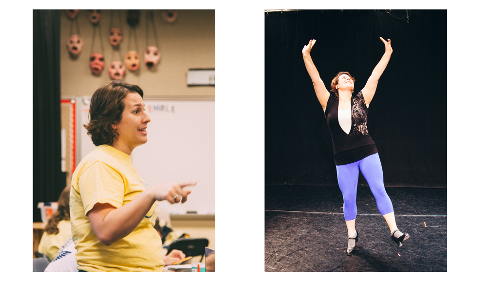 Kristina is a highly organized, methodical theatre professional and educator. She has worked in all levels of theatre and is able to bring to her students not just a healthy knowledge of her craft, but also a respect for the work they create. Being a private business, her most effective advertisement is word-of-mouth. To assist anyone looking to hire her as an acting coach, a new website with a new emphasis and a professional rebrand was needed.
For Kristina Friedgen’s re-branding initiative I:
- Designed a new logo and brand identity
- Designed her new website
- Developed a child theme on WordPress for future ease of updating
What Kristina and I agreed would serve her best would be a brand that felt established and professional while still being approachable and personal. She wanted a design that felt bold; theatrical but not a spectacle, a design with personalization, but not cluttered. Most importantly she wanted a design that was able to clearly define the different roles of her business, while still bringing them together under one brand.
Bit by bit, putting it together
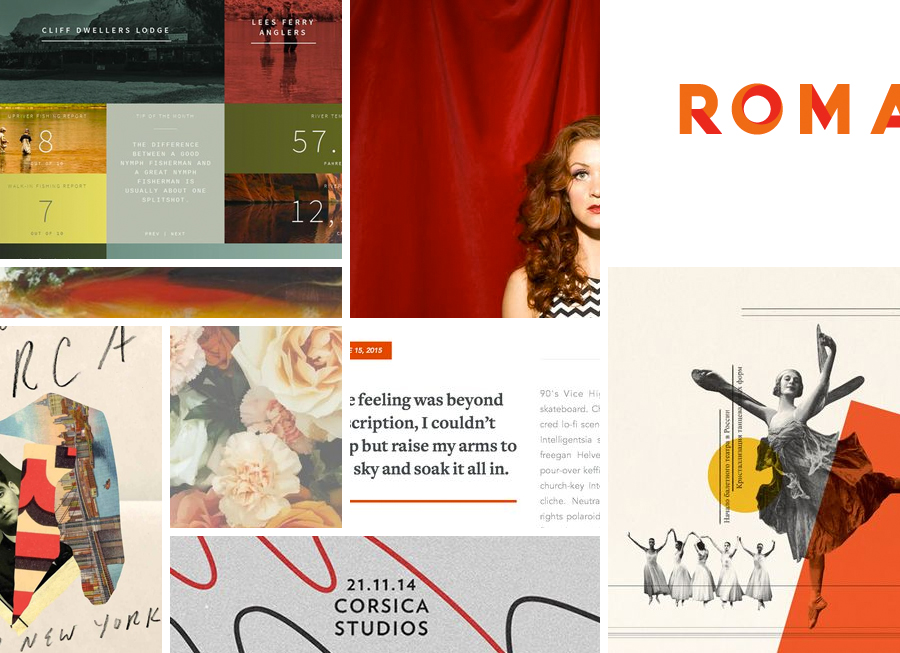
KRISTINA FRIEDGEN MOOD BOARDS | “BOLD”
When building a brand identity the most important part of the process is the client interview. For me this step involved interviewing Kristina and having her fill out the brand survey I send to all clients. I took those responses and searched for various visuals: textures, treatments, type, icons, etc that I felt reflected the descriptions she had outlined in her survey.
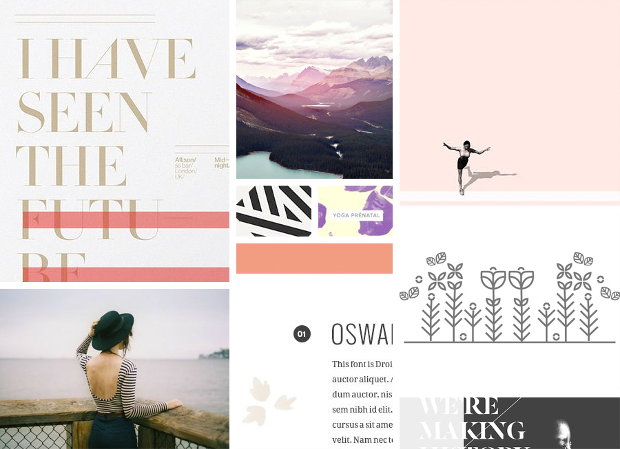
I created several mood boards, all themed very differently to a specific style that I felt she was describing. She narrowed these options down to two specific mood boards. One was the mood board I called “bold” which focused on bold colors, large, heavy-weight, sans-serif fonts, collaged elements, and color overlays. The next mood board was called, “story teller” and focused on more editorial-like type layouts with some geometric designs, a focus on type over photography and a more subtle pastel color scheme.
KRISTINA FRIEDGEN MOOD BOARDS | “STORYTELLER”
When I give clients mood boards like these I ask them to go through and let me know what they’re drawn to and enjoy, that’s the easy part. But alternatively I also ask them to describe what they dislike from these boards and why. It’s easy to forget to ask your client what they dislike from the rounds of work you present, but I find this to be a crucial part of the design process. If I only know what the client likes, I’m working with an unbalanced set of tools.
Kristina explained that in the “bold” mood board she enjoyed the color scheme, type treatment, photography approach, and grid-structure layouts. In that same mood board, she commented that she didn’t like the flower photograph, or the number treatments in the mood board. When asked what she liked in the “story teller” mood board she said she liked the collage effect photograph design, the photographs with text over them, and the title and number treatments. She did not like the flower icon design treatment and the color scheme felt too “girlie”.
With this knowledge I was able to start narrowing down what direction she wanted her brand to go and now it was time for sketching.
Piece by piece
KRISTINA FRIEDGEN LOGO DESIGN | ROUND I
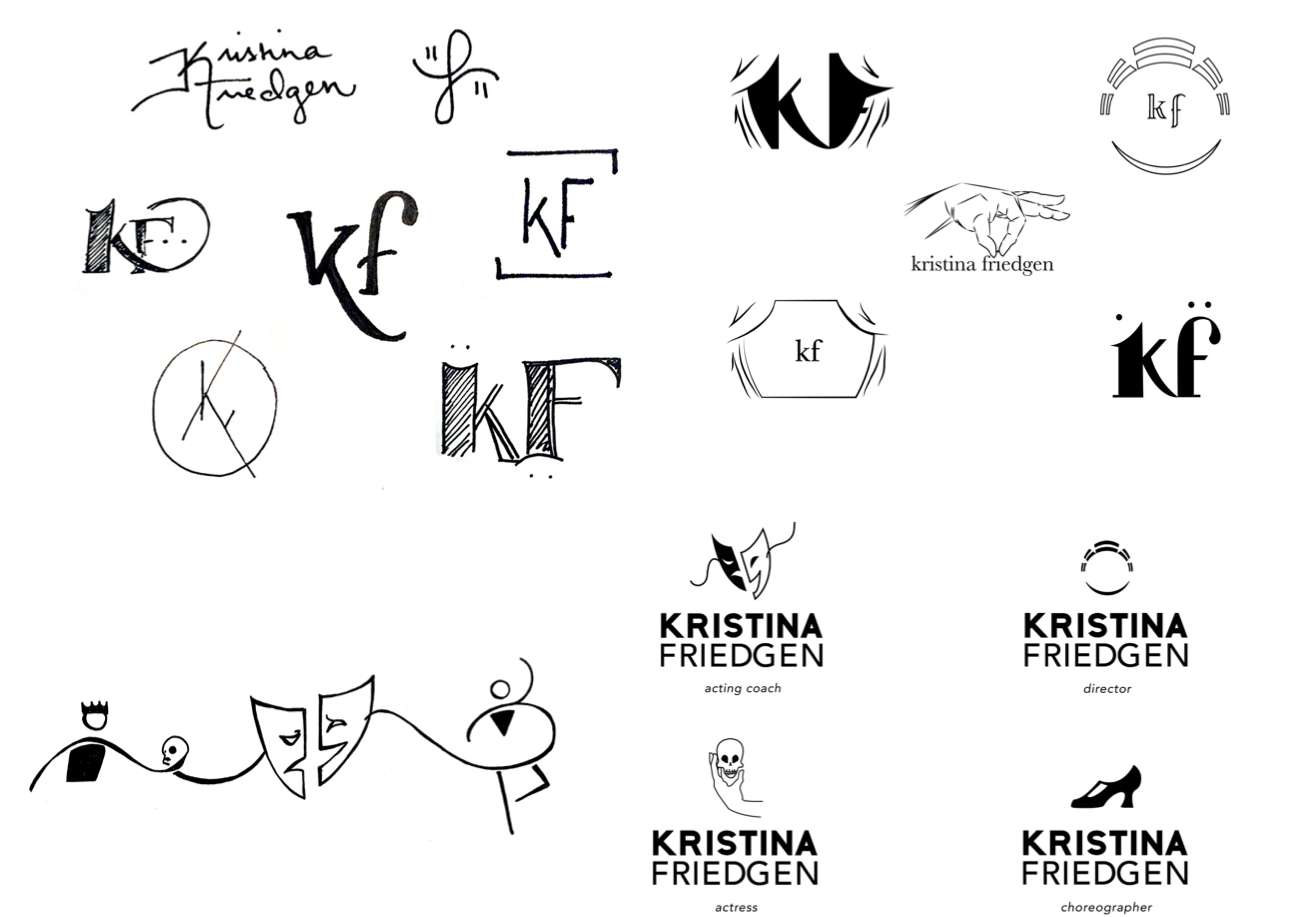
When we began the logo design process, Kristina was unsure if she wanted the logo to be just her initials or if she wanted it to be her full name. In that respect, I ended up trying several different variations including just her last initial, her two initials together, and her full name.
Working with a client on a logo design is never easy, it is always a growing pains process. You have to acknowledge that the client will sometimes have a fixed idea of what they want in their mind or they have absolutely no idea. Both are difficult ways to start. To make the conversation move more productively, I always begin a Pinterest board with my clients and tell them to pin any logos, icons, designs they feel match or appeal to what they’re looking for in a logo design.
Kristina’s board was full of professional theatre logos, and designs used in theatre that seemed to play on the idea of masks, or the physical stage and that is where I began my sketching. While Kristina was referencing several theatre companies, I was fully aware of the fact that a large theatre company would design a logo with very different aspects in mind compared to a private business like Kristina was building. With that in mind I began sketching with an emphasis on concepts like: personal, individual, theatre masks, the name as an icon; classic, stable and professional.
Every little detail plays a part
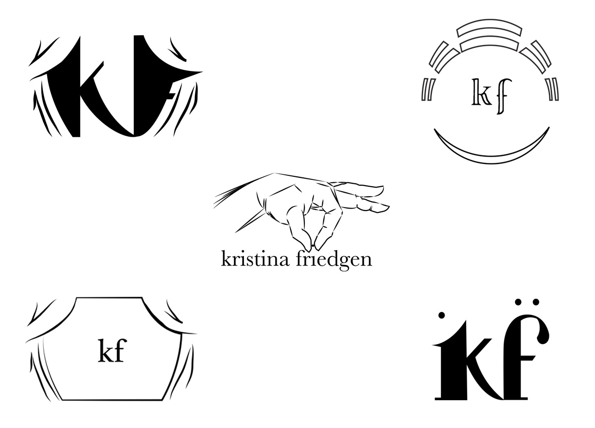
KRISTINA FRIEDGEN LOGO DESIGN | ROUND II
From that first round, Kristina narrowed in on the logos that had a professional feel while also “winking” at the audience with hints to theatre. For example, the KF and the cursive F with the eye dots/lines that referenced theatre mask expressions, but having the letters be lowercase as the uppercase felt too forceful. She challenged me to explore more options that brought more theatre iconography into play.
From that feedback, I began to explore the shape of the initials surrounded by theatre curtains. That felt a little cluttered to me. So, I decided to explore making the letters very clear with borders that referenced theatre iconography: a traditional greek stage layout, and a curtain and stage view. I then fleshed out the mask idea from the previous round by placing the eye dots above her initials. With all these theatre icons running amok, I decided to also make a conceptual mock that emphasized the human element of what she really does as a theatre professional: organize, direct, teach, etc. The hand placing the last piece of her name in place was meant to reference the human effort and directorial actions of her work.
It was at this point when Kristina decided she wanted the logo to be her full name. She felt the initials didn’t establish her brand quickly enough and while she liked some of the concepts, none of them encapsulated all that she was trying to describe with her brand: Acting coach, Director, Actor, Choreographer, Educator, etc.
Having just the vision’s no solution
This was an important turning point in the design process because it immediately disposed of several concepts while introducing a whole new level of difficulty: How do I convey 5 different aspects of her work while not overwhelming the design? She still wanted icons to sit along-side her name, she just wasn’t sure about which icons.
This is when I decided to break these concepts down and divide them. I designed one logo layout with four different icons with two thoughts in mind: The first was to make the name into a statement, but not overly decorative. The second was to separate the concepts in order to make sure I’m finding icons that match Kristina’s concepts in their own individual ways.
Everything depends on execution
KRISTINA FRIEDGEN LOGO DESIGN | ROUND III
Now we were getting to the heart of the matter. After this round Kristina was able to describe that while the icons were closer to what she was going for, she didn’t love every aspect of them and also felt they should be combined or interact with her name more. She liked the clean efficiency of her name – straightforward, easy to read but felt it sat too flat with no interaction with the icons. She appreciated the idea of the masks but felt their execution to be incongruous next to the text. She decided against the greek theatre icon – it didn’t convey quickly enough what she wanted. The hamlet skull was striking but she felt the focus was too direct on the skull and didn’t emphasize the actor enough. The character shoe was too fashion-centric and didn’t bring forward the idea of dance in her mind.
I’m not going to lie – when I got the feedback for this I felt at my wits end. How was I to bring all these concepts together under one icon and have it interact seamlessly with her name?
Designers are very familiar with this moment. In her most recent feedback, Kristina had given me all the information I needed. I just needed to take a deep breath and think. As the designer I felt like trying to convey each section of her business would lead to a jumbled mess, but that was working under the assumption that all aspects needed their own icon. Why do I need to convey icons for each different section? Her roles as director and educator are very similar. Her roles as actor and acting coach are similar. Choreographer was truly the only outlying role in my mind.
Putting it together, that’s what counts
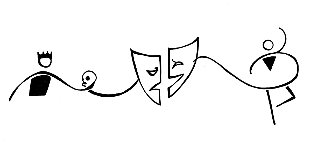
KRISTINA FRIEDGEN LOGO DESIGN | FINAL ROUND SKETCH
KRISTINA FRIEDGEN LOGO DESIGN | FINAL ROUND
From there I just worked on cleaning up the sketch, making it flow seamlessly around and over her name and work both her name and the icon so they interact and balance each other.
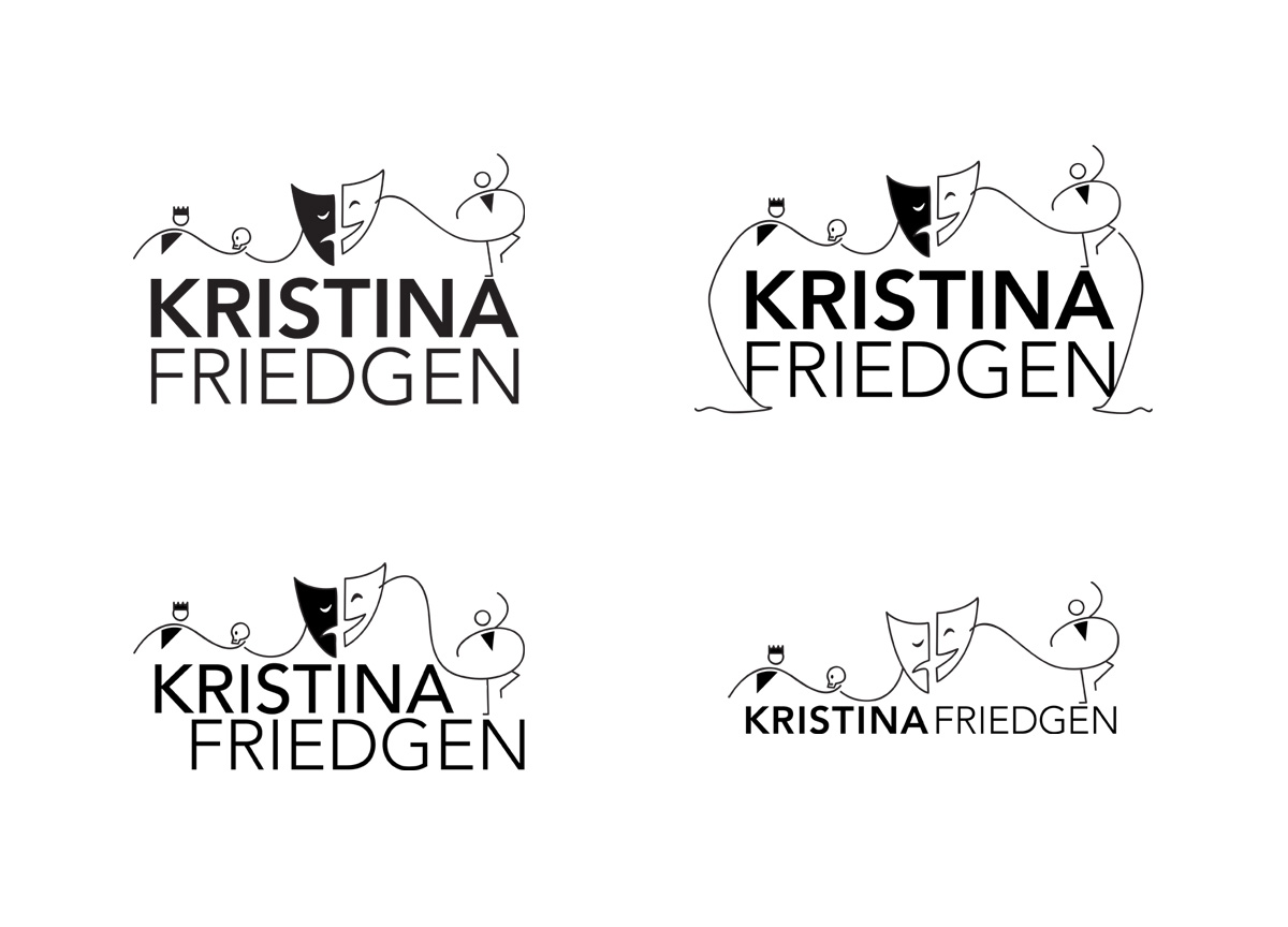
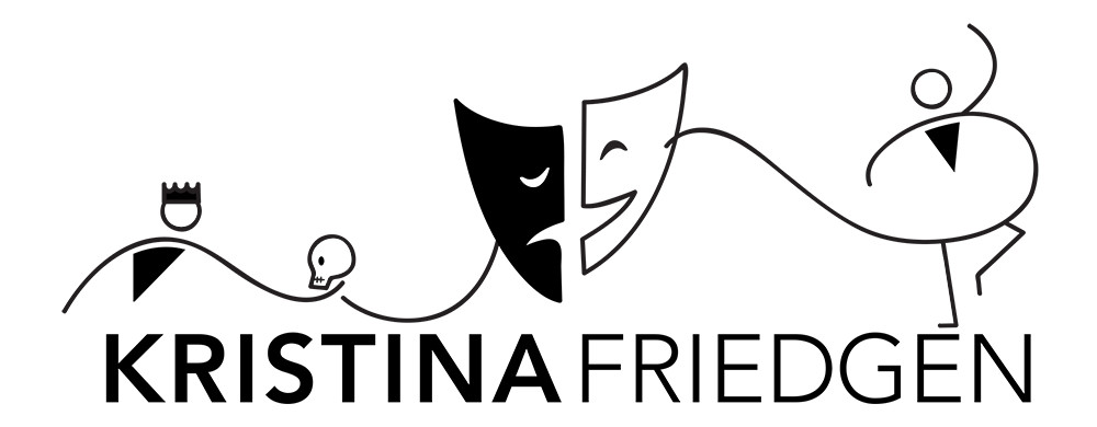
In the end, Kristina selected the design where her name sits on one line, emphasizes “KRISTINA” and balances visually with the flowing lines of the iconography. In order to make the balance between her name and the icons feel more organic, I took the negative space of some of her letters in order to create parts of the icons above. For example, Hamlet’s torso is made from the open-counter of the “K”, and the dancer’s torso is made from the open-counter of the “N”. The masks mouths and eyes are mirrored opposites of each other and the dancer’s foot is parallel to the horizontal lines in the type.
KRISTINA FRIEDGEN LOGO DESIGN | FINAL LOGO
This logo allows for the idea of playfulness, movement, and drama while at the same time not feeling cluttered and disorganized. Kristina and I both feel like the logo encapsulates all her roles while at the same time communicating her business as an expert and approachable theatre professional.
Give us more to see . . .
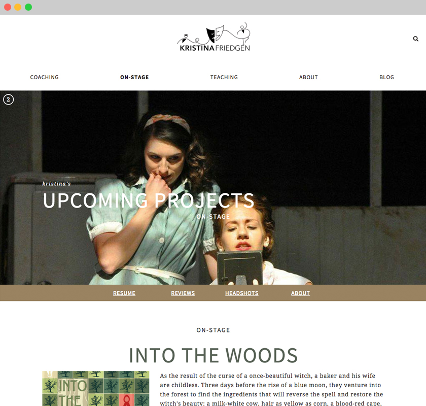
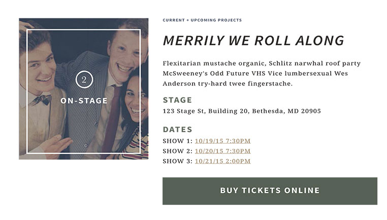
kristinafriedgen.com | on-stage
For this redesign, Kristina and I discussed the three tiers of initiatives she hoped to accomplish.
- Direct students to her acting coaching business. A business with the goal of helping students looking for ways to improve for their theatrical college auditions and prepare for other theatre pursuits.
- Expand on her work as an educator of theatre at Good Counsel High School.
- Showcase her work as an actor, singer, dancer, director and choreographer.
Those are three very hefty goals. One could build a website solely based on one of those goals. For me, as the designer, the first challenge to come to mind was: How do I communicate all these directives without overwhelming the user?
The last collaborator is your audience
In order to answer that question I needed to dive deeper into who that user would be. Kristina Friedgen’s audience consists of three main pools of people.
- The first being any potential clients, ages ranging from 14 – 20 years old with little to moderate theatre experience looking to hire an acting coach or students interested in Good Counsel’s Theatre Department. Their primary objective is to find a way to contact Kristina, either for an appointment or to find more information.
- Next we have the potential client’s parents, ages ranging from 35 – 55 years old with varying levels of understanding of theatre as a professional track. Their primary objective is to suss out what Kristina offers as an acting coach and educator and find a way to contact Kristina, either for an appointment or to find more information.
- The third group is what I refer to as “the peers”. These are theatre professionals, ages ranging from 25 to 45 who are looking to Kristina’s website for advice, information about upcoming shows, references to work on previous shows, and more. Their primary objective is more discussion based. They want to learn more about working in theatre from all aspects: do’s and don’ts, professionalism, technical aspects, and more.
It’s not easy taking users that range anywhere from 14 – 55 years old and who have varying levels of theatrical knowledge and find the best way to get them the information they seek in an inferential and efficient manner.
Attempting to bring order out of chaos
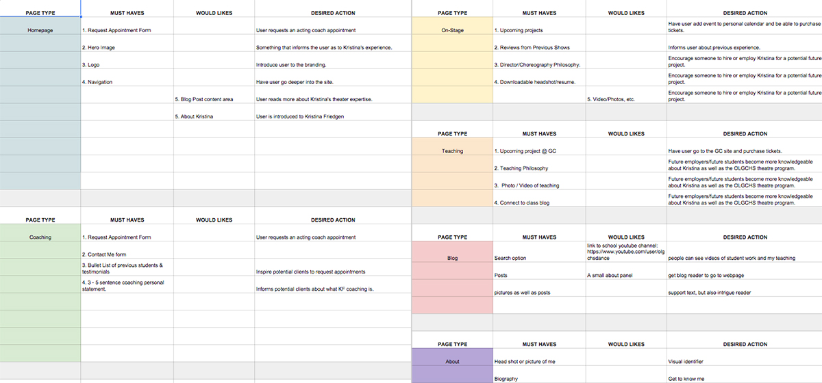
kristinafriedgen.com | INFORMATION DESIGN FORM
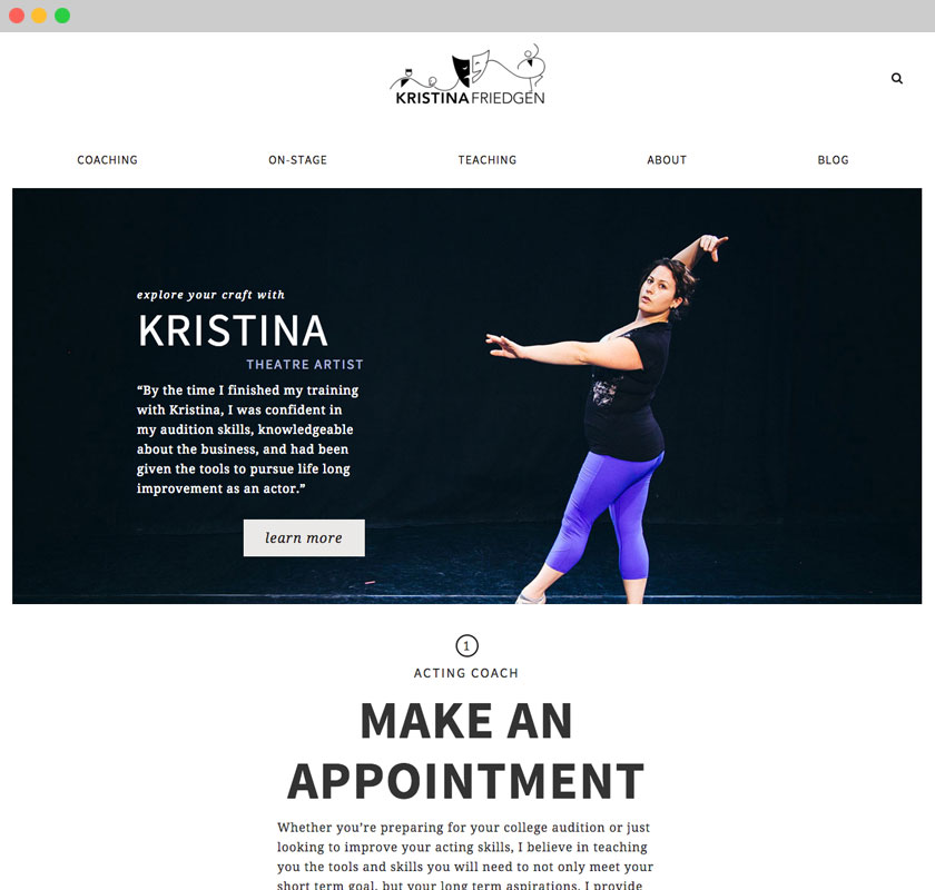
Kristina decided on separating her different varying roles into three sections of her site: Coaching, On-Stage and Teaching. Once that division was decided, together we went through and narrowed down the user-goals for each page. What desired action did she have for the user on each page? Well for coaching it was to make an appointment, for the on-stage page it was to have the user buy tickets to her next show, and the teaching page was to direct users to the Good Counsel site and their next show.
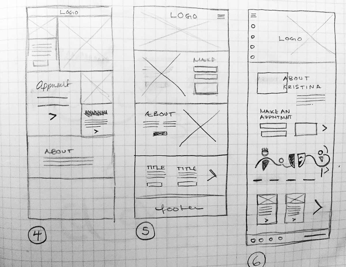
After narrowing down these goals across all her pages, I was ready to start wireframing her site. The purpose of these wireframes is not to establish style or aesthetics, but to help expose the hierarchy of elements on a page and how they’ll be seen across multiple devices. At the same time the wireframes were handed off, I also handed off some proposed style tiles.
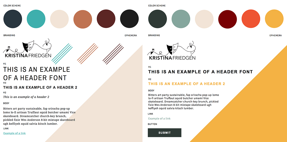
KRISTINAFRIEDGEN.COM | WIREFRAMES & STYLE TILES ROUND | Click on the thumbnails above to see more closely
Style tiles are similar to mood boards, only they utilize designs and styles directly for the site. They utilize the client’s logo and propose color schemes, textures, type treatments, photo treatment, etc. But they do not reflect the web design layout or how pages will be structured.
The goal of the style tiles are to get the general styles that will impact the entire site without prematurely worrying about how the page will layout with that design.
From our previous mood board discussion Kristina was clear that she desired a design that had energy and positivity but also communicated maturity and professionalism. For this purpose, I kept this initial handoff pretty bare bones as I wanted Kristina to see two versions of “mature” and “energetic” and see which direction she leaned in.
For the wireframes she selected numbers 1, 4, and 5 as she liked the variation of layout and the order in which the elements were layered. As for the style tiles she liked the maturity of the colors but felt they were too “masculine”.
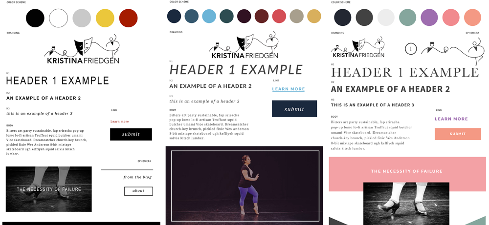
So for the next round I began to incorporate some of the aspects from the wireframes into newly designed style tiles to see which design she felt served her brand’s purpose more:
When I hand off variations of designs to a client, I try to give at least one very different design from the rest. Like a scientist, I try to treat this as a control group. I’ve noticed that this helps the client express more clearly what they like in the proposed designs because they see a more vast difference across all of the deliverables.
Out of all of these, Kristina liked the third one the best as far as color, photo treatment, buttons, and typography go. But in the first one she liked the header type treatments and in the second tile she liked the overlapping angular shapes at the bottom.
Any moment, big or small, is a moment after all
Finally we come to the part of the process where I hand of the mocks that incorporate the feedback from the wireframes and style tiles. From these the client is able to begin seeing how all the design elements will come together on their site.
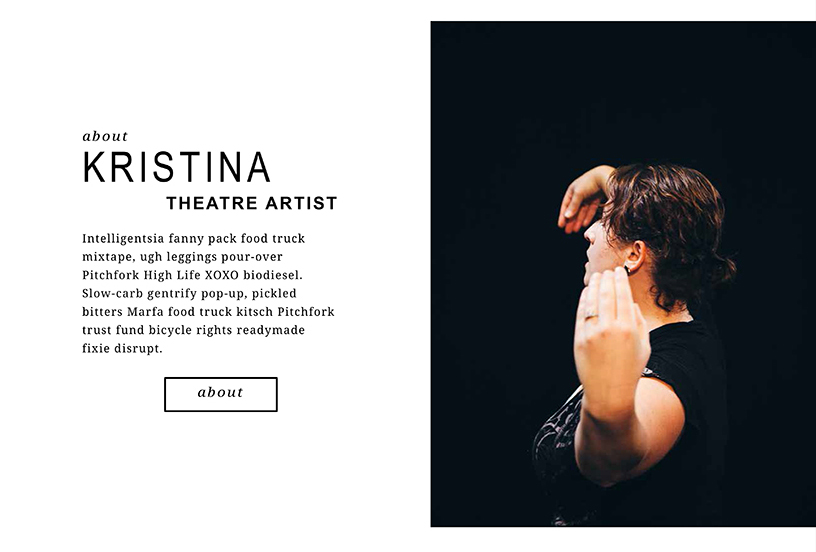
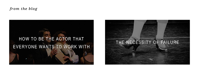
KRISTINAFRIEDGEN.COM | Selections from mock A
Finally we come to the part of the process where I hand of the mocks that incorporate the feedback from the wireframes and style tiles. From these the client is able to begin seeing how all the design elements will come together on their site.
KRISTINAFRIEDGEN.COM | SELECTIONS FROM MOCK B
KRISTINAFRIEDGEN.COM | SELECTIONS FROM MOCk C
When I hand off mocks at this stage I always show how a design like this would sit on a large screen and a small screen to make sure that even this early in the project, the client is considering the usability and user experience of their site from a mobile or tablet perspective.
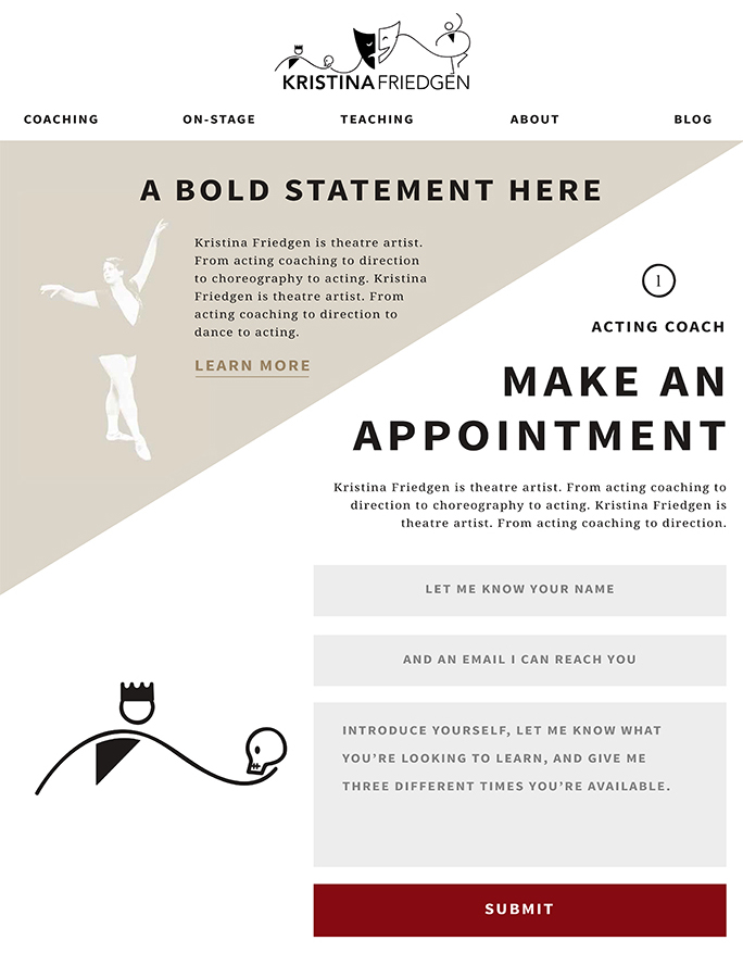
Kristina was ecstatic about the mock C, she loved the colors and felt they were mature and bold. She loved the text treatments and the handling of buttons, number styles, and general layout with enough white space to allow the user to visually focus on several items without being overwhelmed. But she found didn’t love the angular treatment of the content at the top of the page.
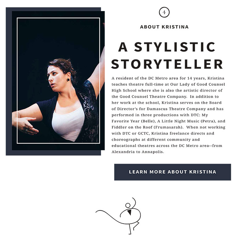
In mock A, she loved how the titles were designed with the three tiers of different type styles leading to the paragraph fonts. From mock B she found she enjoyed how the images with color overlays and the white border emphasized their content without overpowering the page.
Finishing the hat
Armed with this feedback I was able to hand off a final round of mocks for Kristina to see.
KRISTINAFRIEDGEN.COM | SELECTIONS FROM MOCK D
It’s at this stage that the designs begin to look similar, with few differences. For these mocks I tried to incorporate everything Kristina preferred in the previous round while also taking some of the styles a bit farther or interpreting the elements in different ways.
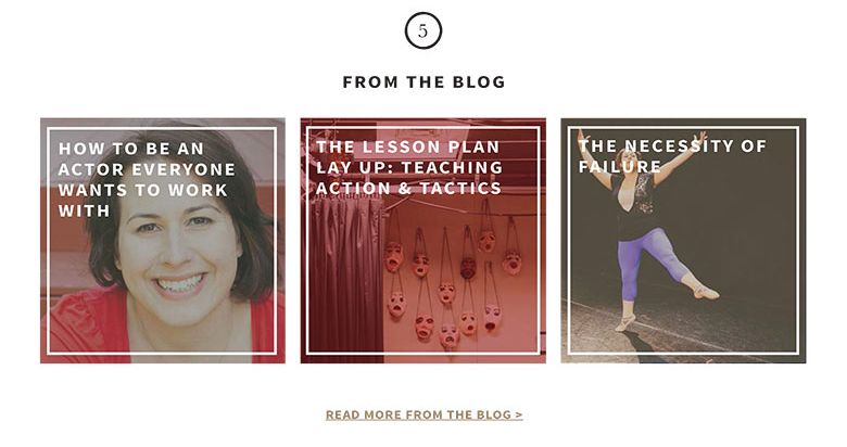
Kristina absolutely loved mock E and her only feedback was she preferred the way the blog section looked in mock D better. From there we had our final design.
Once all styles are approved, it’s at this point that I make the digital style guide:
See the Pen Style Guide: Kristina Friedgen by Katie (@kfriedgen) on CodePen.
The digital style guide is a way for my clients to see their styles in the context they will be delivered: on the web. It’s through these digital style guides that a client can say “oh, I don’t love how the hover state looks on that button”, or “can we make my sign up form larger?” You can’t always rely on pdfs to translate everything perfectly since you never know how they’ll be opened and viewed.
I also like to have the digital style guide as a palette and reference as I develop the site. This is where I begin to design and plan the layout for the website’s css styles and how every page will be coded, what aspects will rely on widgets, what will render in the page content, etc.
For me, designing and developing a website are two sides of the same coin – you can’t consider one while ignoring the other. That only leads to future frustrations. One of the major reasons Kristina wanted a re-design of her website was because her old site was not on a content management system. Her new website is now run on a WordPress child theme that I developed so that she could easily update her website’s content without stress or worry.
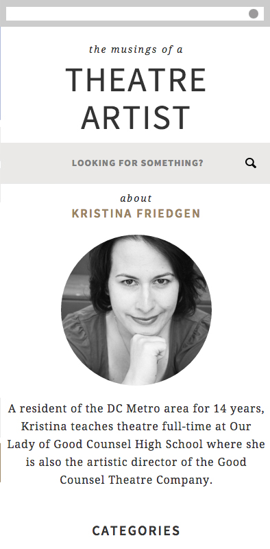
Kristinafriedgen.com | About
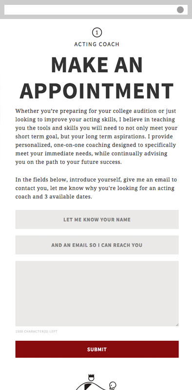
Kristinafriedgen.com | sidebar & Appointment Form
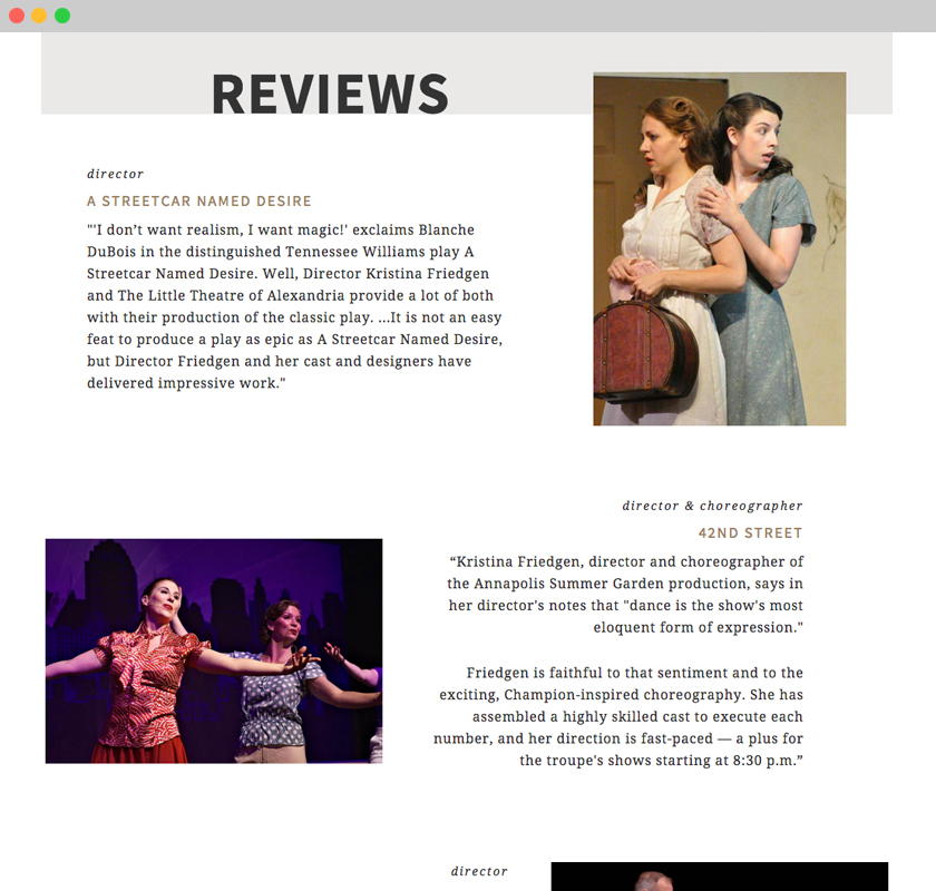
kristinafriedgen.com | on-stage (reviews)
KRISTINAFRIEDGEN.COM | Roles (Homepage) & Contact (about)
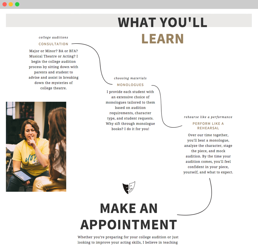
KRISTINAFRIEDGEN.COM | coaching (What you’ll learn)
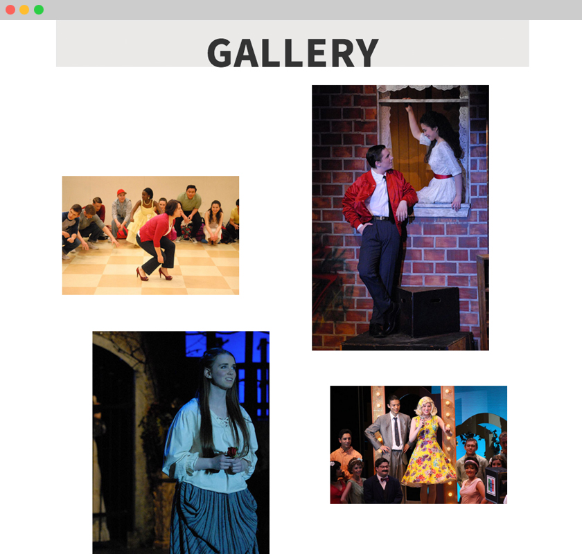
KRISTINAFRIEDGEN.COM | teaching (gallery)
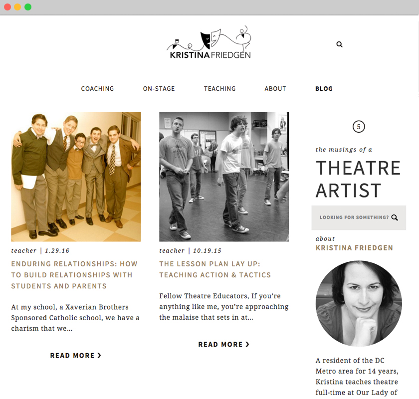
KRISTINAFRIEDGEN.COM | blogroll
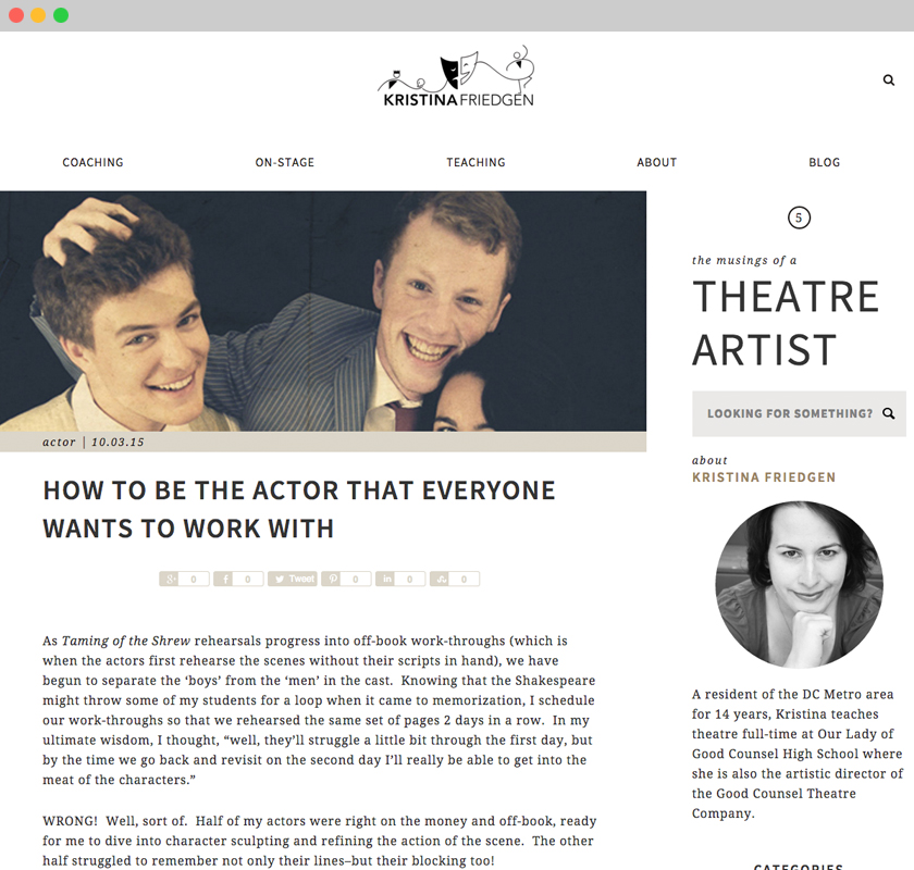
KRISTINAFRIEDGEN.COM | blog post
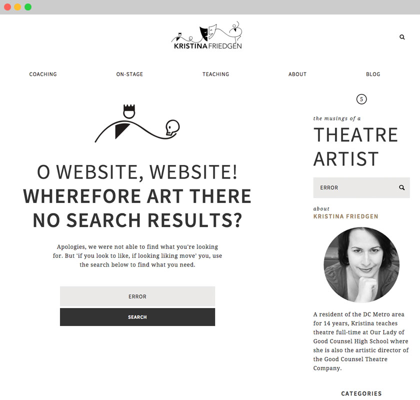
KRISTINAFRIEDGEN.COM | error page
Final Thoughts
From theatre icons to color schemes all the way to development layout, redesigning and developing Kristina Friedgen’s new brand was never once boring. One of my favorite aspects of being a designer is knowing I’ll learn something new with every project I take on. This was the first project I put extra emphasis on how the client would use the content management system after I was done and how I could develop the site in such a way that would make every update as simple as possible.
Kristina can now have people sign up for coaching lessons, navigate to buy tickets for her shows, learn from the theatrical experiences she shares on her blog, and she can keep everything up-to-date on her own.
Looking back over this entire process, I can’t help but be extremely proud of the end result. What felt daunting in the beginning – taking so many different roles and representing them in one icon on one website – now I can appreciate for what it was: a wonderful creative journey.
