
Redesign 2016: New Beginnings
What’s Old is New Again . . . And Again
Redesigning my website always feels like when someone asks me what my favorite movie is or who my favorite artist is, etc. I have to pick one thing to represent myself? That’s so limiting! To solve that feeling of design claustrophobia, I usually redesign my portfolio completely every year. I’ve had a professional website since 2011 and without fail, every year I redesign and redevelop how it looks, how it’s shaped, the UX flow and design ephemera for that year.
2016 was a huge year of growth for me in my professional work. I worked on projects that employ new web standards and practices. Using this knowledge I’ve applied new style standards and atomic design and development, BEM specificity, and I became extremely comfortable using Github to improve my file versioning and Gulp to compile and streamline my SCSS workflow. With all these tools at my disposal I knew this year my portfolio redesign strategy had to be different. I wanted to make it so that I don’t have to tear down and ditch my old sites as I go forward, but rather build them with a structure that’s flexible for future iterations, improvements, extensions and enhancements.
Before I could even begin to think about the design of my new site I knew I had to treat my site like any other project I would take on – by using my design and development workflow. My workflow starts with research of the “client”, the product and the customer or user. Next would be mood boards and sketching. Then would come mocks and development exploration. And finally, development implementation.
Research: Learn where we’ve been to see where we’re going
As with any client I needed to take a look back at all my previous designs and see what holds up over time? What is still representative of my style? What choices could be improved? What do I want to say now that I couldn’t say then?
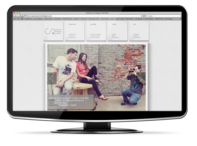

portfolio redesign 2011


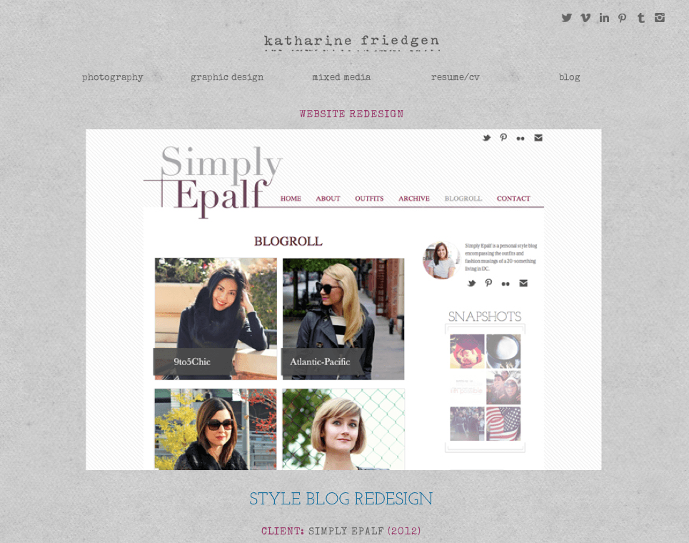

PORTFOLIO REDESIGNs 2013 & 2014

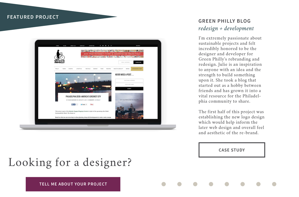


PORTFOLIO REDESIGN 2015
While these different versions vary in many ways I did notice similarities that popped out and showed a preference for certain design decisions. These include a large photo feature on the homepage, serif body copy, grid homepage and main page layouts, and color schemes.
In earlier years it seems I preferred textures and display fonts and later years I preferred a clean white background and more vector, block shape elements. And as the years progressed I seemed to lean more towards a modular approach to content. This leads us into what’s under the hood – the development progression.
From 2011-2014, my website was a hand-coded HTML, CSS, & jQuery site with a blog run off a custom developed theme on tumblr. In 2015 I decided to migrate my entire site to WordPress and have the content be more manageable and less reliant on the fragile hand-coded HTML pages I had to individually, manually update.
All of this information helped me to begin shaping what I preferred from a design and development perspective: a site with clean and classic visual treatment with a more modular and flexible code system.
research: what do the users say?
When I made my first personal, professional website it was in order to help me have an online portfolio to apply to jobs. As my site and experience have grown, the purpose for my site is to help maintain my online professional presence, advertise to freelance clients about what I do and inform them about my process.
But after all these years of making content and housing them on these varied sites I needed to know who was my user? Who is coming to my site and what do they hope to gain from the experience? So I created and sent out a user experience survey and was extremely encouraged by the response I received.
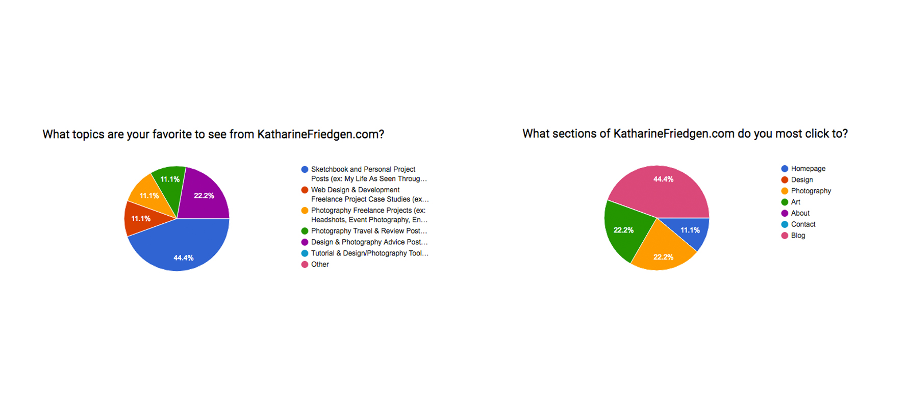
Below are a few of the responses that I felt helped inform my design choices for the 2016 redesign and helped to show me the highest draws to my site.
In Graph Group A you’ll see responses that focus mainly on how the users of my site approach my site and where they come from personally. Based on this information, I’m able to tell that my users range between 19 – 45 years old and 61 – 75 years old, with a higher readership from the 26 – 30 year olds. He/she mainly interacts with the web while at a desk, but prefers to use their mobile device. Professionally they come from all over but the majority are in Education & Communications & Marketing, with a smaller contingent working in fields related to the Environment and Engineering/Computer Science.
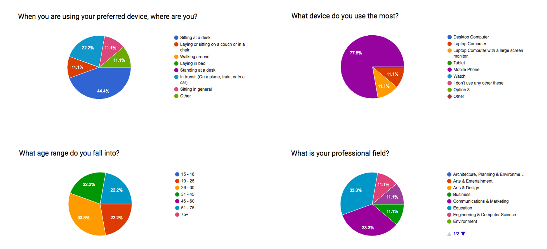
User experience graph group a
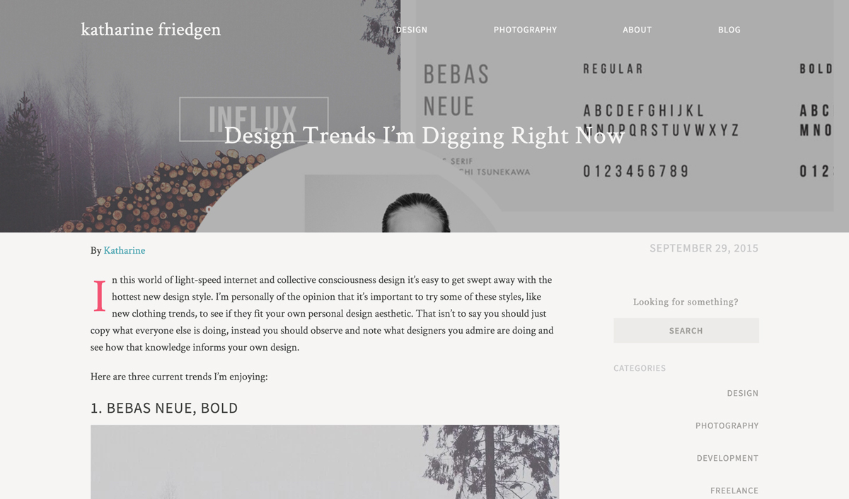
Now that I know who is coming to my site, I needed to know the why. What brings them back and what do they want more of? In Graph Group B the overwhelming draw to the site seems to be the blog and my writings of my personal projects, next is my design case studies and photography process recommendations.
USER EXPERIENCE GRAPH GROUP b
With all this information in mind, I’m able to begin sketching the structure and flow of the site and planning the design concepts.
mood boards: Tones, treatments, & type
When I create mood boards I try not to let myself feel like I have to go in one direction. I usually create more than one mood board at a time so that when I peruse through websites and blogs and other image libraries I can start to create very different mood boards and sort them appropriately.
For this 2016 redesign after looking at what I’ve chosen in the past I knew I wanted to go a little more flat, with emphasis on photography, and an approach with more icon design and/or a hand-touch-feel to my site. So for the first mood board, which I titled Solace, I focused on muted tones, with pops of color, light hints of textures, bold sans-serif fonts, and stark thick-lined icons.
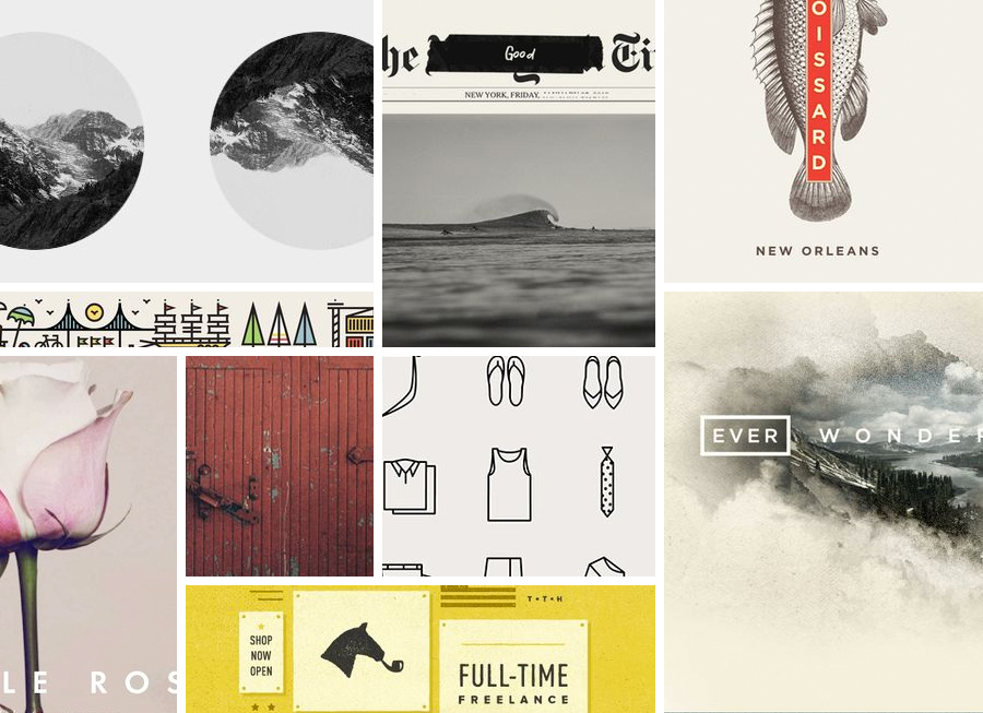
mood board: solace
In the second mood board, which I titled Pop Block, I tried to go a little more modern and editorial with an emphasis on serifs as body text and title text, accent text as bold sans-serifs, circle photographic features, and pops of yellow, magenta, and blue.
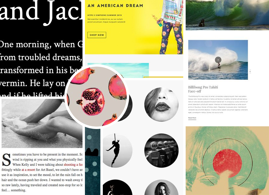
Mood Board: pop block
These two mood boards would eventually inform the main design choices of my pattern lab and atomic design structure.
wireframes: building the look & flow
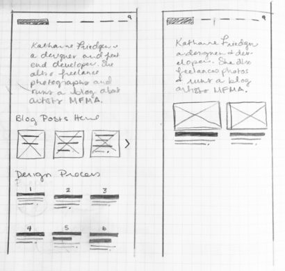
wireframes: Homepage & about
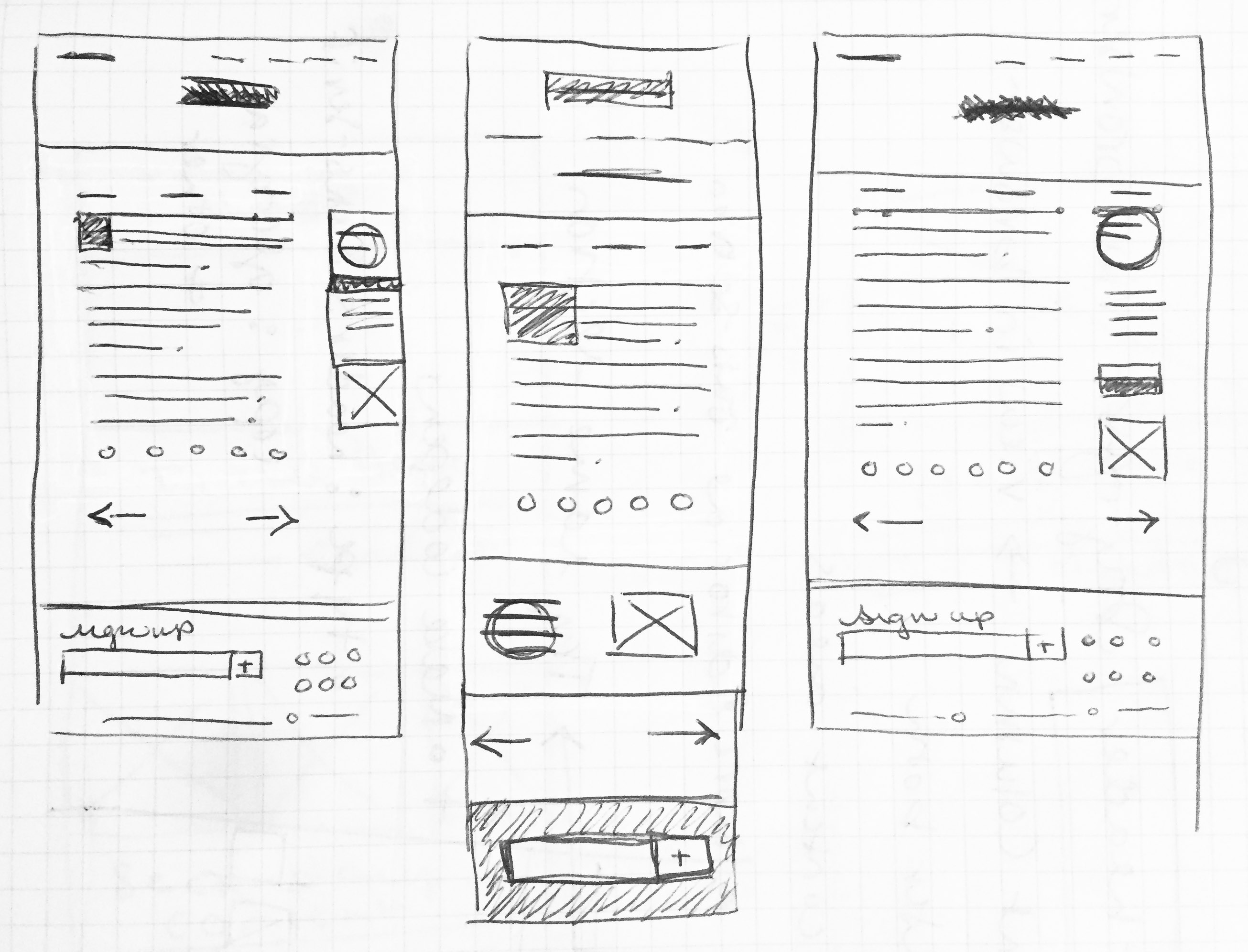


wireframes: blog post, sidebar, & navigation explorations
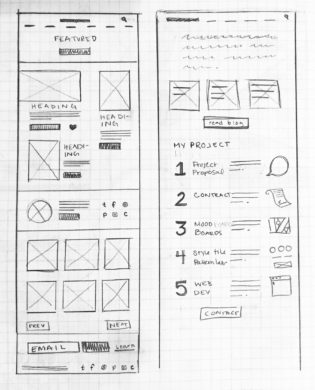
With all the information gathered I had a few things I knew I wanted right off the bat. Knowing that the blog posts are the biggest draw to the site, I wanted to make sure they were front and center on the homepage. The next was what pages I needed to include in this site. One of the weakest aspects of my previous versions is that they try to show everything instead of focusing on what I want to emphasize.
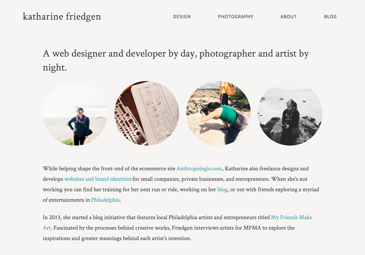
The pages I knew I had to include where Home, Design, Photography, and Blog. I do eventually plan on their being a “shoppable” aspect to my site where I can sell my photographs, artwork, and prints. But that is something I plan to build in later. After perusing other peers in the same line of business as me I knew I needed something akin to a Contact or About page. I didn’t want to have a purposeless about me page that just gives a quick bio, so I wired up some sketches where my About page houses a small bio, a blurb about my process, and a way to contact me for work.
The next series of rough wire sketches focuses on the structure and responsive transitions for the Blog Post, Navigation and Sidebar options. For the navigation I wanted to explore hamburger navigation option – which I later decided against – and see how it would handle across pages.
For the single blog post and sidebar structure I wanted to make this feature feel approachable, comfortably readable, and content driven. When adhering to a grid structure you’re bound to have certain breakpoints squish your content or force your design to look off on just a certain size. With that in mind I wanted to plan for the best-case scenarios when it comes to the articles on my site.
Development explorations: The final frontier
There were several aspects about the development of this redesign that I knew I wanted to incorporate. I knew I wanted to use SCSS, so I would need a compiler (grunt or gulp, preferably). I wanted something that would build sympathetically with WordPress PHP templates. Ideally I’d also find a way of streamlining my development by housing my code on Github and creating a continuing build process.
After researching the options available, I eventually settled on Roots’ Sage Starter Theme. Sage includes Gulp and Bower and gives you an excellent template base to start from without over-doing it.
With my dev base decided, it was finally time to begin the mocks for my site.
Final Mocks: it’s the last version because I put “final” in front
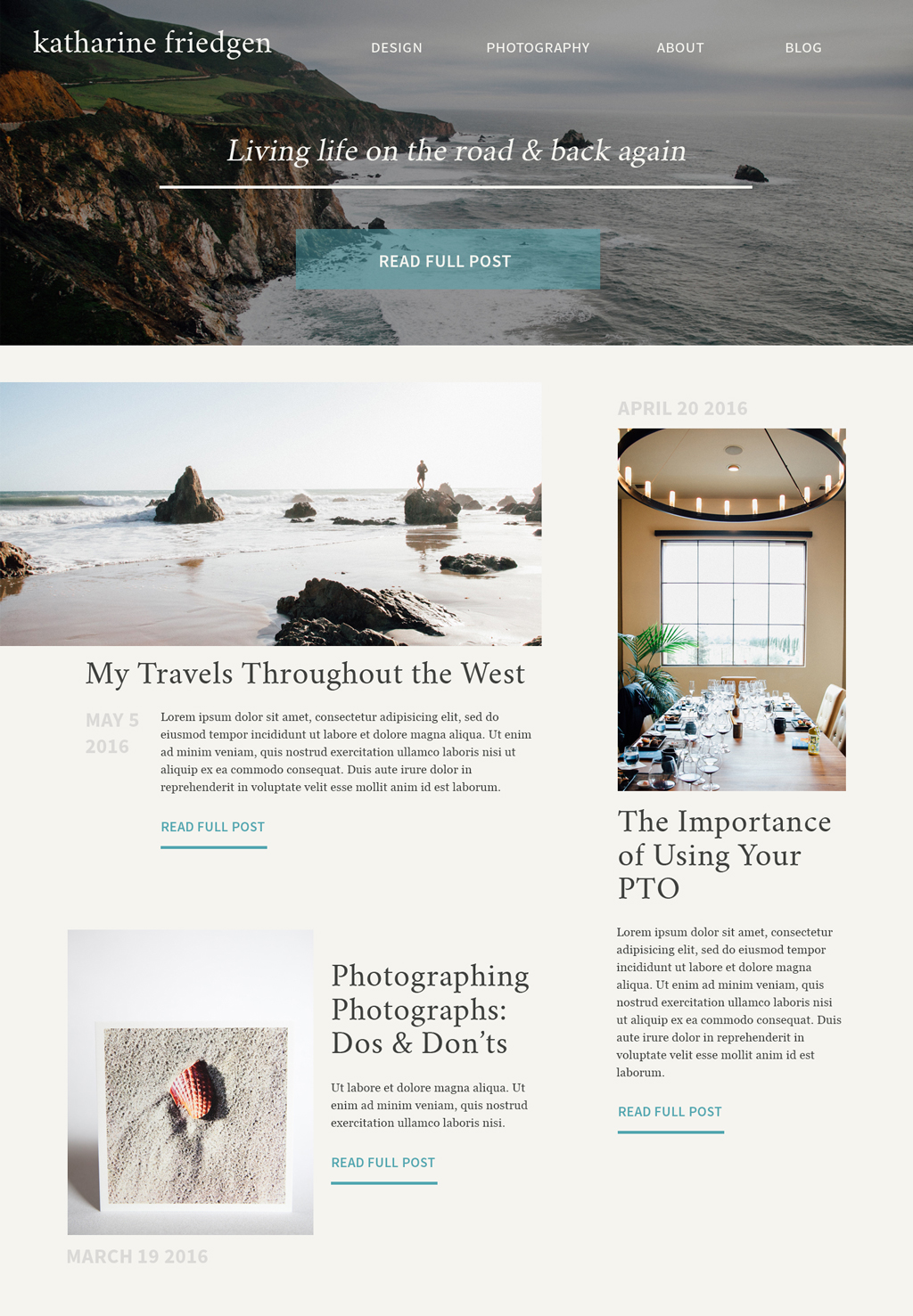
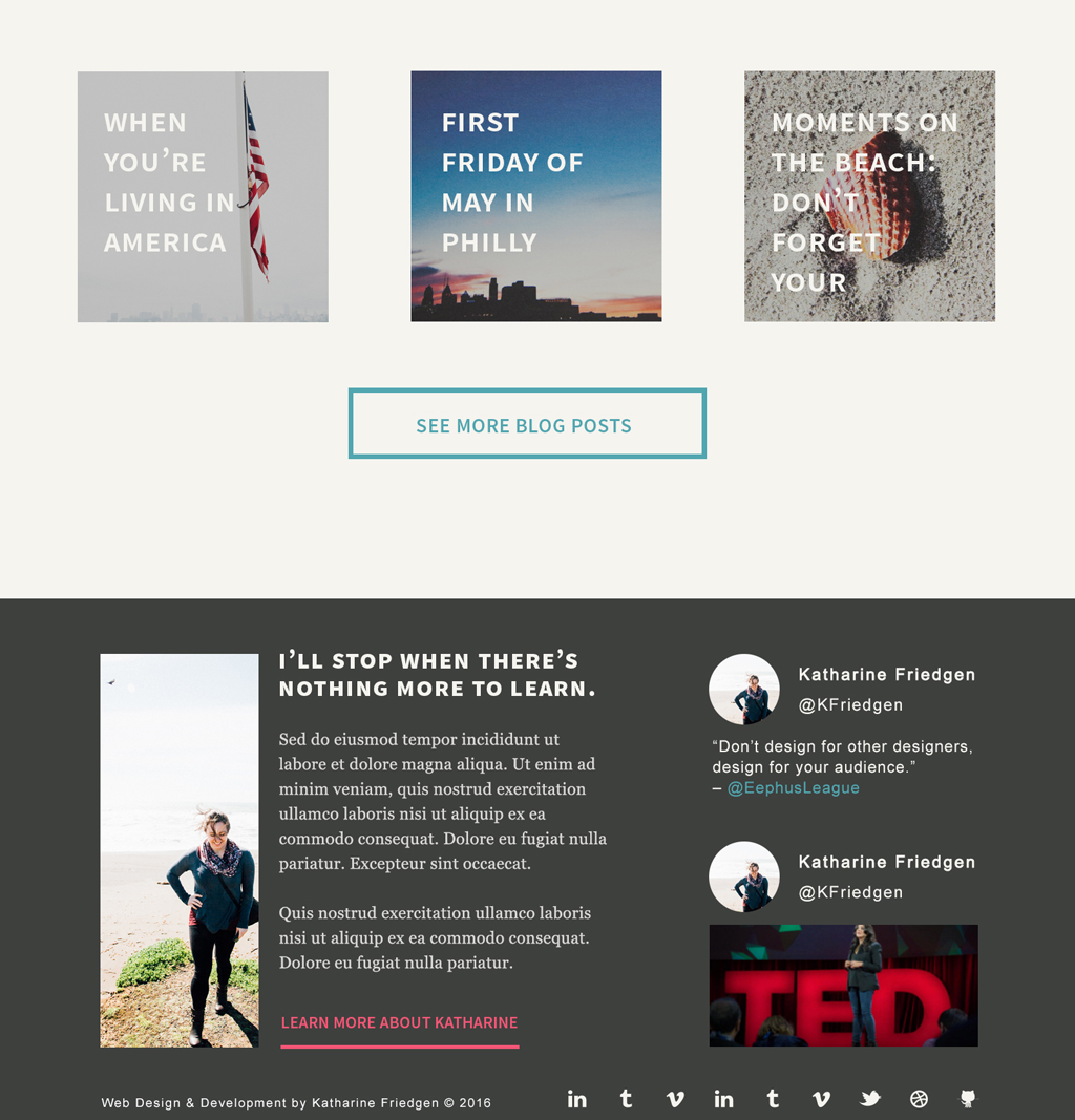
Mocks: Homepage


Mocks: Blog Post & Portfolio Page
For the design I worked with a 12-column grid structure and started to hone in on the style elements that I wanted to feature on the site. As I worked on these mocks I created a style guide on CodePen in order to see these styles the way they would finally render, on the web. After establishing base styles here I began developing the rest of the website.
style guide: redesign 2016 version 1
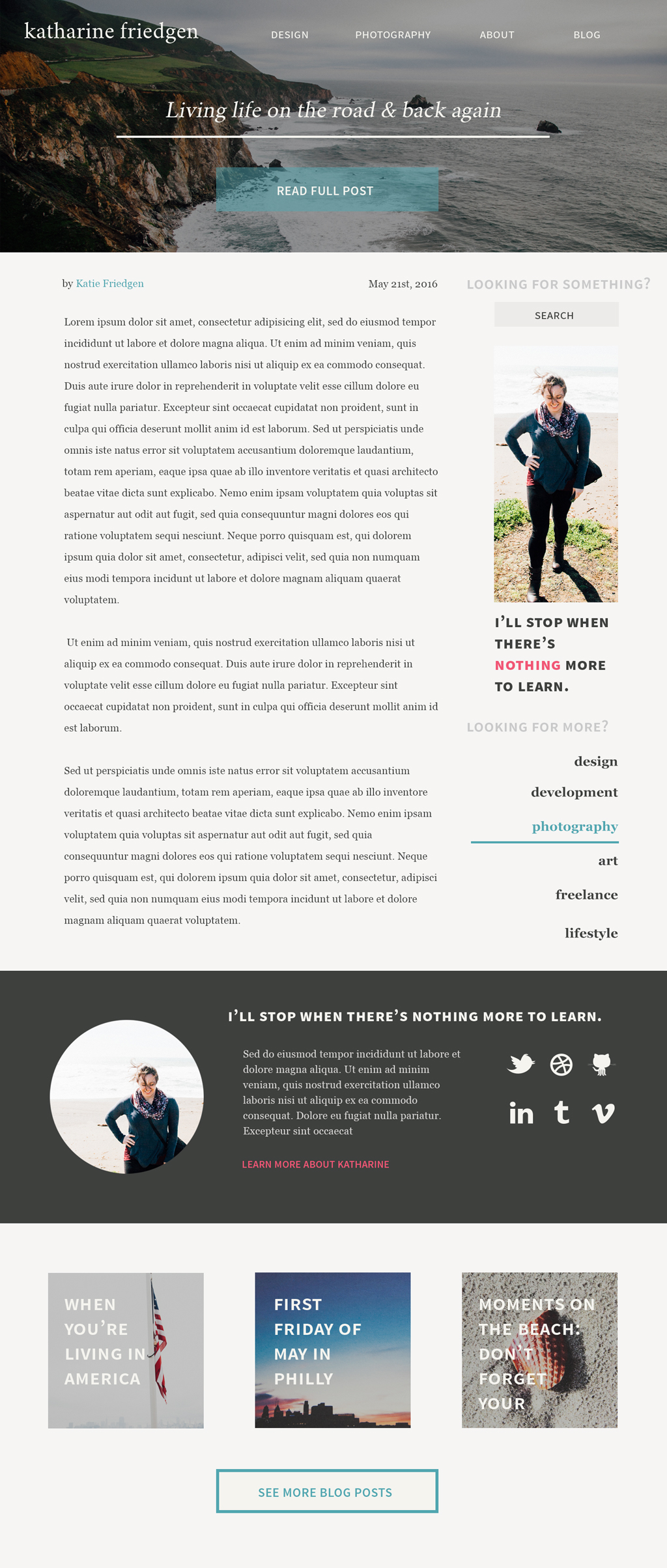
redesign 2016: A new beginning
KATHARINE FRIEDGEN REDESIGN 2016 | HOMEPAGE
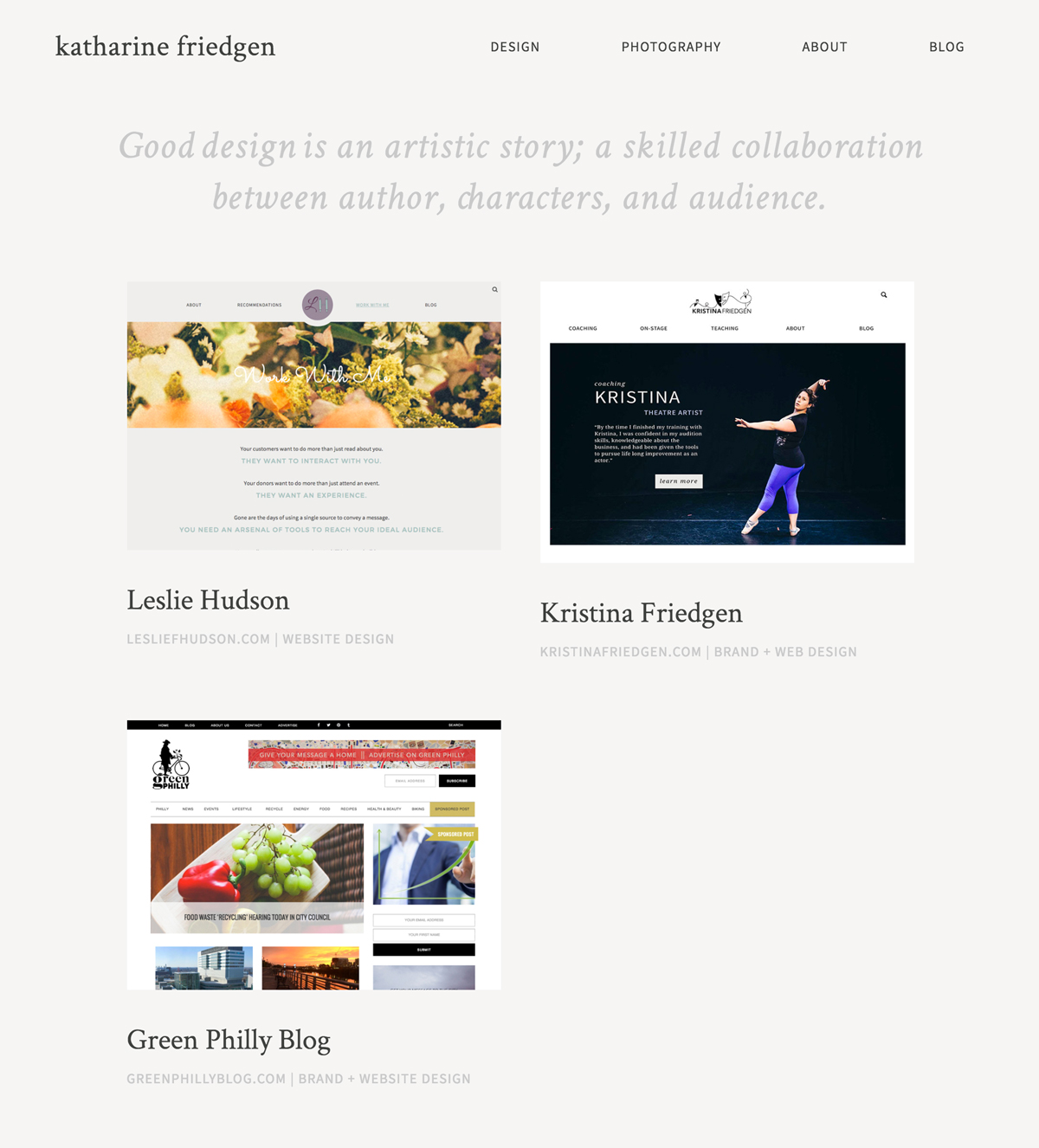


KATHARINE FRIEDGEN REDESIGN 2016 | Portfolio pages


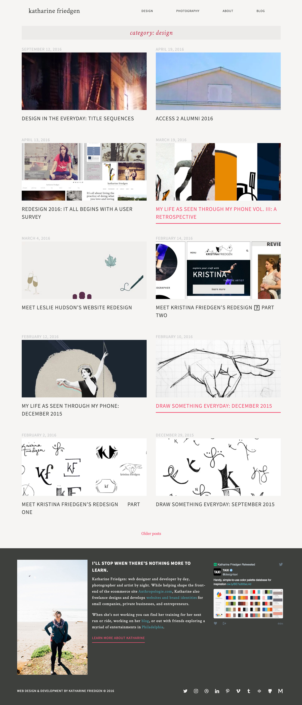
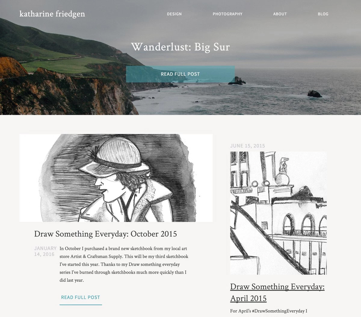
KATHARINE FRIEDGEN REDESIGN 2016 | blogroll, SINGLE POST PAGE, sidebar & category roll
KATHARINE FRIEDGEN REDESIGN 2016 | single post page


KATHARINE FRIEDGEN REDESIGN 2016 | about & error page
And voila! A new site design is born. But beyond it being new it’s also just the beginning. You’ll notice not every aspect of my original design is live currently. That is because I plan on building upon this base design. For now, I’ve established new brand styles that adhere to my pattern lab and I will take this foundation and grow my portfolio’s design and functionality from this. My initial goals identified by my research have been met: emphasize and feature blog posts and freelance work. But there will be more improvements in the future.
The site is developed modularly where one new post, one new page, etc will apply and update in other locations. For example, the homepage currently just displays the navigation, footer, most recent post, and a scattering of previous posts. But later it will grow to feature current freelance work. The about page is currently a bio and contact location, but later will house a summary of my design and development process.
By using BEM to name each section and by declaring base styles I will be able to update any future versions from one stylesheet and for the most part in one declaration. By utilizing the Sage boilerplate, my site is faster than it’s ever been thanks to compiling my files with Gulp.
In the end, I learned a lot from this project and I’m extremely proud of the result. One of my art professors in college always said, “A truly great work is never really finished.” And that’s the mentality I’m taking with this portfolio. It will grow and shape as I do as a web professional, and all I can hope is that it helps users explore my site in a more efficient and succinct fashion.