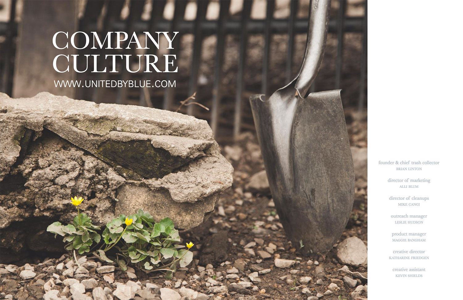
United By Blue
Design & Photography
A week after moving to Philadelphia in 2011, I accepted the film & photography internship at a small, sustainable, clothing retail start up called United by Blue. Little did I know what would become of that single choice.
For those of you who don’t know UBB, let me introduce you. United by Blue is a sustainable retail startup with a one-to-one mission: For every product they sell, UBB removes one pound of trash from our world’s oceans and waterways through company organized cleanups.
Working for a startup is a fast-paced, exciting and inspiring experience. Every person on our team was an incredibly talented and self-sufficient individual, which is imperative in a startup. While I worked at UBB I learned as much about being an entrepreneur as I did about our environment.
While I started as the film & photography intern, I eventually was hired as the Creative Associate, which added design to my responsibilities. In 2013 I became the Creative Director, in charge of United By Blue’s marketing and product visual presence.
A Start-Up Celebrating the Beauty of Loving the Outdoors
United By Blue’s one-to-one mission is more than just a pitch. The company organizes and hosts cleanups all over the world and to date has removed over 200,000 pounds of trash from oceans and waterways. It’s through this mission that the entire brand stems it’s aesthetic. From the love of the outdoors and nature at it’s most pure all the way to finding hidden or forgotten gems, UBB celebrates the vintage and timeless details that often go overlooked in mainstream retail. Being a two component business – a for profit on one side and a sustainable initiative on the other, there was a constant dialogue between the products created and the mission.
Brand Photography

I was in charge of planning, designing, photographing, and editing all the brand photography. This included product photography for UBB’s catalogs and e-commerce site, our in-house styled shoots for promotional and marketing materials, cleanup documentation for all UBB’s cleanups, and photoshoot look book photography. Each of these projects were fascinating learning experiences as well as wonderful challenges to find solutions for each unique situation.
Product Photography

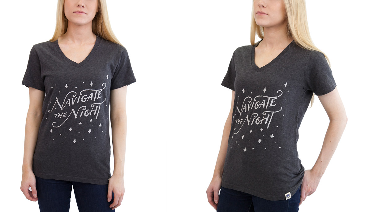
Our product photography was the most straight-forward: document each product while capturing every important detail – whether that be a flourish in the design or the texture of the sustainable material. We used in-house photographic backdrops and lighting in order to style and properly light each shoot. Designing each shoot was a challenge. I had to keep in mind not to just show how creative can we pose each model, but instead focus on what pose displays the product best.
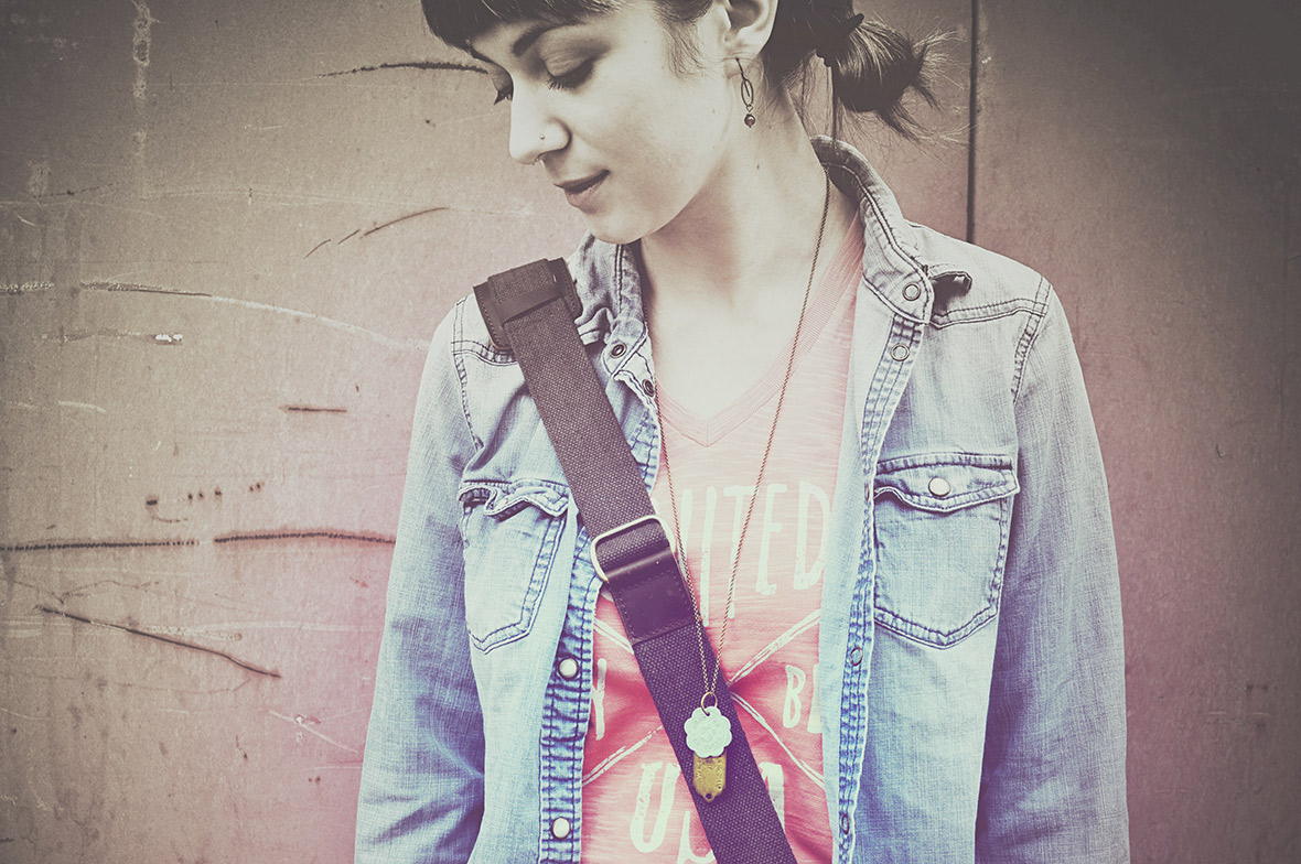
In-house Styled Shoots

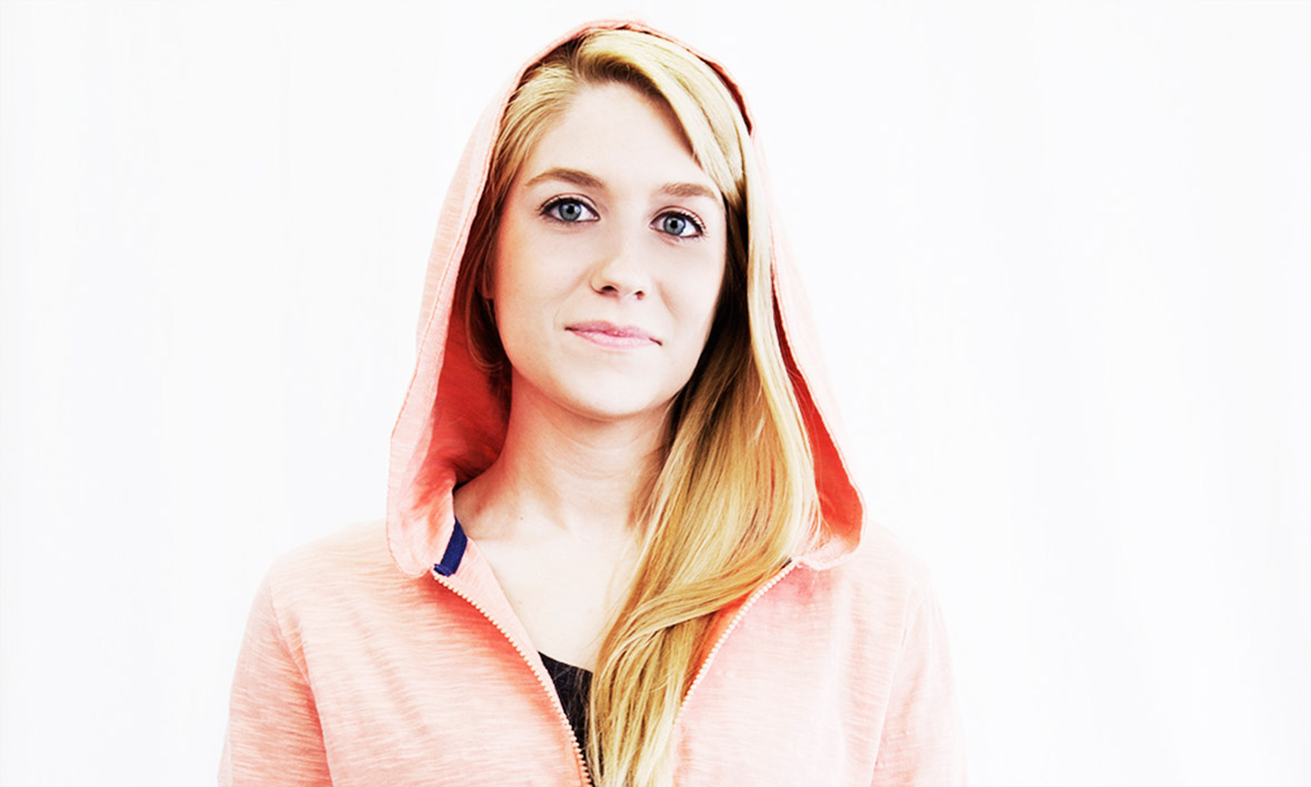

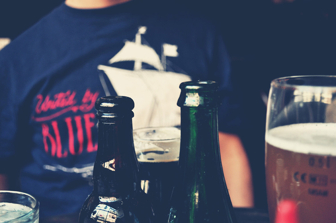
In-house styled shoots are photoshoots that I shot in UBB’s company studio with either a backdrop we constructed or a simple white backdrop. Each shot would be designed and styled in order to create promotional or marketing materials. These were fun and difficult all in one fell swoop. I was constantly trying to find ways to keep the in-house shoots fresh and different, either with different focuses (on body or still product) or adding in textures versus keeping it focused solely on the product or model.
One of my favorite in-house shoots was for UBB’s Kickstarter Bike Bags. We used a restored bike to pose the bags while also enhancing it’s well-loved texture and look. UBB’s studio at the time wasn’t big, so my biggest challenge was to photograph this bike (that had no kickstand) in a way that focused you on the product’s ease and style.
Lookbook Photography


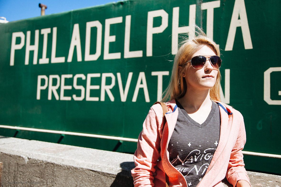


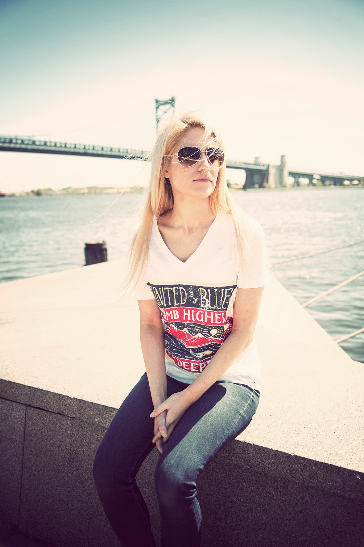
My favorite photographic projects were creating United By Blue’s look book photography. From concept development to model selection all the way to execution and editing these were just a blast to do. While photoshoot concepts would be created once the product line was finalized the planning and actual shoot had to wait for samples to arrive. Once they did it was off to the races and I would usually do a day of shooting, a few days of editing and we’d end up with plenty of promotional photography for e-commerce site usage, social media promotion, and the actual look book. These images were used in almost everything from web promotions to trade show catalogs.
Several of our photoshoots feature Philadelphia as a backdrop. While I’ll admit that was the easiest solution, it wasn’t the only reason. Having an outdoor apparel and supply brand in Philadelphia is extremely unique, but if you live here you know the old-harbor-town river walks and colonial side-streets that speak directly to the United By Blue aesthetic. The bridging of city living and outdoor love. For me it was crucial to feature Philadelphia’s unique personality in order to enhance the product’s energy.
You can see all the look books I created for United By Blue here on Issuu.
Back to school, 2012
into the woods, 2012
Winter wanders, 2012
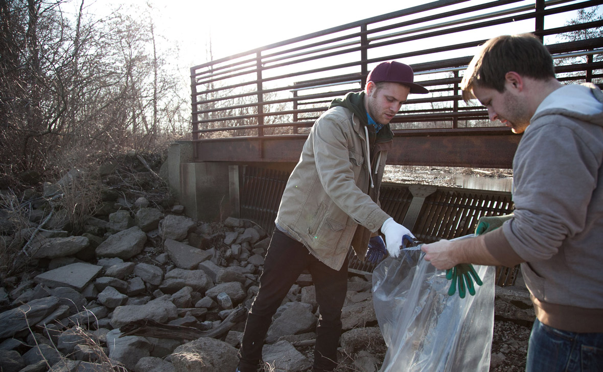
Cleanup Documentation

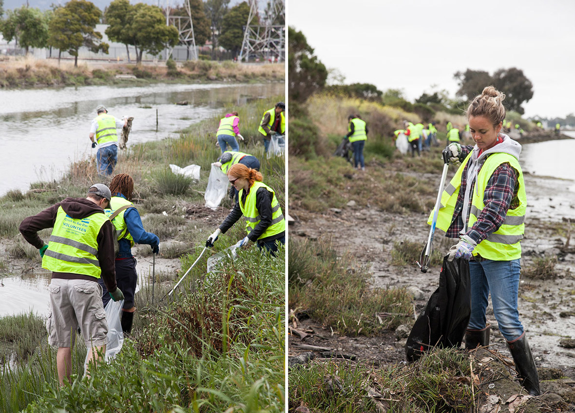
Being the backbone of UBB’s mission; The cleanups were one of the most important photographic responsibilities. Cleanups were a completely different photographic process than any styled shoot. These were candid, documentary shots meant to highlight the work, the mission, and the people giving of their time and efforts to help make the world a better place. While we had posed moments and final group shots, I always found the best photos were the simple candid observations of the volunteers working hard and having fun.
One of my favorite, and one of UBB’s most unique cleanups was when we took all the employees to Bartram’s garden and we did a small company cleanup just us, wearing UBB’s most recent (at the time) line of clothes and products. We wanted to have a company day where we documented not just the team cleaning, but also showing how much we love the outdoors, Philadelphia, and how much fun we would have at our cleanups.
company cleanup lookbook, 2013
Graphic & Layout Design
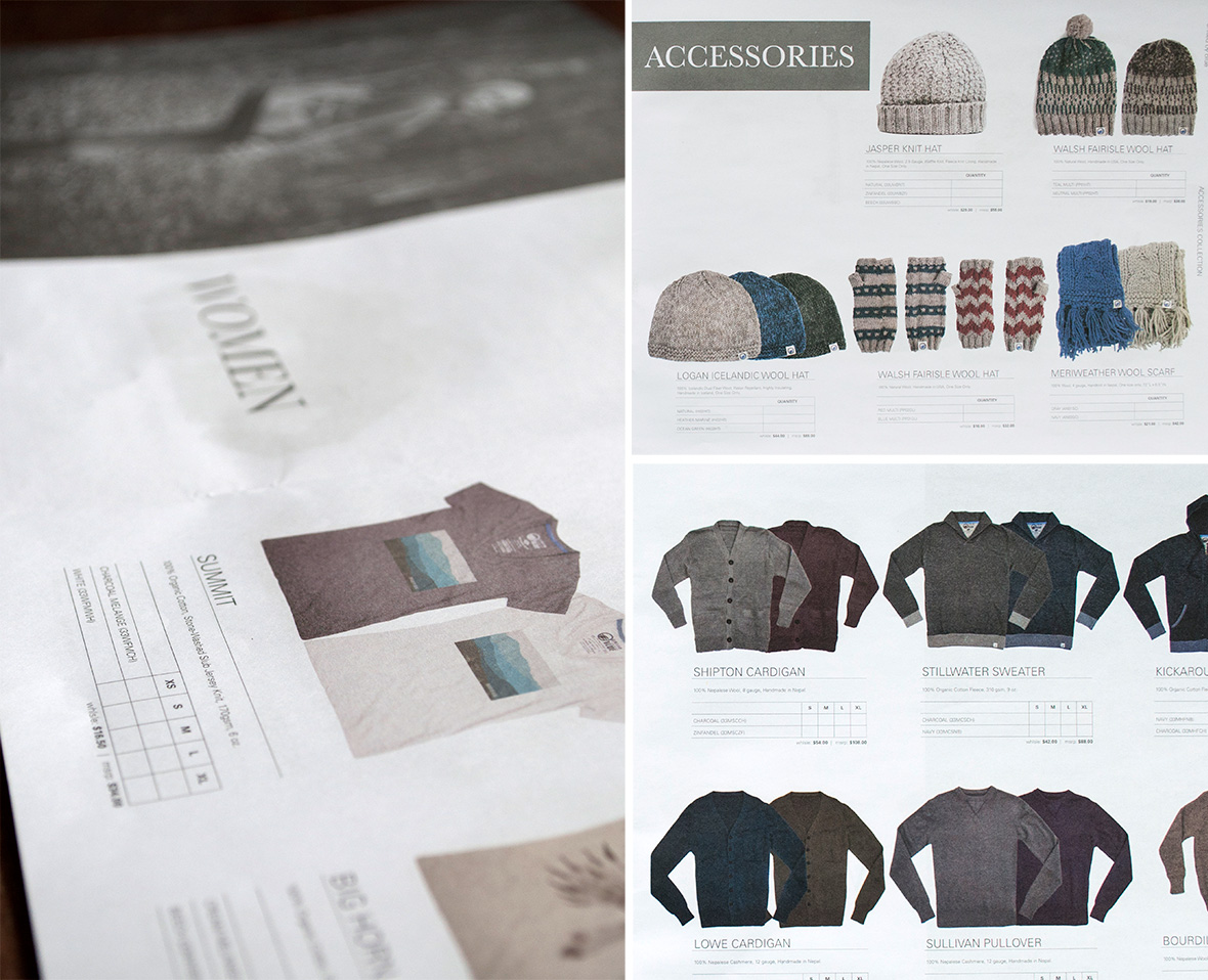
Tradeshow Catalogs
One of the most important recurring projects I worked on were the trade show catalogs. These were the catalogs the company would take to trade shows to place orders for the next season’s lines of clothing. For these documents I styled, photographed and edited every product, designed the layout for and developed the actual catalog using Adobe InDesign, before sending this off to the printer.
Email Newsletter Design


Anyone who works in retail or likes retail enough to subscribe to a newsletter knows how important the email presence is for any clothing company. It’s a constant touchpoint with the customer that helps keep the brand and product fresh in his or her mind.
With that in our heads, we tried to keep our customer in touch with our mission while not boring them, and also featuring simple and quick call to actions that didn’t force them to spend too much time one one email. The two emails I’ve featured here were part of the welcome series where UBB introduces themself in the first touchpoint and then invites the customer to enter the conversation on social media in the second touchpoint. The addition of motion into the email was the best way to express several aspects of the company while not forcing the user to scroll forever and gave each email a moment of surprise and energy.
Proposed Web Design
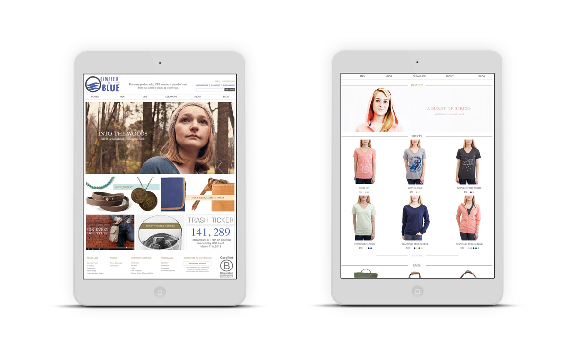
Tablet View: Homepage, Product Category

Desktop View: Product Category
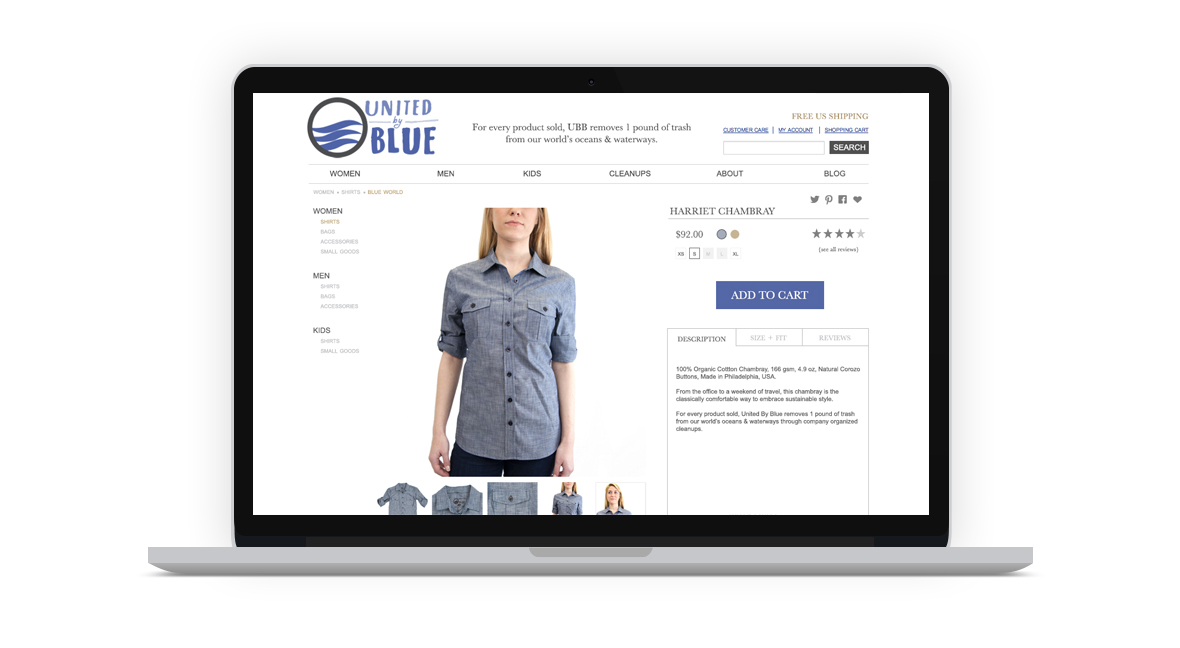
Laptop View: Product Detail Page
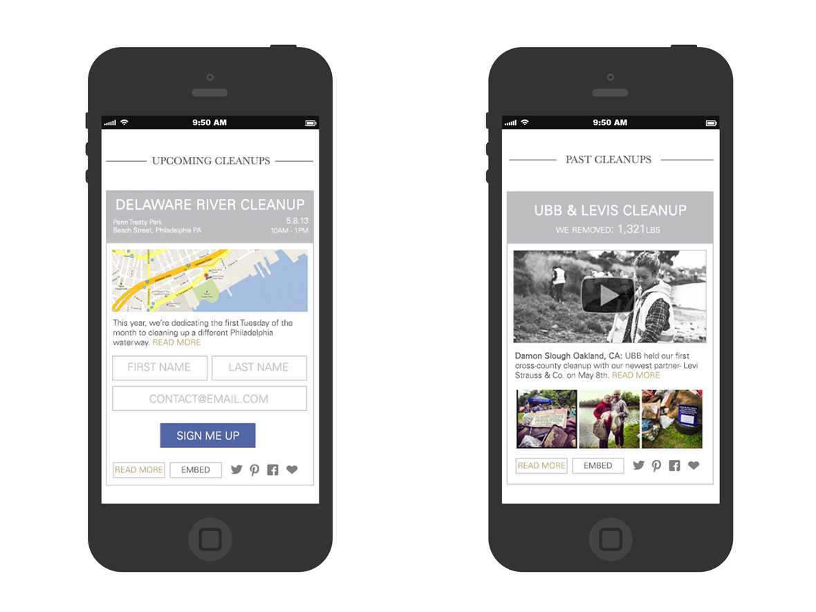
Mobile View: Cleanup Signup & Past Cleanup Details
Before I begin this section, let me disclaim that these designs were proposed web design elements that I made prior to leaving United By Blue and so they do not reflect the design of the current United By Blue website.
While I worked at United By Blue we grew from a very small wordpress site all the way to a fully functioning ecommerce site and it continued to grow at such a speed that in 2013 UBB started to look into a website redesign. When tasked with starting to design this initiative I took several things into account.
- Our branding was slowly refining and becoming more photographic based and more type minimalistic, which meant the site would need to reflect that.
- With more users on the go and the rise of responsive web design, I was adamant that we needed to make the site fully responsive and accessible on as many devices as possible.
- UBB had a large opportunity to do some incredible things on the web to enhance cleanup sign up and sharing.
With all those elements in mind I focused on making a design that featured the photographic content while not distracting the user. We featured design elements like clean lines, a white background, and solid color ephemera. This was a division from UBB’s of tradition of using texture (whether it be wood or sand or cloth) in the design and detailing of the website. This enabled the user to note the only texture shown – the product.
Another large aspect that I mocked up was the cleanup widget site experience. The two forms that people would interact with for cleanups would be the before and after parts of a cleanup:
- Upcoming Cleanups (before) – sign up, learn about the cleanup, know where you’re going and what you need to bring, and tell your friends.
- Past Cleanups (after) – Watch the video recap, read the write up, see the instagrams and photographs, and tell your friends.
My vision for these two parts of the site would be to make them widgets in order to ease sharing. For the upcoming cleanup’s widget the goal was to smooth the user’s way by making the sign up one click and the secondary goal would be for the user to share this with his or her friends. For the past cleanup’s widget the primary goal was to encourage attendees to share the experience with his or her friends. To that end I design both widgets to be social – each able to be shared across Twitter, Pinterest, Facebook, and Tumblr. In addition to all those I also designed it to be embeddable to help bloggers, newspapers, magazines, etc share the signup directly onto their own site.
Final Thoughts
In a word? Inspiring

Working with United By Blue was an incredible experience where I was able to grow my talents, learn several new skills, and see first-hand how a business is run from the ground up. Each visual touchpoint I worked on was an education, each person I worked with helped make every project a joy.
You never have a slow day at a start-up. It’s a fast-paced environment that continually demands your A game. I worked with an amazing team at UBB and their efforts inspired me everyday, not just their effort of growing a business but also spreading the word about an important movement.