West Elm’s Registry Matchmaker
Introduction
There’s always stress in big life events, whether it’s the chaos of planning a wedding or the first purchase of a home or apartment. Making your registry – no matter what the occasion – should be fun.
When we first began discussing what would become Registry Matchmaker, above all we wanted customers to enjoy themselves while building a full and robust registry.
Personalization and curating experiences to match a customer’s preferences is fast becoming the baseline for any great web experience. With Registry Matchmaker, we tried to bite off a small piece of this technology initiative to help expose the customer to the wide variety of products at West Elm, while also continually improving which products recommendations they see based on their own input.
Skip the case study and see the final design here.
Brief
Problem
Customers interested in signing up for a Registry on West Elm’s site are met with a lengthy sign-up process and confusing customer journey into the registry list. We’re also concerned that customers are unaware of the depth and breadth of the West Elm assortment and styles. Those who make it through the sign up and get to their registry list, usually don’t complete their registry or only register for a few items.
Goals
- Allow customers an easier, new way of exploring our full assortment of products in order to increase average order size.
- Allow for faster creation of a registry in order to increase registry sign ups, completions, and increase conversion driven by registries.
Hypothesis
If customers can start and quickly add personalized items to their registry more easily then they’ll be more likely to utilize their West Elm Registry for a wider range of products across the assortment.
Project Scope
Create an innovative and fun tool that allows for faster registry creation, personalized recommendations and helps expose the customer to the full product assortment at West Elm.
Research
Competitive Analysis


With the rise of personalization initiatives in the tech world, it’s not hard to find examples of this like + dislike submission model.
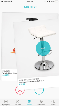
Zola’s app has the Blender feature which allows registrants to add and skip items to help quickly create a registry gift list.
Stitchfix has the Style Shuffle in their app which continually serves up clothing items to the customer and helps inform the future stylists of that customer’s preferences.
The biggest difference between these features and what we were trying to build at West Elm, is that we didn’t want to make customer’s download a native app. Instead we would build this within our progressive web app (or beta site, with the hope that eventually it would live on the production site) and customers could utilize it without any extra downloads needed.
Concept + Brainstorming
Perhaps the most difficult part of brainstorming into this feature was keeping the scope small. There’s so much we can and wanted to do with this feature: from allowing a customer the ability to have an overall view of how much they’ve added from the different categories to serving them a more “guided” experience that let’s them personalize into price and attributes.
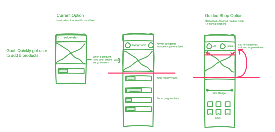
Overall view option concept 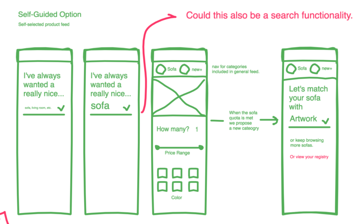
“Guided” option concept
In the end, we tried to keep the goal directly into the creation of a personalized registry list.
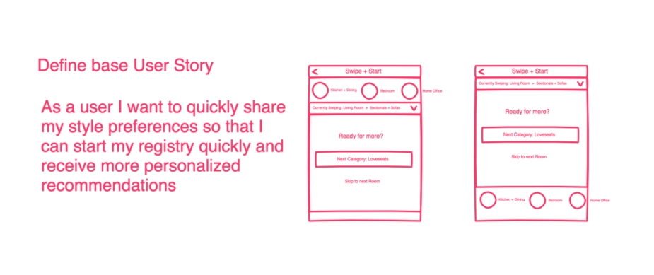
User Story
- As a West Elm registrant, I want to easily create a list of items that reflect my personal style so that I can grow my investment into and enjoyment of my home.
Wireframes
We quickly found that even this small scope included a lot of extraneous states we had to consider and plan for. Working through the following questions allowed us to concept and design into a holistic flow.
- How can we “add” an item to a registry if the customer is not signed in / has no account / has no registry?
- How do customer’s know somethings added to their registry?
- How do we allow them to sign in / create an account / registry and also drive them back into the feature without a hiccup?
- How do we fit this experience into one view so it has the feel of an app tool, with no scrolling required?
- How do we prompt them to view other categories?


Designs
There were two main flows we tried to plan and design into:
- When a customer uses this tool and they are either not signed in yet, don’t have an account, and/or don’t have a registry.
- When a customer has an account and is signed in already and also already has a registry.
New user
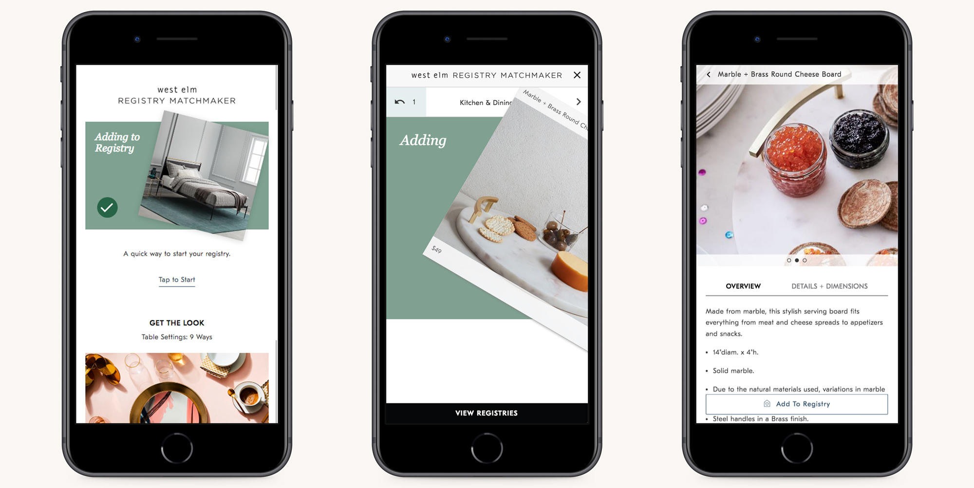
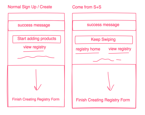
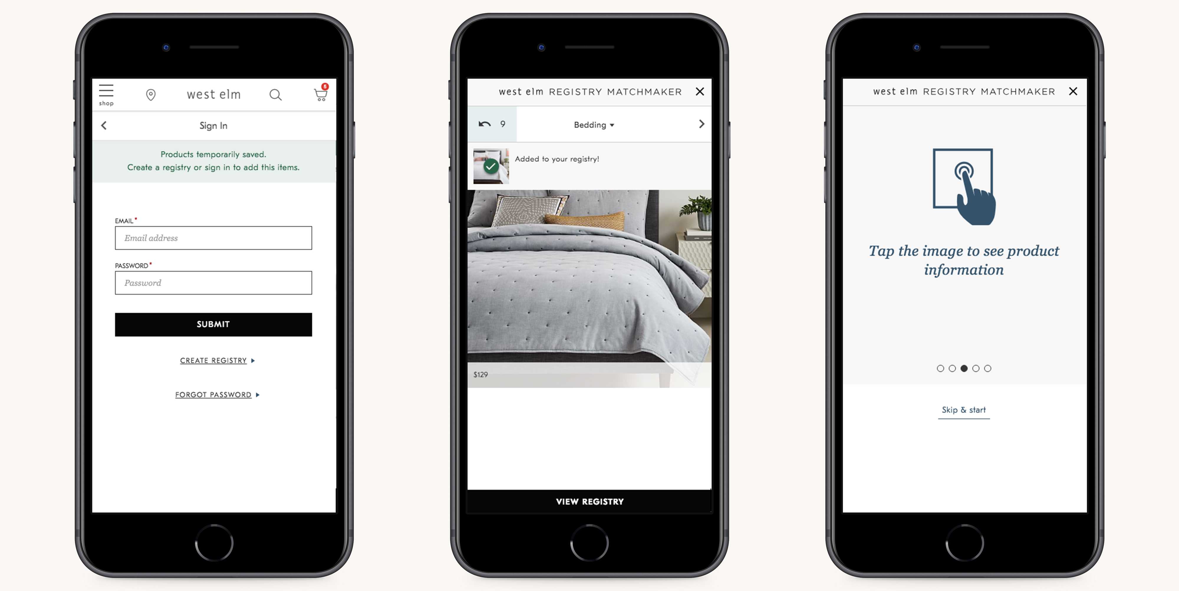
One of our priorities of this project was to allow customers to start a registry and view the West Elm product assortment quickly and easily. We hypothesized that if we rushed them too quickly into a sign up / form for a registry, then they’d be more likely to abandon the registry.
So we decided to allow customers to begin “adding” items to a nonexistent registry for a limited amount of item additions. After that limit is reached we prompt them to sign in / sign up / create a registry.
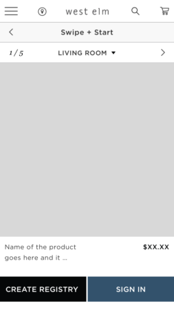

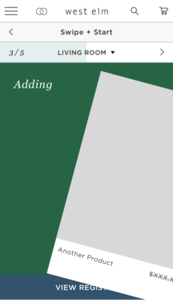
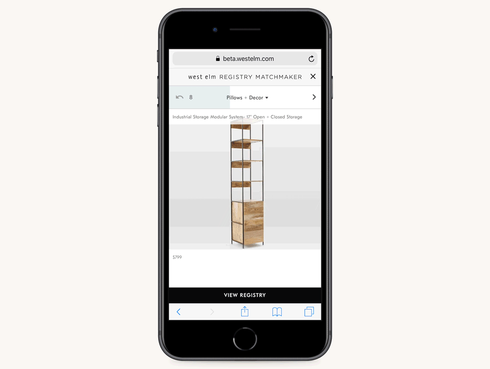
Adding an item to registry 
Confirming an item is added, even when the user isn’t signed in. 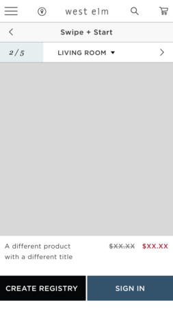
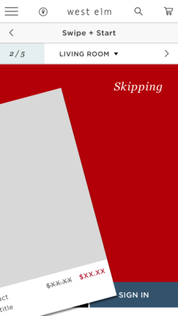
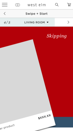
Customer skips an item 
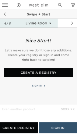
At a certain point, we prompt a user to sign in. 
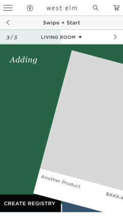
Once they have a registry and are signed in, we detail it in the confirmation.
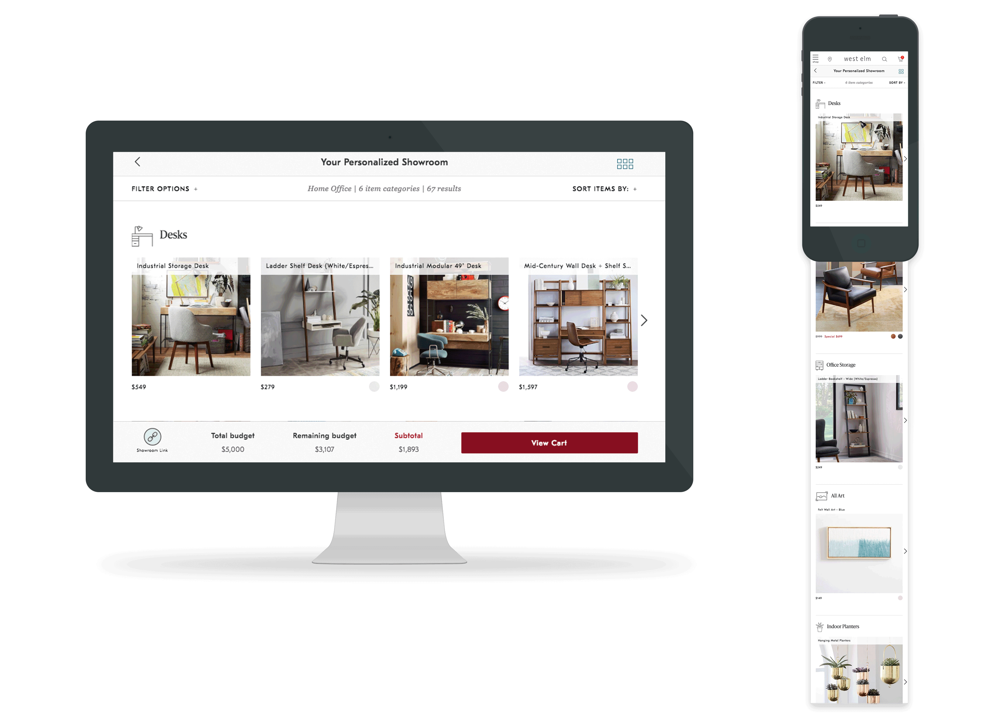
Existing User
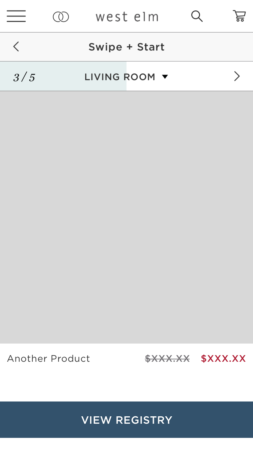
For customers who are returning or already have an account or registry, they are able to jump into the experience and add items without interruption.
Our biggest drive for these individuals is to make sure they are able to find the other categories, see the full West Elm assortment. After a certain number of products added from a single category is reached, we prompt the user to see if they’d like to jump to a different category.
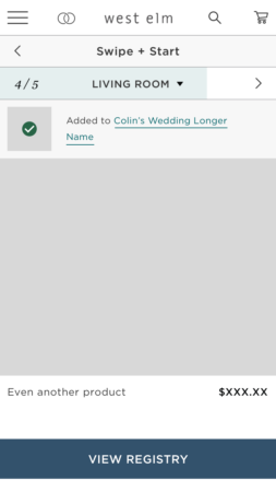
Existing users see their registry link displayed in the confirmation 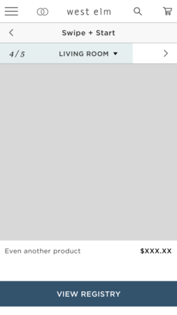
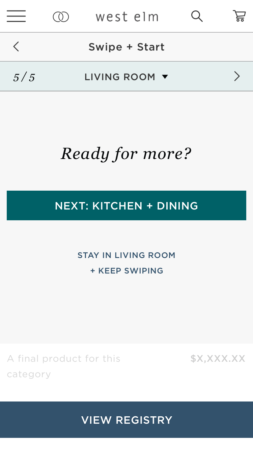
Customers are prompted into different categories once they’ve added a certain amount of items from one.
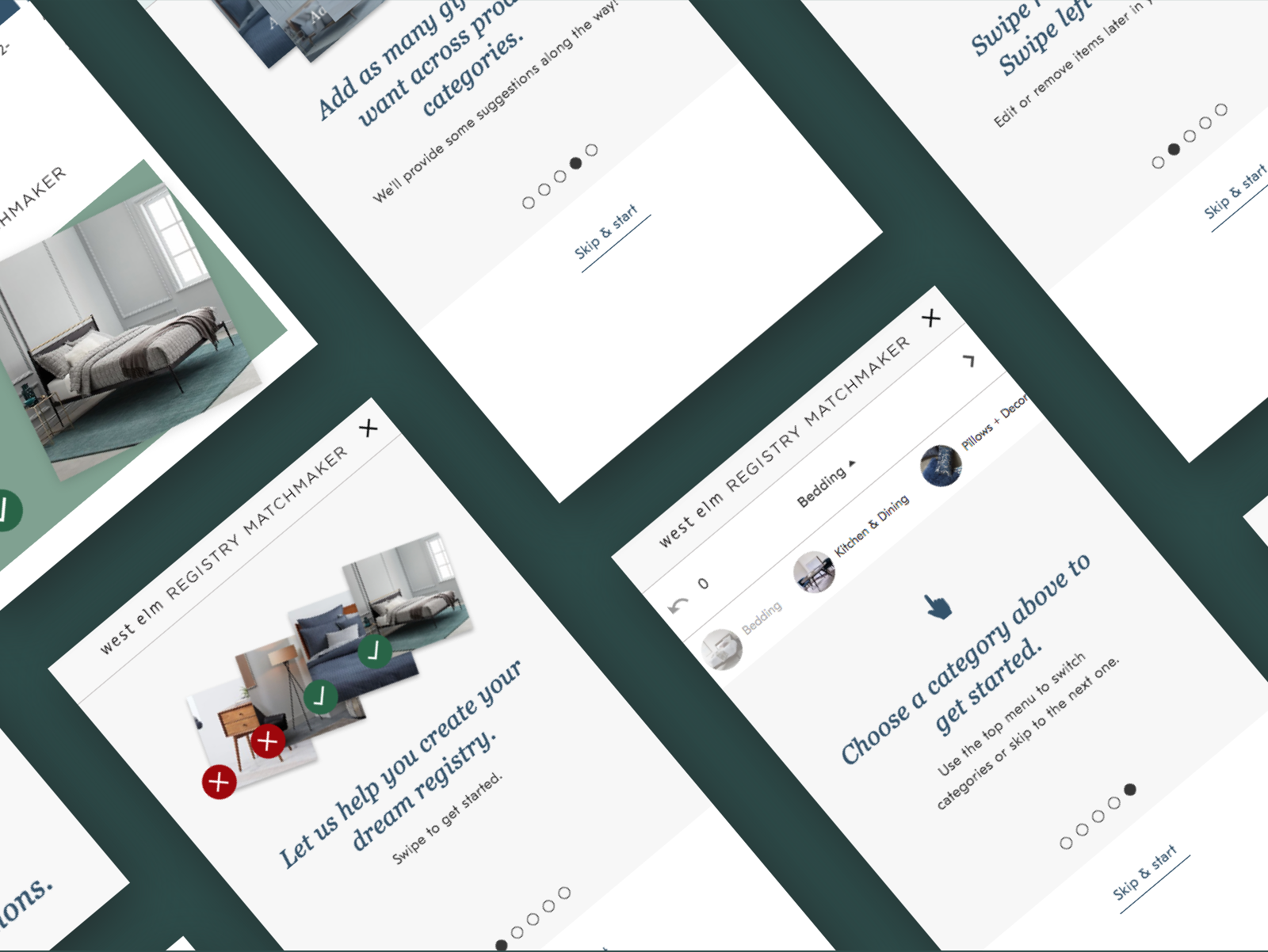
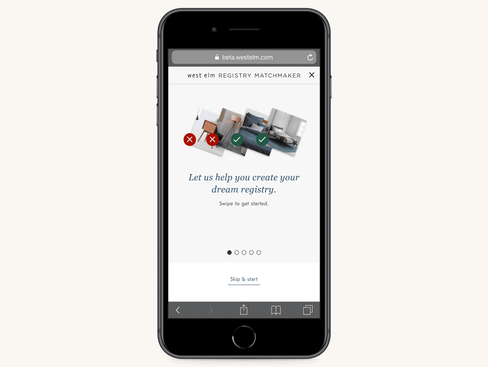
On Boarding
As with any new feature or tool, there is always a need for a quick introduction into the features options and interface. You can see the prototype of the on-boarding process for Registry Matchmaker here.
Testing
Our product owner, Colin, ran a qualitative study to get customer feedback, identify pain points and areas of opportunity within the experience.
Initial Perceptions
At face-value of the experience, we noticed a lack of understanding of what the tool in the end was trying to give the customer. Many people believed it was a style quiz that would help recommend products in the end.
“It’s called Matchmaker, so [I think it’s] a little quiz that helps you figure out what your style is and what things would look good in your house.”
A user in the unmoderated study referring to the name prior to using the tool
Usability + Understanding
In addition, we asked customer to tell us how useful the tool was at different moments. Once right after they experienced the on-boarding and then again after they used the tool.

After on-boarding 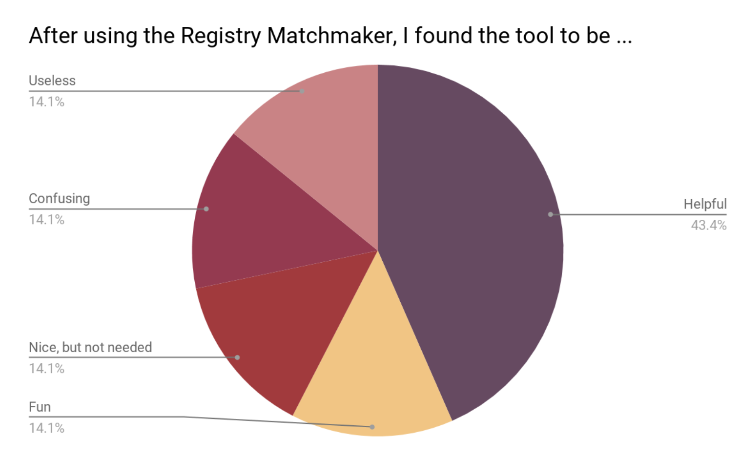
After using the tool
While it is extremely encouraging to see that after using Registry Matchmaker, people found the feature more helpful, it’s concerning to see a growth in the more negative answers after the experience as well (ie, “useless”, “nice but not needed”, “confusing”).
These feelings seem to be tied to a few different pain points that customers mentioned in the study:
Customers want to be able to see product information
Over half of the participants mentioned wanting to know more about a product before going so far as to add it to their registry.
Customers didn’t trust that an item was saved
“I feel that it’s safer because there have been times on websites in the past where I have added products…then came back to find that the items were no longer in the cart or favorites because it got deleted from cookies or cache.”
A user in the unmoderated study referring to their lack of trust in the “saved” product
The feature in the original design comps that shows a confirmation banner was de-scoped initially because of level of effort. After multiple users mentioned their lack of trust in the positive swiping action, we prioritized this feature and the confirmation was added.
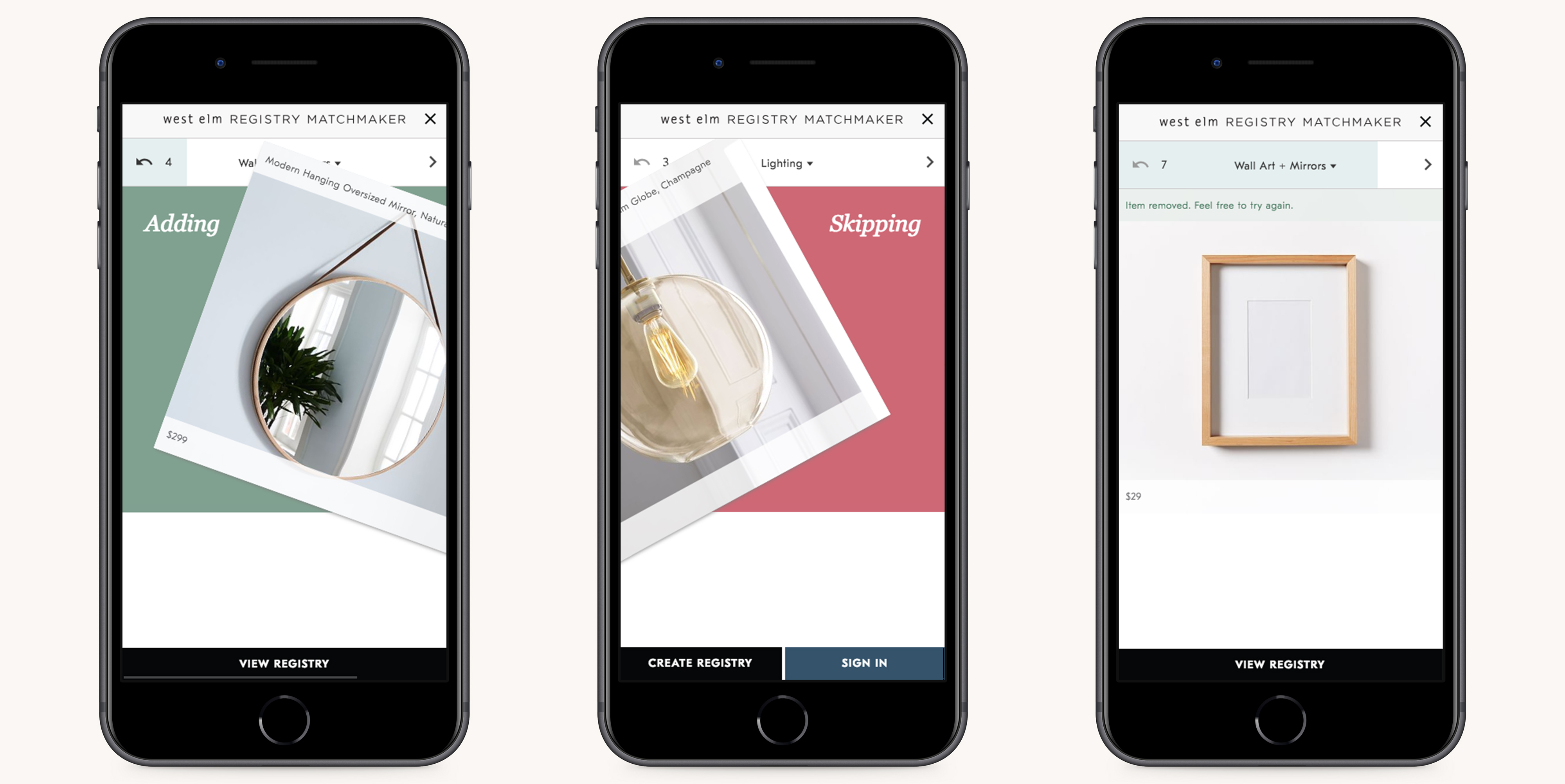
Customers also mentioned how they wish after swiping left or right on some of the options that they wish they could take it back. It clearly left some of them feeling like the tool didn’t work for them in it’s rigidity.
Pivots + Recommended Iterations
After the presentation of the study and analysis, the team prioritized the following features to be added into the experience:
- Allowing customers to see product information by tapping on a product image.
- Adding an undo button that reverses the most recent action.
- Adding and emphasizing the success state of an added product.
Registry Matchmaker Experience
On-Boarding
Adding, Declining + Undoing Items

Categories + Assortment


In the end, we created a fun and helpful tool that allows customers to:
- create a robust registry list more quickly and efficiently
- learn about and see more of West Elm’s product assortment
- get served more personalized product options based on their preferences
You can try Registry Matchmaker on your phone today!
Questions?
Do you have any questions regarding this project? Feel free to reach out and contact me.