Design in the everyday: Title Sequences
Visual design is such a broad spectrum across today’s media. We experience some form of design almost instantly upon waking up each morning and continually get bombarded until we close our eyes to sleep at night. With that amount of design exposure it’s easy to become immune to really taking the time to notice good design when it’s in front of you. This new series, Design in the everyday, is my effort to take the time to actually process and discuss the design I admire and aspire towards in my own work.
Television shows have become such a large part of how we relate to the people around us. My generation constantly uses animated gifs, quotes, and goes to conventions based on their favorite shows. As an avid reader, I am drawn to shows that emphasize character development, clearly have a pre-planned story arc, and are visually stimulating.
One of the firsts aspects of visual design an audience is exposed to in a show is their opening credits. Sometimes the credits are quick and to the point: one title card, styled on-brand and done. I don’t mind those at all – as an avid Supernatural fan, that’s all I want. Sometimes you see shows do this in order to allow for a longer episode – I’m all for that.
But other times, shows use their opening credits as a way of setting the tone; deepening the audience’s experience by steeping them into the thematic architecture of the show-world. When the design of these title sequences is executed well it makes the television show everything I expect when I see a play or read a book – complete emersion into the world I’m seeing. Below I’ve listed several of my favorite title sequence designs as well as a description of why I think it’s successful.
Sherlock
By: Peter Anderson Studio
The BBC’s Sherlock is a modern day interpretation of Sir Arthur Conan Doyle’s classic, Sherlock Holmes. What does that mean exactly? Well, Sherlock does carry his signature tool a magnifying glass, but in this version you’ll more often than not see him using a microscope.
color scheme: Sherlock

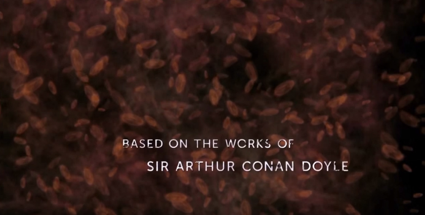
The title sequence for this show draws you in with layers of scientific references, London cityscapes, gritty textures, and traditional Sherlock iconography: the well-known magnifying glass, clues and the tools he uses to solve his cases.
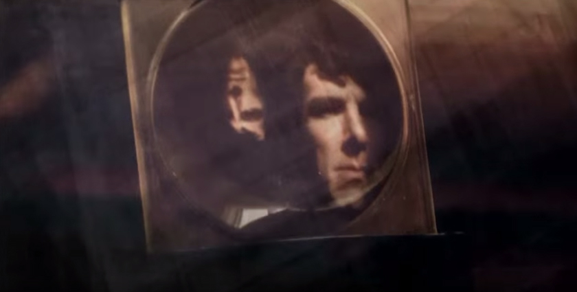
But there’s a twist to every image shown in this sequence. The magnifying glass is shown with two reflections of Sherlock’s face, indicating a duality of character that our unlikely hero battles with constantly. One aspect of Sherlock’s character that gets underplayed or worse sensationalized is the fact that he is an addict (both an addict to solving the unsolvable, as well as a number of drugs). Not only that but he constantly rides the line between hero and adrenaline junky – a “high-functioning sociopath” in his own words.
The color scheme is based in earthy, dark colors that seem to reference old worn books, or the colors of London streets in rain. The constant deep focus and shifting focus of the frames reference Sherlock’s ability to deduce a crime scene in seconds.
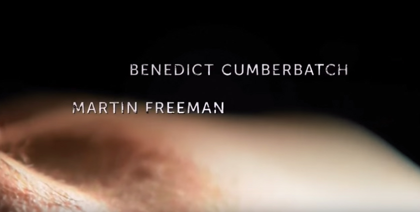
The stark-spaced, uppercase sans-serif shows indications of decomposition as if to reference the dead bodies that usually catalyst Sherlock’s cases. Or perhaps a destructive treatment to the sans-serif is a blending of old and new: old – the worn treatment of the letters, new – the modern, thin serif-free typeface. Either way it makes for a dramatic entrance into Sherlock’s modern-day London.
Blindspot
By Johnny Wong
Blindspot is a new show that describes the story of a mysterious woman who’s found left in a duffle bag, naked in the middle of time square, her entire body completely covered in tattoos that are filled with clues relating to crimes and injustices that have yet to be revealed. While it’s admittedly not the strongest written show on this list, I find the title sequence to be quite elegantly accomplished with an intention of purpose I enjoy.
COLOR SCHEME: Blindspot

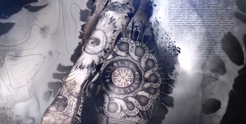
It’s a quick intro that displays the many variations and interpretations of “Jane”‘s tattoos. The animation uses the motion of ink soaking across paper while overlays of the tattoos fade in and out. The use of ink is an obvious reference to ink used in tattoos, but the ink spreading also seems to reference Rorschach tests. The Rorschach tests are known as “inkblot tests” and are used by psychologists to detect underlying personality and emotional information:
Some psychologists use this test to examine a person’s personality characteristics and emotional functioning. It has been employed to detect underlying thought disorder, especially in cases where patients are reluctant to describe their thinking processes openly. – Wikipedia
Jane, the main protagonist, is required to see a psychologist as she has no memories and even in one episode is subject to a Rorschach test.
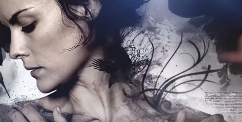
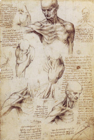
From an execution standpoint, I think one of my favorite aspects is that the designer seemed to draw from the sketchbook pages of Leonardo Da Vinci. Da Vinci used his sketchbooks as a journal for personal wonderings which ranged from scientific to religious. The mix of writings and illustration throughout Jane’s tattoos and present throughout these title sequences are consistent with the way Da Vinci would combine both paragraphs of text and imagery together:
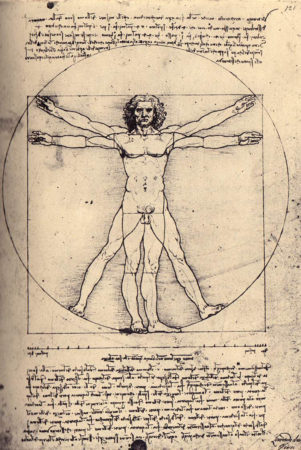
And it’s hard not to notice the allusion to the vitruvian man, the famous sketch of a man in space, mixed with the symmetry of the Rorschach inkblot tests:
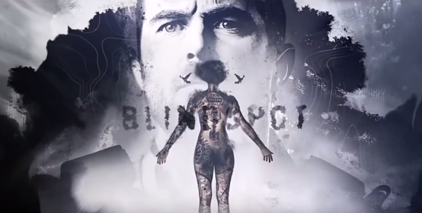 Da Vinci’s work is often used in popular media and believed by some historians to be deeply filled with codes, conspiracies and he even wrote in mirror writing. The whole premise of the show, Blindspot, is to decode these various riddles and codes across Jane’s body, so the tie in design-wise to Da Vinci is an extremely rich reference.
Stranger Things
by imaginary forces
It would be extremely difficult to write a post about TV title sequence design and not mention Stranger Things. The recent Netflix sensation is a period drama, horror/thriller set in the 1980s in the American Midwest. While the title sequence isn’t full of imagery and fast paced visuals like other shows on this list, what it does with motion, typography and an excellent music selection sets the eerie tone and bold personality of the show.
Color Scheme: Stranger Things

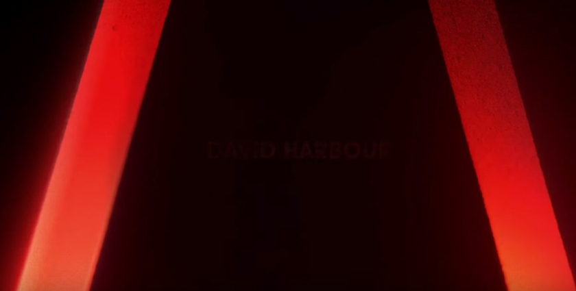
The design for this entire production is flawless in my opinion. In fact, the only design flaw I can pinpoint is that it’s so well done – the quality of production just isn’t something they could deliver in the 1980s. But aside from that fact, the show designers do an incredible job of making you know exactly how it looked and felt to live in the 1980s.
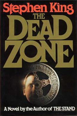
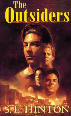
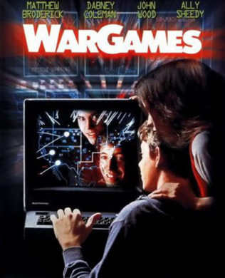
Beyond just the title sequence, but starting with the title sequence you get pulled back to the design of books written in that era on the same vein with Stranger Things. For example, anything written by Stephen King, The typography and illustration (more related to the Stranger Things poster), and War Games as it relates to the type treatment.
The stark typography grows on a dark background with a growing swell of music, which most closely resembles the LOST title sequence. Both LOST and Stranger Things have a great deal of mystery and monsters in common, so the inspiration doesn’t seem unintentional.
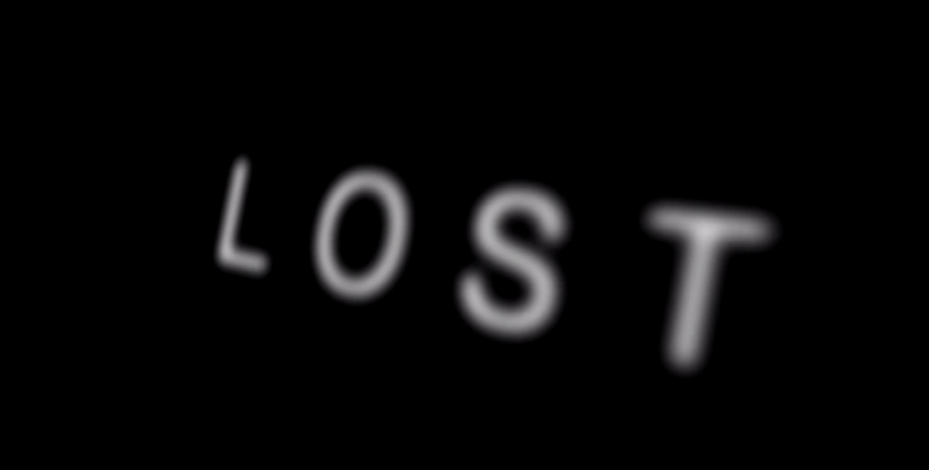
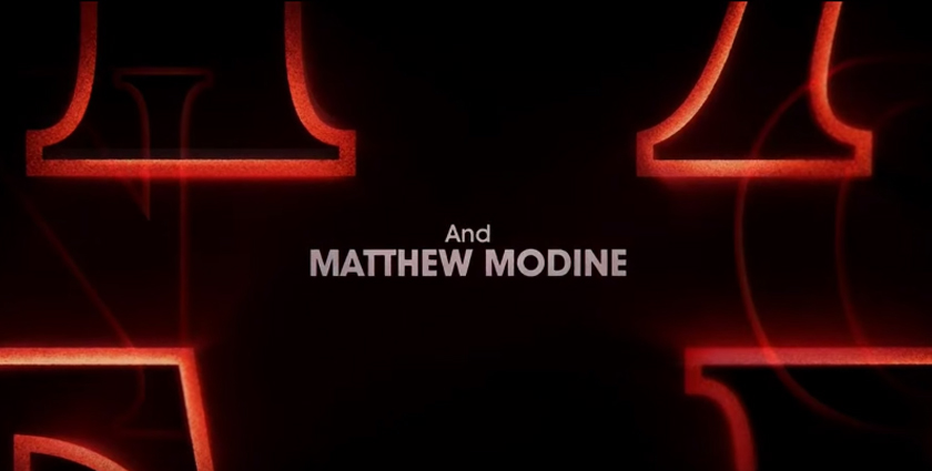
The difference from LOST’s sequence is in the motion. Towards the end of the Stranger Things sequence you realize the growing type and different angles of letters and their negative space coalesce into their final and completed type forms.
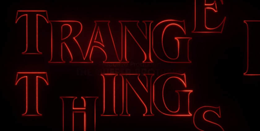
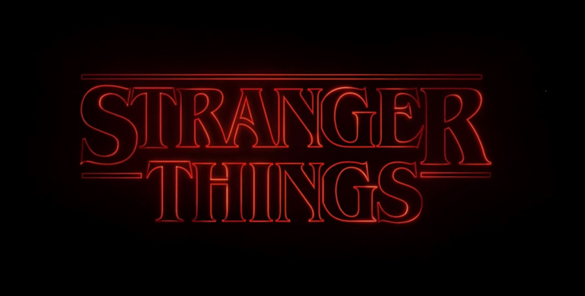
Overall, the designers found a subtle and era appropriate way to introduce the audience to a world they aren’t used to – one without fancy overlays of photographic imagery, one where if you wanted to call someone you needed to know where they were before you could talk to them. Nothing more scary than no cell service, am I right?
Fringe
by Andrew Kramer
Uniting philosophy, science fiction, horror and romance, Fringe may be my favorite show I’ve ever watched. Not only is the design of the show exquisite, the plot (especially the first season) is one of the most intentional and well executed I’ve ever seen. Ok now that I’ve finished my hero worship of the great J.J. Abrams, let’s move onto why the title sequence is excellent.
color scheme: fringe

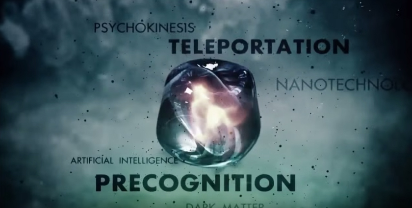
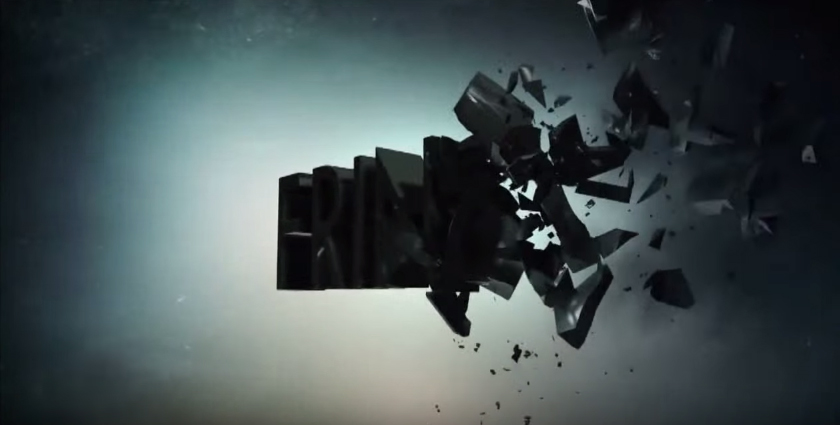
The design for the Fringe title sequence combines several things to communicate what “universe” you’re entering, but the designer uses several different tools to communicate this to the audience. First off is typography. Fringe is one of the only title sequences I’ve seen that utilizes maybe every font available in a single typeface. This isn’t common practice, you’ll usually see two — three maximum — but this is done to provide visual variance and hierarchy.
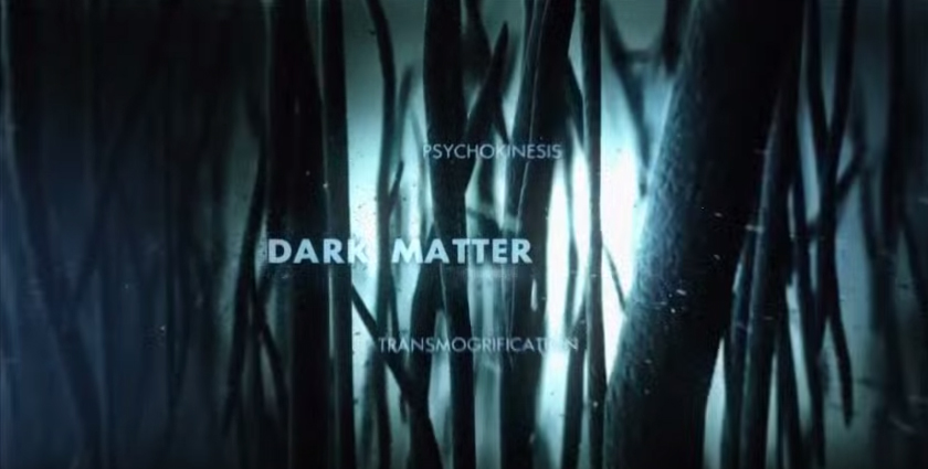
Second is the colors used, which are the typical green and dark blues common to sci-fi shows. The motion and texture combination is the third and most resonant aspect of the design (in my opinion), each frame moves from one textured frame to the next only to end with the title being created from some kind of matter. This title generation mimics almost perfectly the way the twilight zone would begin their show:
Fringe draws many parallels to the Twilight show, being a show meant to honor and highlight the unexplainable, the cases unsolved, and the unexplored ideas. The allusion to the Twilight Zone is well executed and pays homage without losing it’s Fringe-branded style.
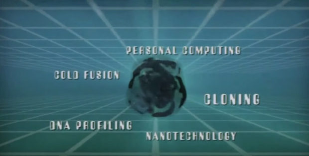
As a bonus, the show would change their opening credits based on the content of the episode. They would do this every time they were in an alternate universe, or the future, or a musical noir episode. But perhaps my favorite design change was when they did a throw-back episode to the 1980s where they featured the catalyst moment for the entire show. In order to bring the audience into this slightly altered version of the show – they updated the title sequence accordingly and like Stranger Things, did an excellent job:
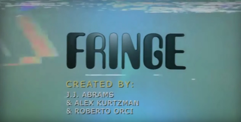
The VHS visual grain might be my favorite part of this version. But I love the updated typeface, the era appropriate computer imagery, but still keeping the visual references the same.
While not what most people would call traditionally design suave, I think the level of design intention and tie-ins with the shows thesis are epically done and worth noting.
Chuck
by imaginary forces
And now for something completely different. Chuck was a show that you wouldn’t necessarily expect to have an exceptional design title sequence being a spy-meets-comedy show, but Imaginary Forces is back with another incredible solution.
color scheme: chuck

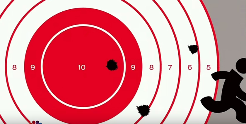
Chuck, a computer “nerd herder” technician by day, is an unwilling CIA/NSA asset after his mind “downloads” a coded message containing all of the government’s secret data which throws him into the life of a spy.
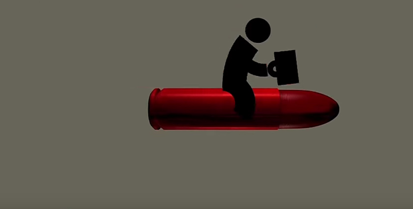
Drawing on the iconography of old spy movies and combining it with the generic imagery inherent in corporate computer commerce, you get one of my favorite title sequences. Keeping the color palette limited to reds, greys, blacks and white is a direct reference to old spy movies – the shot above being an homage to the James Bond famous title sequence:
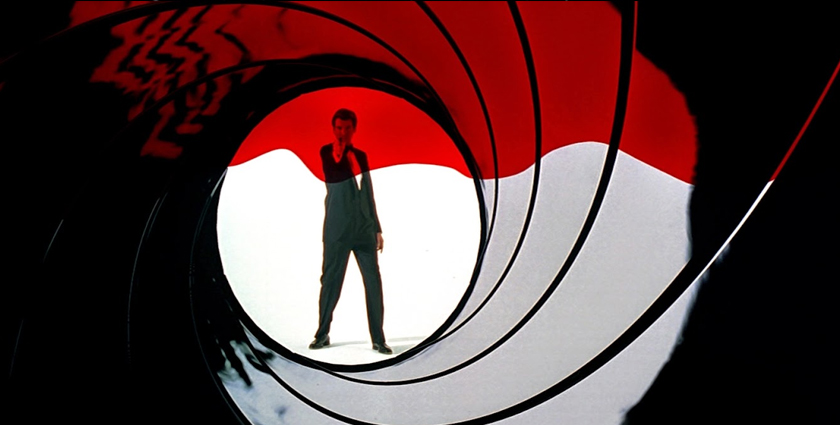
Definitely not the only reference, though. Chucks entire title sequence is an homage to all the James Bond movie introductions. But the designers use the default icon of “man” (most commonly found on restroom doors) to replace the epic hero and play with shapes and repetitive patterns to communicate patterns and movement.
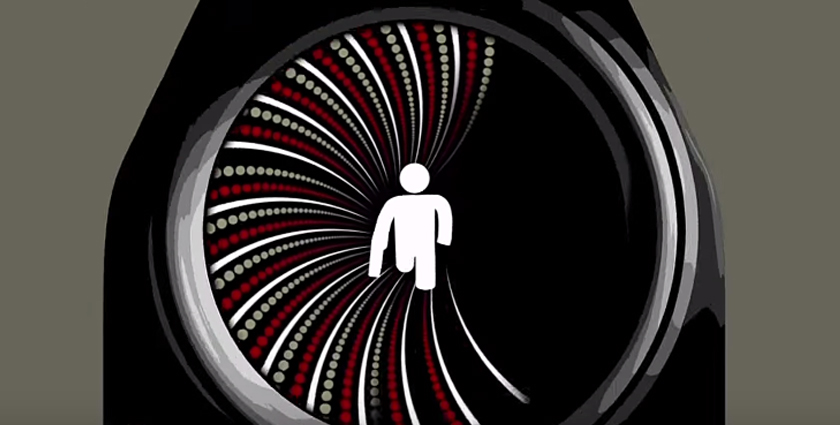
The best part of this title sequence is the humor the designers play into when they take iconic James Bond imagery and mimic it in their own Chuck-way.
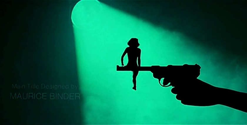
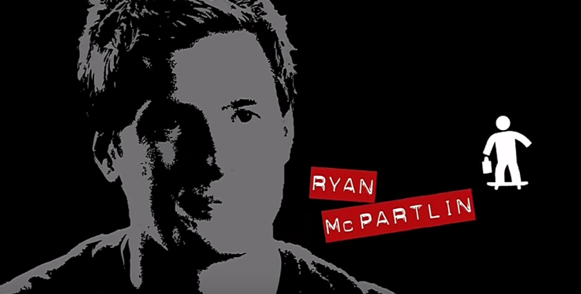
The sequence utilizes different typefaces for different type applications. The actor’s names use a typeface that directly relates to generic commerce price markings. The show constantly juxtaposes Chuck’s mundane day-job with his secret spy identity and the title sequence does a great job of playing off that idea while adding the appropriate humor that runs through the entire show.
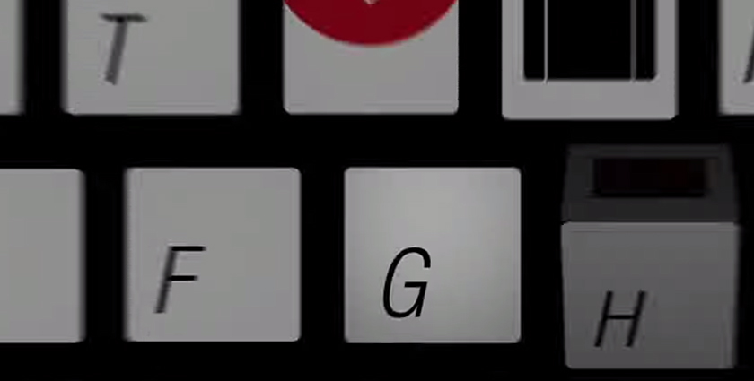
The ending shots display a keyboard with flipping keys, but end visually as a simple computer which leads the audience of every show into the day-job half of Chuck’s life.
It’s pretty risky to have an “animated” introduction to a show that isn’t animated, but when you draw on the show’s themes and allude to the past – or more aptly to inspirations for the show you develop a cohesive concept that can become a solid design.
jessica Jones
by imaginary forces
When I brainstormed this post I had no idea Imaginary Forces was behind so many of my favorite title sequences, but they are doing an incredible job. My final featured title sequence favorite belongs to Marvel & Netflix’s Jessica Jones. A mix of comic book, film noir, feminism, and psychological horror, Jessica Jones is an incredibly dense show. How do you create a title sequence that draws the audience into a world based around a character who is more closed off than Fort Knox? Why, you show the audience the city through her eyes.
color scheme: jessica jones

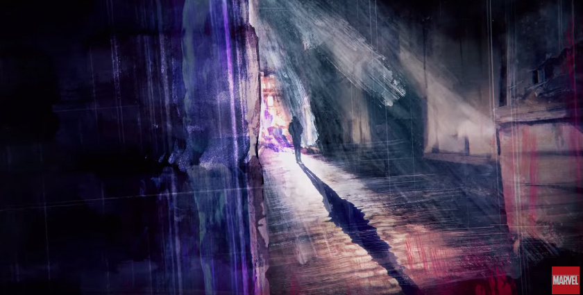
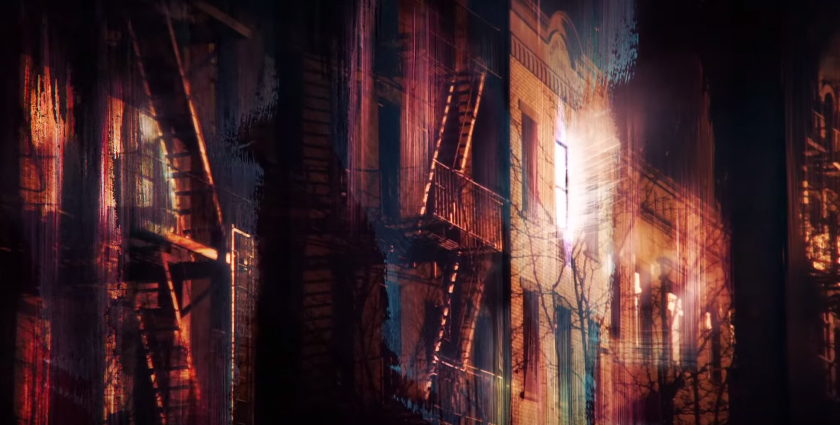
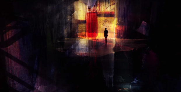
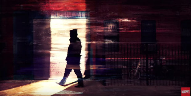
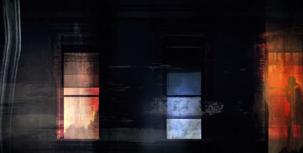
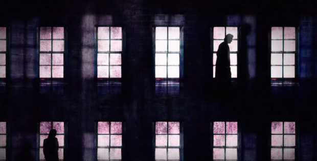
The title sequence is introduced in moving paintings of city scenes, but they’re all extremely cinematic filled with views around corners of silhouetted figures. The use of the brush strokes is a different treatment than usual and the saturated colors of pinks and orange are distinctly feminine, perhaps hinting that the perspective is a womans. But alternatively while these colors are feminine and bright the majority of all the frames are surrounded in darkness which implies a more dramatic perspective.
The continual use of silhouettes, especially throughout smoky city scenes also refers to the film-noir aspect of the story.
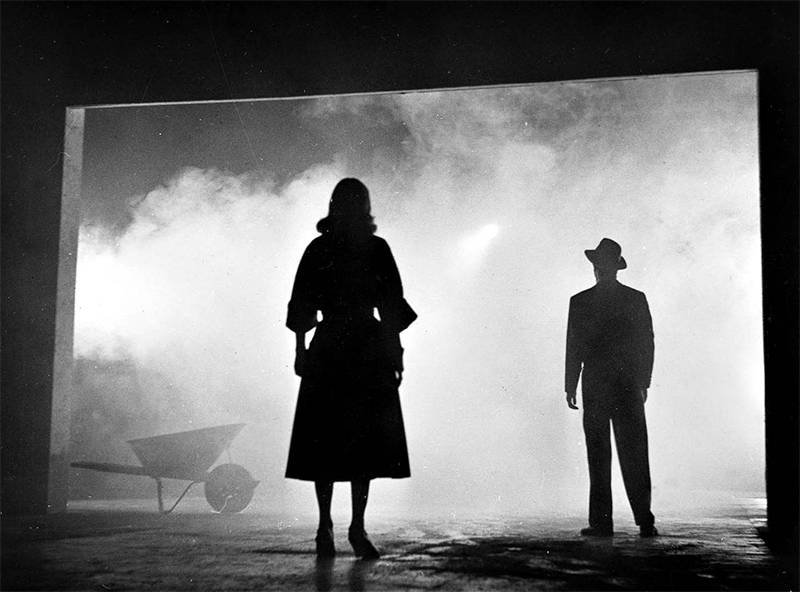
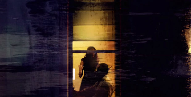
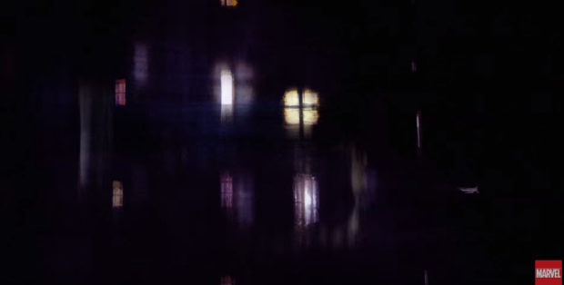
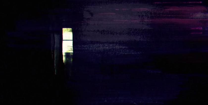
But perhaps the most important iconography of this title sequence is the use of windows to color the personality of the city, but also and perhaps more importantly expose you to an aspect of Jessica Jones psyche. She’s a private detective with demons and super powers. But she’s first-and-foremost a private eye, so what does she do? She watches people’s lives unfold through their windows with a camera on hand.
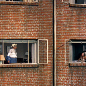
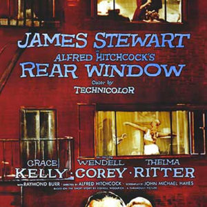
The windows are the most interesting part of the title sequence, in my opinion. They’re rich in color and texture, expressive in the stories not told, but implied and the framing seems to draw upon one of my favorite Hitchcock movies. It’s hard not to see allusion to Hitchcock’s Rear Window in these cityscapes.
Both are stories of people interfering in the lives of strangers, with mixed results, to say the least. In the end, the iconography of the windows slowly becomes the eyes of Jessica Jones, closing the sequence’s mystery as to who is seeing all these scenes.
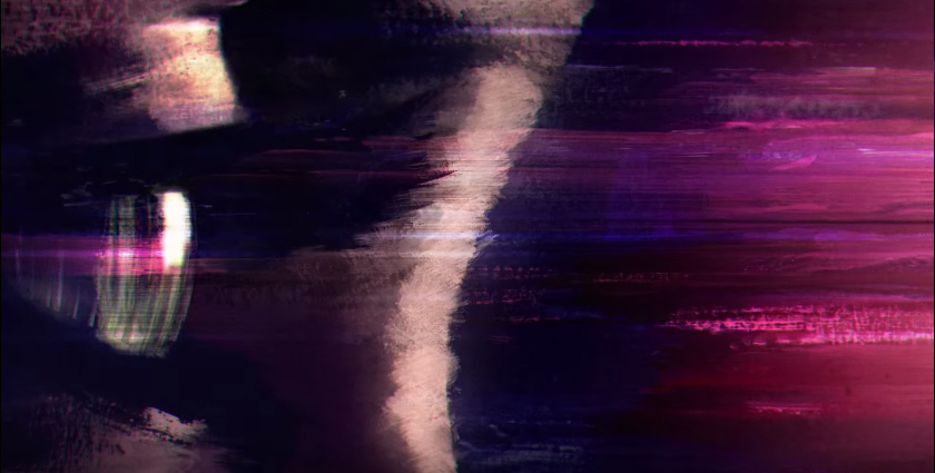
The layers and layers of paint, dense and colorful, but dark all seem to describe Jones’ character to a tee. Combined with all the images directed as if by her own eye, introduce the audience to a private detective who watches life from the outside; an outsider in her own right.
Learn more about the designer’s process and inspiration on Art of the Title.
Title sequences shouldn’t just be a way to introduce the cast of actors, they should introduce the world the audience is about to enter. After exploring these design solutions one thing is extremely clear: title sequences that build on the designs and artistic references of the past are usually the most rich and interesting in the end.
What are your favorite TV show title sequences?
