Meet Green Philly Blog ⇥ Part Two
With Green Philly Blog’s new brand aesthetic decided in the identity phase, we marched onward toward the design of the site. Before worrying about any part of the actual look of the site, I reiterated the goals from the beginning of the project: Making Green Philly more accessible to everyone. In order to meet that end I knew I’d focus on three major strategies while designing the layout of this site:
- Making the site fully responsive.
- Giving social media icons a high visibility as often as possible
- Making articles as clickable and simple to access as possible
A Website to Reach them All
But before I counted my chickens, I needed to know which eggs to focus on. The first part of this process is to determine what information I will design and develop for specifically.
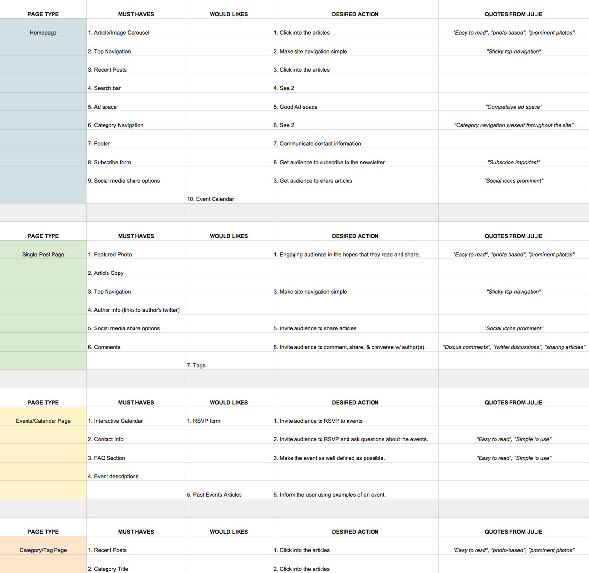
Information Design Form
I had Julie pick the five pages she primarily wanted to develop and in those she was to assign goals to each page. For example, the homepage’s primary desireable action would be for the user to click into an article and the secondary action would be to make site navigation simpler. It’s only with this information that I can then know what aspects of a page need to be visually highlighted, featured, or pushed back.
Moving forward from here we established what visual components were essential to each specific page, in addition to what user experience would be desired on each of those pages. This also helps with knowing which plugins to start researching and also what to style into the site. Once the informational design goals were identified it was time to move onto style tiling.
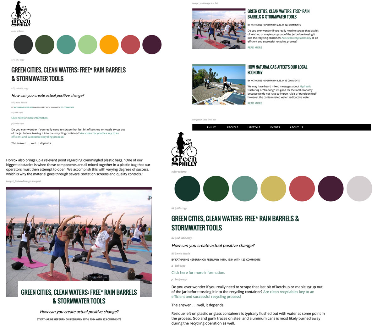
Green Philly Blog Initial Style Tiles
Style tiles are meant to be a way to show a client design suggestions without designing a fully laid out web page. To that end, they usually consist of elements you’ll see in a final design with little regard to layout: color, texture, typography, photographic treatment, icons, etc.
I prefer to display my style tiles almost like a style guide to get a removed-from-content opinion from the client. By keeping it online – Julie is able to see what my styling will look like in the end, but by not designing it fully she can still have room for edits. I’ve found this to be a flexible and extremely helpful way to get feedback regarding initial and early-stage design mocks.
Once the styles are firmly approved and confirmed by Julie, I mocked out the pages with the chosen styles, added edits and adjusted the design where necessary. Once the mocks were approved I began the development of the child theme.
Choosing a parent theme took some time, but we eventually landed on the Caps theme. Several considerations go into the successful choosing of a parent theme. For starters, Caps is a fully responsive, magazine parent theme with several features that Julie had requested initially: carousel, feature images a priority for each post, social icons, drop down navigations with image capabilities, etc. In addition to that they have an excellent support record and are able to answer any and all questions very quickly and thoroughly.
After that, all it took was time to develop the child theme, get it to testing and soft launch and then finally once all errors are fixed, we launch the site early this year.
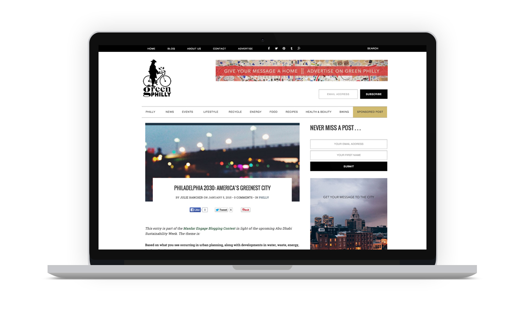
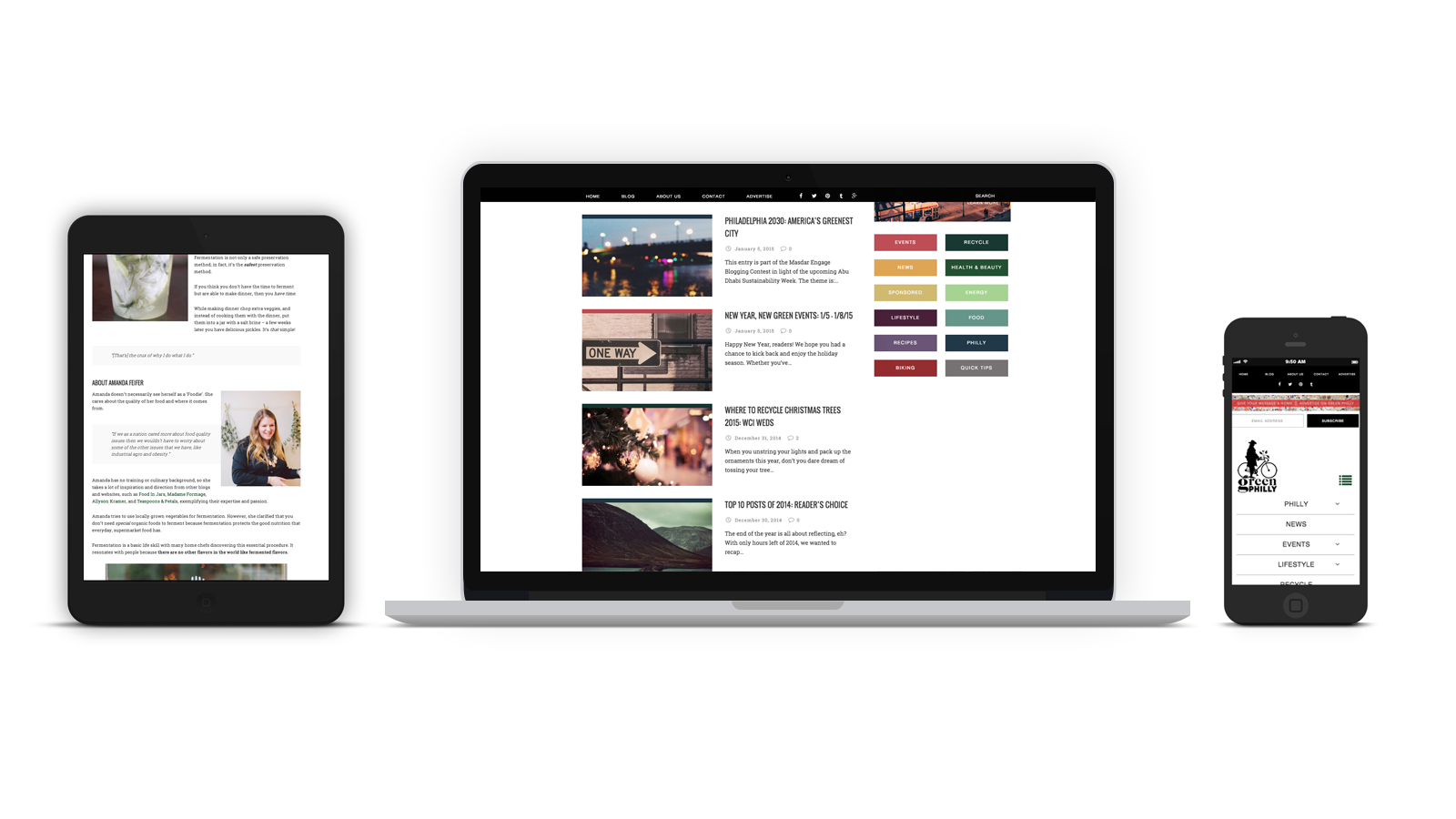
The most important part of any web design is the consideration you have for the site’s user. To that end, I focused on trying to make every view – no matter what device – easy to read, easy to share, and enjoyable to browse.
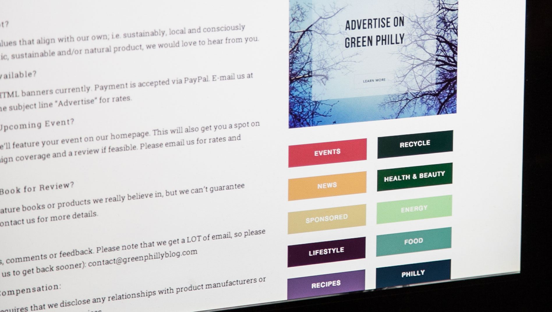
The site’s structure is a stark contrast of black and white in order to frame the very colorful categorical organization of posts. Each category has it’s own color – as you see in the sidebar, and that color also follows that category through all it’s posts and archive pages. A constant reader of Green Philly Blog will eventually learn that food articles are turquoise and biking, under red.
Once a user has clicked into an article, they are immediately focused on the feature image and served sharing links at the top of the article as well as at the bottom, in order to double the chances of sharing.
Green Philly Blog’s new site is now fully responsive, more accessible through improved SEO and increased shareability across social media, and now puts a greater emphasis on headlines and feature images.
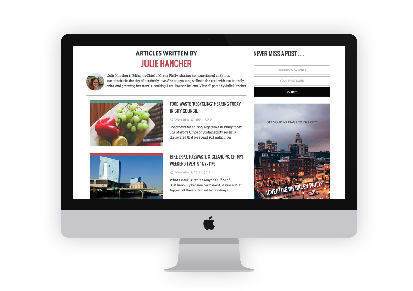
Desktop View: All posts by Julie
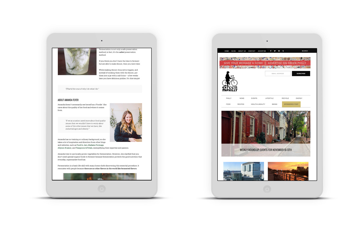
Tablet View: Single Post
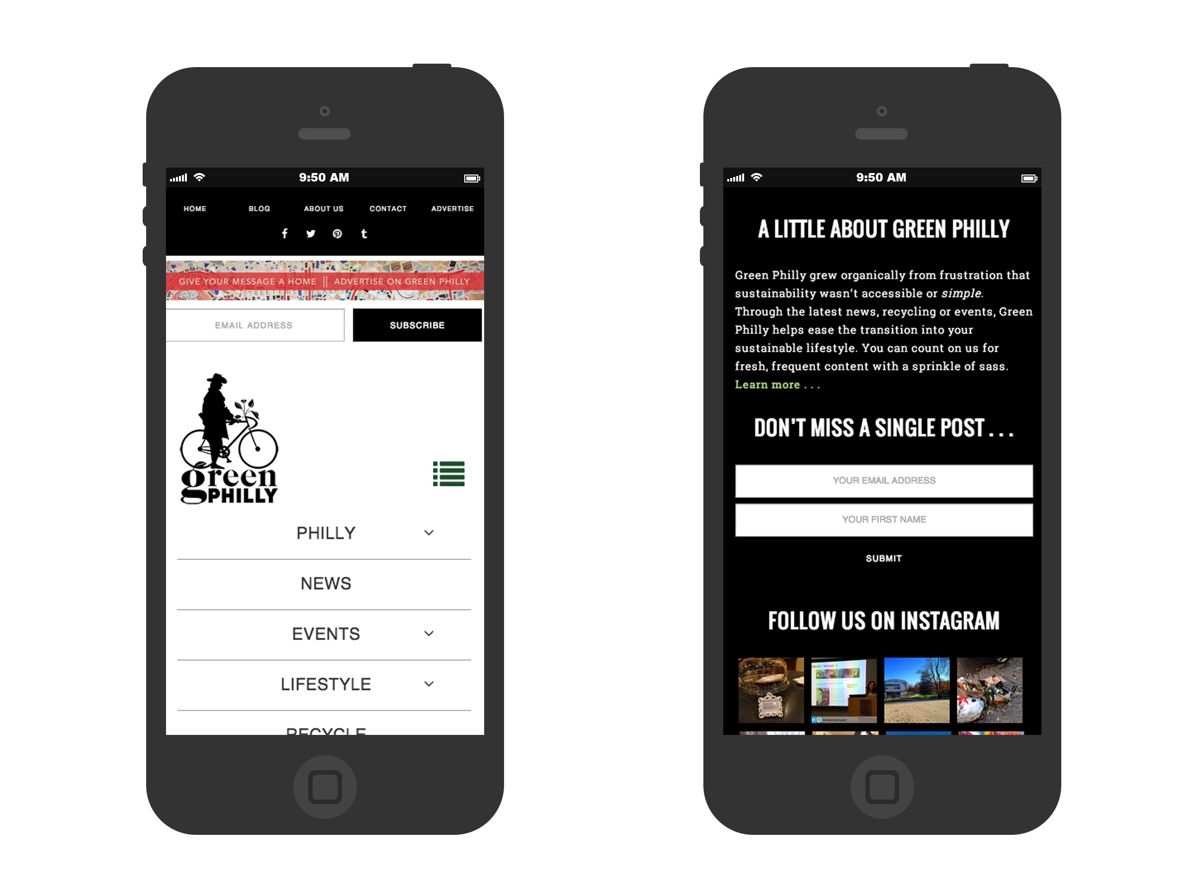
Mobile View: Navigation + Footer
Final thoughts
Working on a site that holds 8 years worth of content was an incredibly rewarding challenge. How do you take the old content and style it to work with the design of the new and optimized content? The key was in the information design and in the end that was the most fufilling part of designing this site. Taking years worth of posts, slimming down the categories and tagging into more attractive SEO key words and then structuring navigation based on that. It was like playing a game of tetris or jenga – add the right piece here, but don’t crowd it or remove a piece there but don’t let the whole thing fall apart.
I’m extremely passionate about sustainable projects and felt incredibly honored to be the designer and developer for Green Philly’s rebranding and redesign. Julie is an inspiration to anyone with an idea and the strength to build something upon it. She took a blog that started out as a hobby between friends and has grown it into a vital resource for the Philadelphia community to share.