Meet Kristina Friedgen’s Redesign ⇥ Part One
Kristina Friedgen, a theatre artist from the DC/Metro area, came to me looking for a new logo and web design with the primary goal of promoting her acting coach business while also communicating her other continuing roles as a director, choreographer, teacher, and actor.
Kristina is a highly organized, methodical theatre professional and educator. She has worked in all levels of theatre and is able to bring to her students not just a healthy knowledge of her craft, but also a respect for the work they create. Being a private business, her most effective advertisement is word-of-mouth. To assist anyone looking to hire her as an acting coach, a new website with a new emphasis was needed. But first things first: the logo.
What Kristina and I agreed would serve her best would be a brand that felt established and professional while still being approachable and personal. She wanted a design that felt bold; theatrical but not a spectacle, a design with personalization, but not cluttered. Most importantly she wanted a design that was able to clearly define the different roles of her business, while still bringing them together under one brand.
Bit by bit, putting it together…

KRISTINA FRIEDGEN MOOD BOARDS | “BOLD”
When building a brand identity the most important part of the process is the client interview. For me this step involved interviewing Kristina and having her fill out the brand survey I send to all clients. I took those responses and searched for various visuals: textures, treatments, type, icons, etc that I felt reflected the descriptions she had outlined in her survey.
I created several mood boards, all themed very differently to a specific style that I felt she was describing. She narrowed these options down to two specific mood boards. One was the mood board I called “bold” which focused on bold colors, large, heavy-weight, sans-serif fonts, collaged elements, and color overlays. The next mood board was called, “story teller” and focused on more editorial-like type layouts with some geometric designs, a focus on type over photography and a more subtle pastel color scheme.
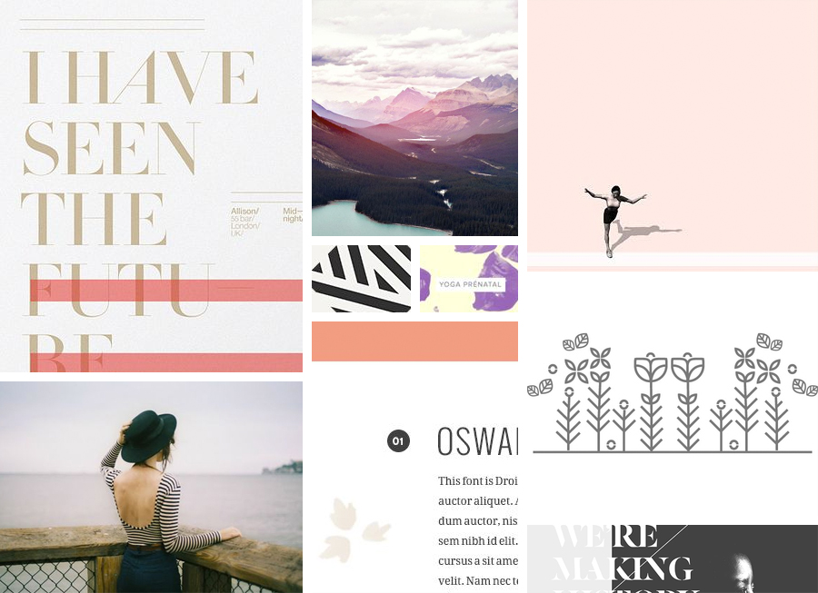
Kristina Friedgen MOOD BOARDS | “STORY TELLER”
When I give clients mood boards like these I ask them to go through and let me know what they’re drawn to and enjoy, that’s the easy part. But alternatively I also ask them to describe what they dislike from these boards and why. It’s easy to forget to ask your client what they dislike from the rounds of work you present, but I find this to be a crucial part of the design process. If I only know what the client likes, I’m working with an unbalanced set of tools.
Kristina explained that in the “bold” mood board she enjoyed the color scheme, type treatment, photography approach, and grid-structure layouts. In that same mood board, she commented that she didn’t like the flower photograph, or the number treatments in the mood board. When asked what she liked in the “story teller” mood board she said she liked the collage effect photograph design, the photographs with text over them, and the title and number treatments. She did not like the flower icon design treatment and the color scheme felt too “girlie”.
With this knowledge I was able to start narrowing down what direction she wanted her brand to go and now it was time for sketching.
Piece by piece
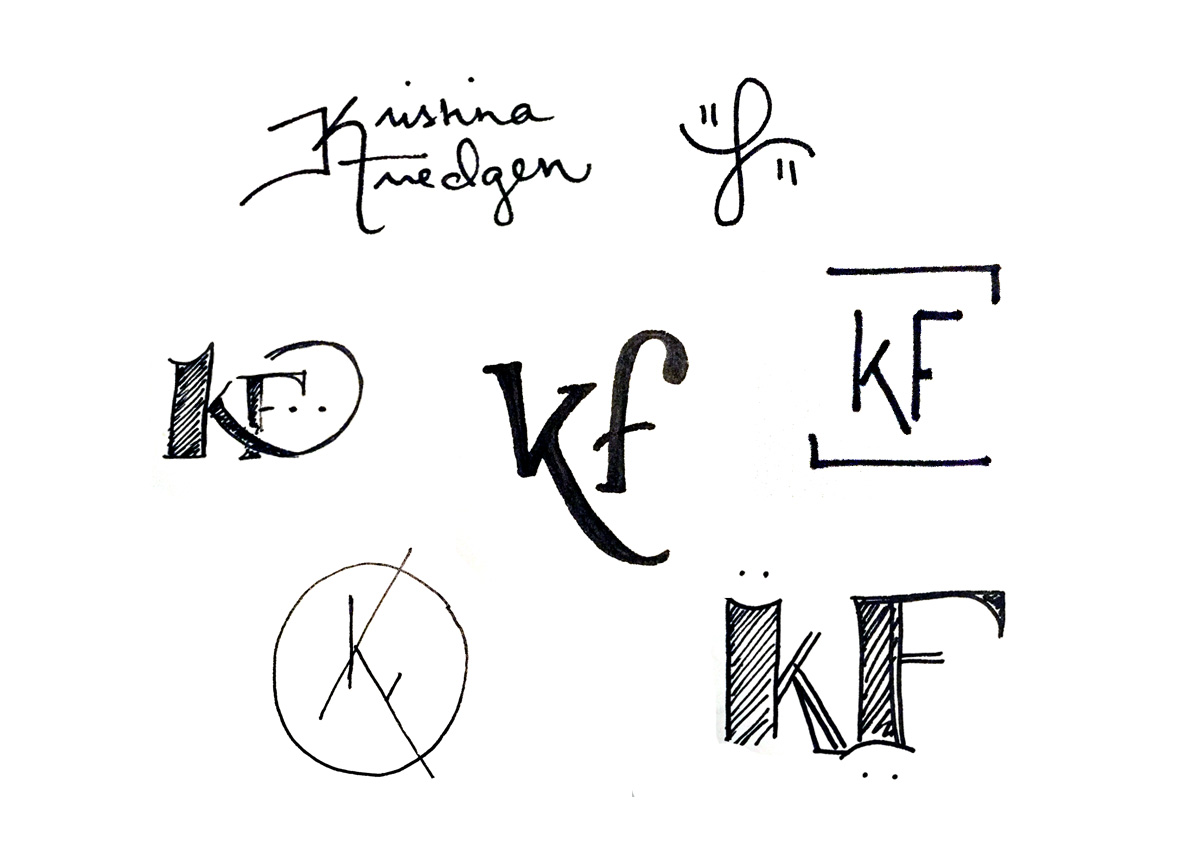
KRISTINA FRIEDGEN LOGO DESIGN | ROUND I
When we began the logo design process, Kristina was unsure if she wanted the logo to be just her initials or if she wanted it to be her full name. In that respect, I ended up trying several different variations including just her last initial, her two initials together, and her full name.
Working with a client on a logo design is never easy, it is always a growing pains process. You have to acknowledge that the client will sometimes have a fixed idea of what they want in their mind or they have absolutely no idea. Both are difficult ways to start. To make the conversation move more productively, I always begin a Pinterest board with my clients and tell them to pin any logos, icons, designs they feel match or appeal to what they’re looking for in a logo design.
Kristina’s board was full of professional theatre logos, and designs used in theatre that seemed to play on the idea of masks, or the physical stage and that is where I began my sketching. While Kristina was referencing several theatre companies, I was fully aware of the fact that a large theatre company would design a logo with very different aspects in mind compared to a private business like Kristina was building. With that in mind I began sketching with an emphasis on concepts like: personal, individual, theatre masks, the name as an icon; classic, stable and professional.
Every little detail plays a part
From that first round, Kristina narrowed in on the logos that had a professional feel while also “winking” at the audience with hints to theatre. For example, the KF and the cursive F with the eye dots/lines that referenced theatre mask expressions, but having the letters be lowercase as the uppercase felt too forceful. She challenged me to explore more options that brought more theatre iconography into play.
From that feedback, I began to explore the shape of the initials surrounded by theatre curtains. That felt a little cluttered to me. So, I decided to explore making the letters very clear with borders that referenced theatre iconography: a traditional greek stage layout, and a curtain and stage view. I then fleshed out the mask idea from the previous round by placing the eye dots above her initials. With all these theatre icons running amok, I decided to also make a conceptual mock that emphasized the human element of what she really does as a theatre professional: organize, direct, teach, etc. The hand placing the last piece of her name in place was meant to reference the human effort and directorial actions of her work.
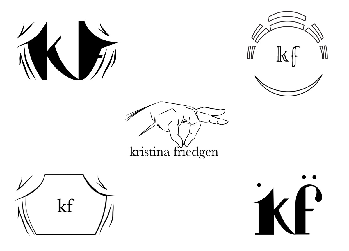
KRISTINA FRIEDGEN LOGO DESIGN | ROUND II
It was at this point when Kristina decided she wanted the logo to be her full name. She felt the initials didn’t establish her brand quickly enough and while she liked some of the concepts, none of them encapsulated all that she was trying to describe with her brand: Acting coach, Director, Actor, Choreographer, Educator, etc.
Having just the vision’s no solution
This was an important turning point in the design process because it immediately disposed of several concepts while introducing a whole new level of difficulty: How do I convey 5 different aspects of her work while not overwhelming the design? She still wanted icons to sit along-side her name, she just wasn’t sure about which icons.
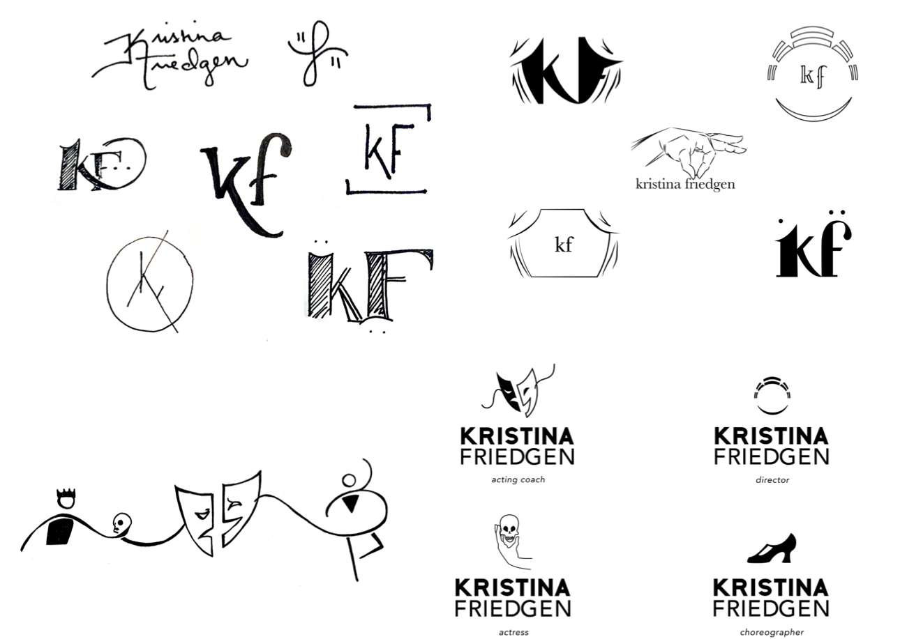
This is when I decided to break these concepts down and divide them. I designed one logo layout with four different icons with two thoughts in mind: The first was to make the name into a statement, but not overly decorative. The second was to separate the concepts in order to make sure I’m finding icons that match Kristina’s concepts in their own individual ways.
Everything depends on execution
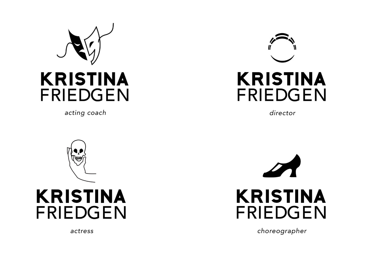
KRISTINA FRIEDGEN LOGO DESIGN | ROUND III
Now we were getting to the heart of the matter. After this round Kristina was able to describe that while the icons were closer to what she was going for, she didn’t love every aspect of them and also felt they should be combined or interact with her name more. She liked the clean efficiency of her name – straightforward, easy to read but felt it sat too flat with no interaction with the icons. She appreciated the idea of the masks but felt their execution to be incongruous next to the text. She decided against the greek theatre icon – it didn’t convey quickly enough what she wanted. The hamlet skull was striking but she felt the focus was too direct on the skull and didn’t emphasize the actor enough. The character shoe was too fashion-centric and didn’t bring forward the idea of dance in her mind.
I’m not going to lie – when I got the feedback for this I felt at my wits end. How was I to bring all these concepts together under one icon and have it interact seamlessly with her name?
Designers are very familiar with this moment. Personally, I usually only identify it in hindsight – but we can all relate to it. When this moment comes I always hear my drawing professor from college in my head say, PUSH IT BACK.
In several drawing classes in college I would meticulously work on a sketch in charcoal and, without fail, an hour into the class my teacher would walk by and say, “now push it back and start over.” By “push it back” she meant use my chamois to smudge the existing drawing back into the paper and begin to draw anew on top of the old drawing.
This “push it back” moment is crucial to the design process, just as it is for drawing. It forces you, the designer, take every previous sketch and concept you’ve made and blur it to the back of your mind. Don’t forget everything you learned in that process, but build new ideas on top of the old.
In her most recent feedback, Kristina had given me all the information I needed. I just needed to take a deep breath and think. As the designer I felt like trying to convey each section of her business would lead to a jumbled mess, but that was working under the assumption that all aspects needed their own icon. Why do I need to convey icons for each different section? Her roles as director and educator are very similar. Her roles as actor and acting coach are similar. Choreographer was truly the only outlying role in my mind.
Putting it together, that’s what counts
With that in mind I started sketching a concept that began with the iconic theatre masks (these representing the ideas of director and educator) and used the ties from the mask to pull the concepts of actor, acting coach and choreographer together.
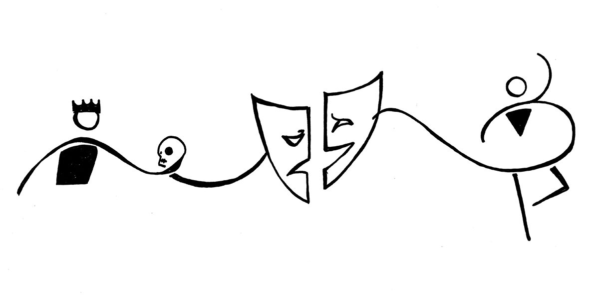
KRISTINA FRIEDGEN LOGO DESIGN | FINAL ROUND SKETCH
From there I just worked on cleaning up the sketch, making it flow seamlessly around and over her name and work both her name and the icon so they interact and balance each other.
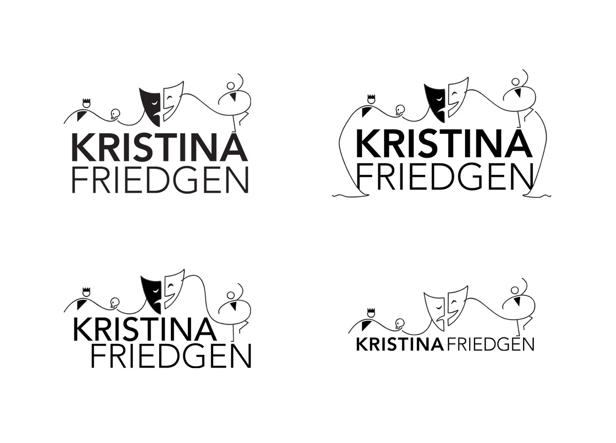
KRISTINA FRIEDGEN LOGO DESIGN | FINAL ROUND
In the end, Kristina selected the design where her name sits on one line, emphasizes “KRISTINA” and balances visually with the flowing lines of the iconography. In order to make the balance between her name and the icons feel more organic, I took the negative space of some of her letters in order to create parts of the icons above. For example, Hamlet’s torso is made from the open-counter of the “K”, and the dancer’s torso is made from the open-counter of the “N”. The masks mouths and eyes are mirrored opposites of each other and the dancer’s foot is parallel to the horizontal lines in the type.
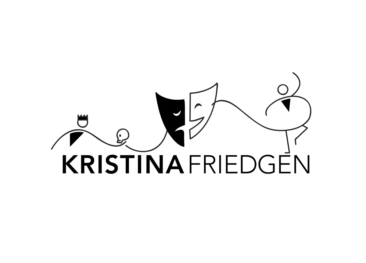
KRISTINA FRIEDGEN LOGO DESIGN | FINAL LOGO
This logo allows for the idea of playfulness, movement, and drama while at the same time not feeling cluttered and disorganized. Kristina and I both feel like the logo encapsulates all her roles while at the same time communicating her business as an expert and approachable theatre professional.
