Meet Leslie Hudson’s Website Redesign
Leslie Hudson is many things: she’s a writer, a public relations marketer, and an event planner. While she wears several different hats, she uses her powers to promote businesses that support ideals she herself is passionate about. From sustainability to canine service dogs to small business entrepreneurs to food news and more. Leslie has built a healthy sized portfolio for her many responsibilities.
A Writer’s Block

When Leslie approached me for this redesign, she had already designed and created her own logo and set up a basic wordpress site to house her writings and general information. But while she had created the written content for her brand she was still lacking a fleshed out brand identity to help create a seamless aesthetic user experience for her professional website.
In the end, I designed a brand and website as well as developed the wordpress child theme for Leslie Hudson’s professional website: LeslieFHudson.com.
new site, new goals
“It began the usual way . . .”
For Leslie, with this redesign, she had a few different goals in mind.
- Her primary goal was to establish a more consistent and professional looking brand for her featured work as a writer, marketer, and event planner.
- Her featured work goals are to develop her blog into a resource for event planners looking for advice as well as a place to feature positive endeavors – from people to events – that she can write about.
- The other goals were to make it easier to contact her about her work or inquire about freelance work
- As well as to make her work more accessible and share-friendly across devices.
Before this redesign, Leslie was relying on a default wordpress theme for her website which wasn’t always visually consistent and was usually hard to update. For this redesign I picked the Genesis parent theme and developed a child theme that utilized repeating modules and simplified content areas to allow for easy updating and consistent styling across Leslie’s site.
Since her primary content goals include becoming a resource for event planners and marketers as well as a hub of positive and inspirational stories the next goal as a designer was to design an extremely readable and accessible blog.
setting the tone
Where now? Who now? When now?
Before I dove into layout specifics I needed to flesh out the brand styling. In our initial interview, Leslie claimed she was looking for a site that could be described by users as “positive”, “funny”, “inspirational”, “calming”, and “feel-good.” When asked what textures, drinks, and seasons her brand aligned with, she said, “sand”, “earthy”, “white wine” and “summer.” This helped establish color palette options as well as visual ephemera ideas, but I needed more logistical information to help shape the tone of her visual brand.
Leslie’s target audience consists of young to mid-level professionals, primarily those working in event and marketing fields, ages ranging from 35 – 55 years old.
From this information I was ready to create and hand off a few mood board options in order to help narrow down the path to Leslie’s brand style.
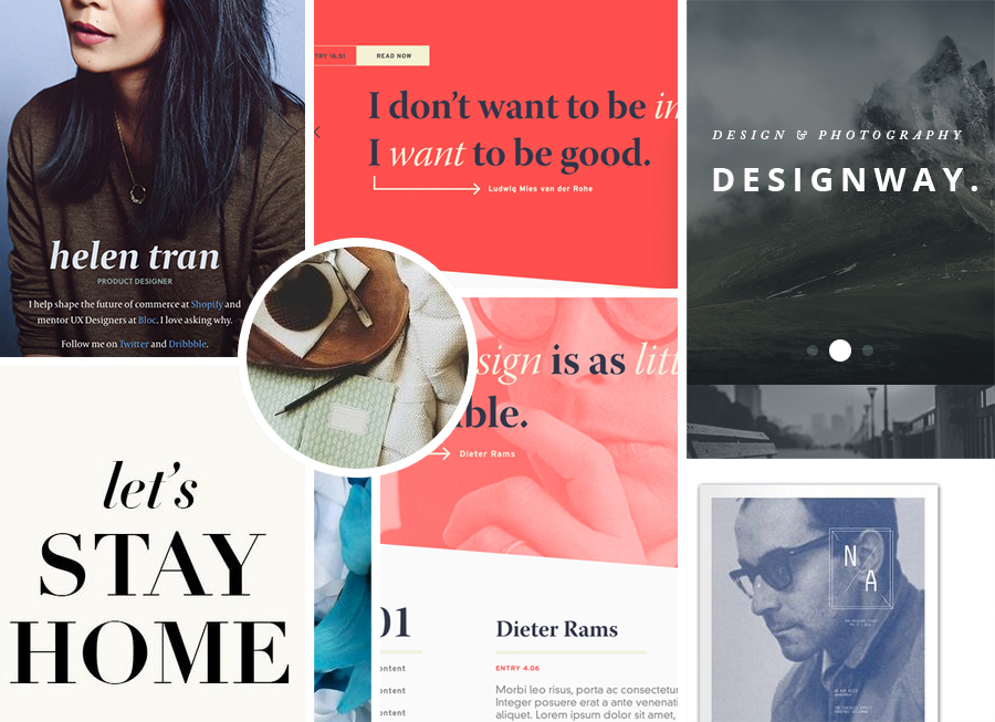
LeslieFHudson.com | Mood board: “Editorial”
This moodboard put an emphasis on strong photo-journalistic photography, bold jewel-tone and flat matte colors, clean and clear-cut typography styles. From this board, Leslie described that she enjoyed the photographs with the text overlay, but didn’t enjoy the color scheme.
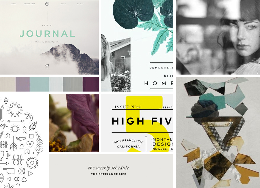
LESLIEFHUDSON.COM | MOOD BOARD: “Herbalist”
Several of the bloggers and websites that Leslie had listed as admiring put a strong emphasis on natural more desaturated colors, less contrast between type and image, and the freedom for icon imagery. The “Herbalist” moodboard tried to encapsulate all those qualities while referencing Leslie’s requests of “calming”, “optimistic” and “earthy.” Leslie was, “really drawn to this one. I love the colors, whimsical hand drawn elements, as well as the various symbols.”
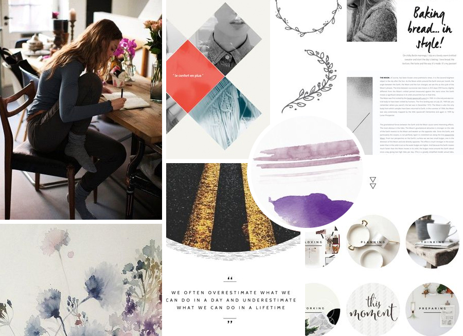
LESLIEFHUDSON.COM | MOOD BOARD: “Dear diary”
This mood board took all the references to positivity and optimism and embraced all the extremely personalized and human elements one can have on a website: hand-drawn elements, like handwriting and water colors and doodles. This moodboard also leaned towards sans-serif fonts combined with display fonts (like the handwriting.) Leslie enjoyed the “pops of color” and she “really like[s] the geometric/circle cut-outs when it comes to photos. It’s something different and features the images without making the photos the focus.” As a writer, the importance of the words cannot be under-emphasized and this comment especially resonated with me from Leslie’s feedback.
First comes Tone, then comes Style
All this happened, more or less
After analyzing her feedback from the mood boards and running through a few variations, Leslie and I were able to finalize her style tile and finish out the brand identity that she began when she made her logo:
See the Pen Style Guide: Leslie Hudson by Katie (@kfriedgen) on CodePen.
We decided on using bold san-serifs as the majority of her text headers with a special display text that would be her secondary header across her site. This contrast allows for bold statements as well as a personalized and whimsical feel. For the body copy we went with an extremely eye-friendly san-serif and utilized her logo-branded lavender color for the links.
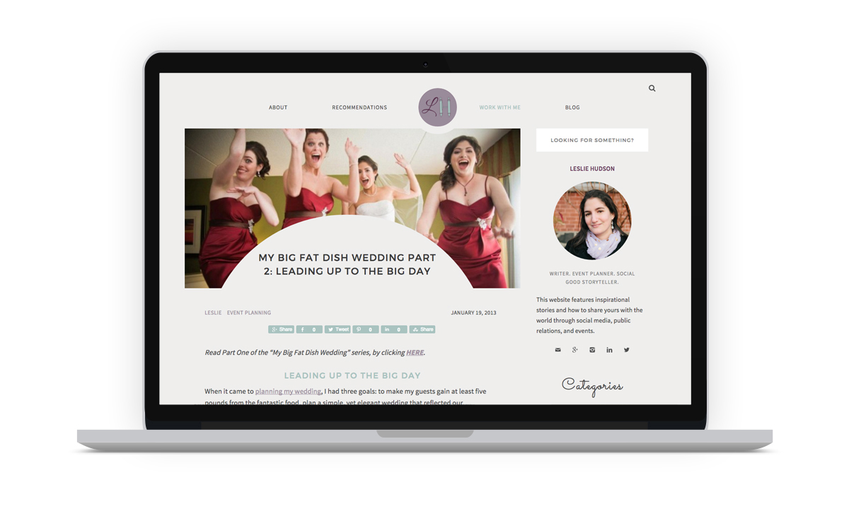
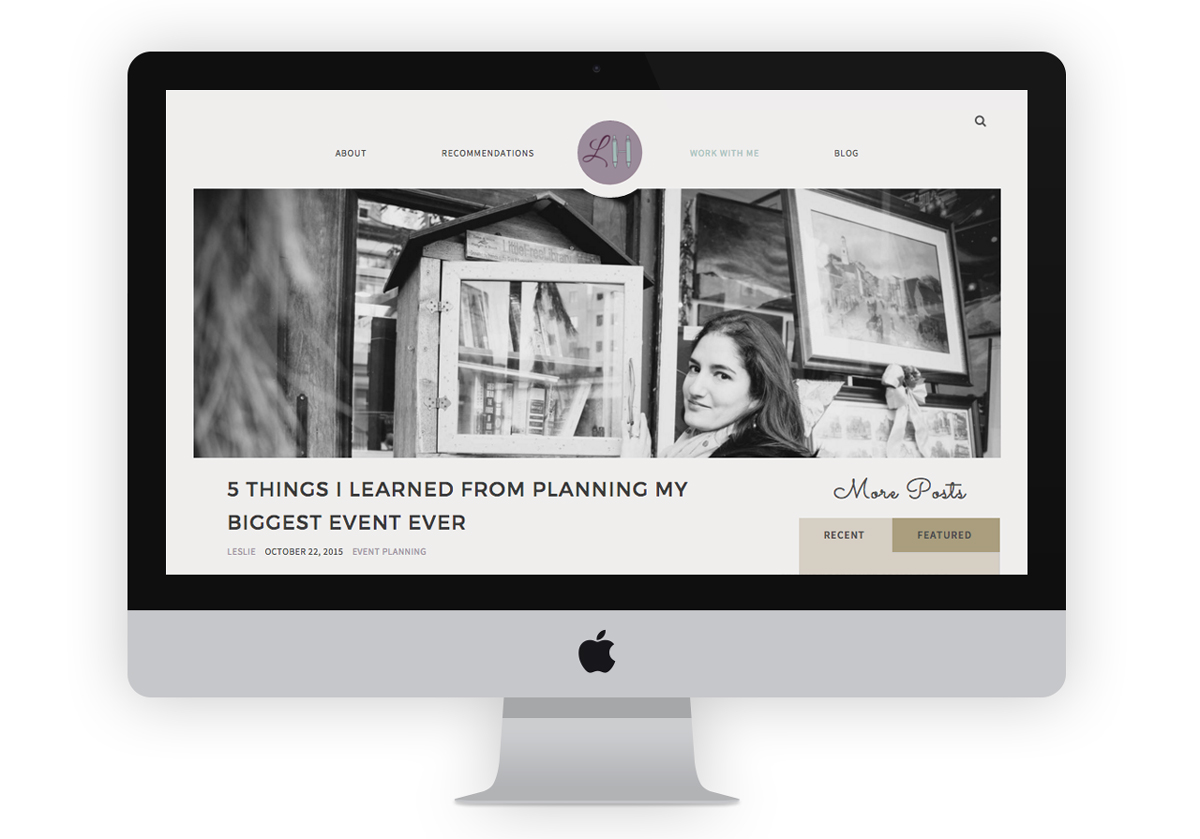
LeslieFHudson.com | SINGLE POST PAGE
The background color was specifically selected to allow for easier user readability. Too much contrast and a user can get eye-tired from the amount of white-space to type-space on a screen. Too little contrast and the reader doesn’t see words – just hieroglyphic lines across a screen. Here we went with a warm gray that complemented Leslie’s branded colors of lavender and teal while also being light enough to provide enough contrast with the body copy and other text colors.
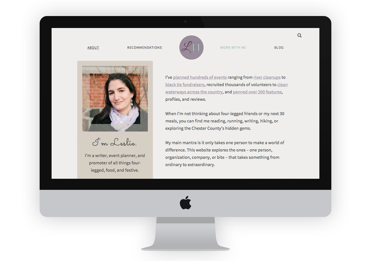
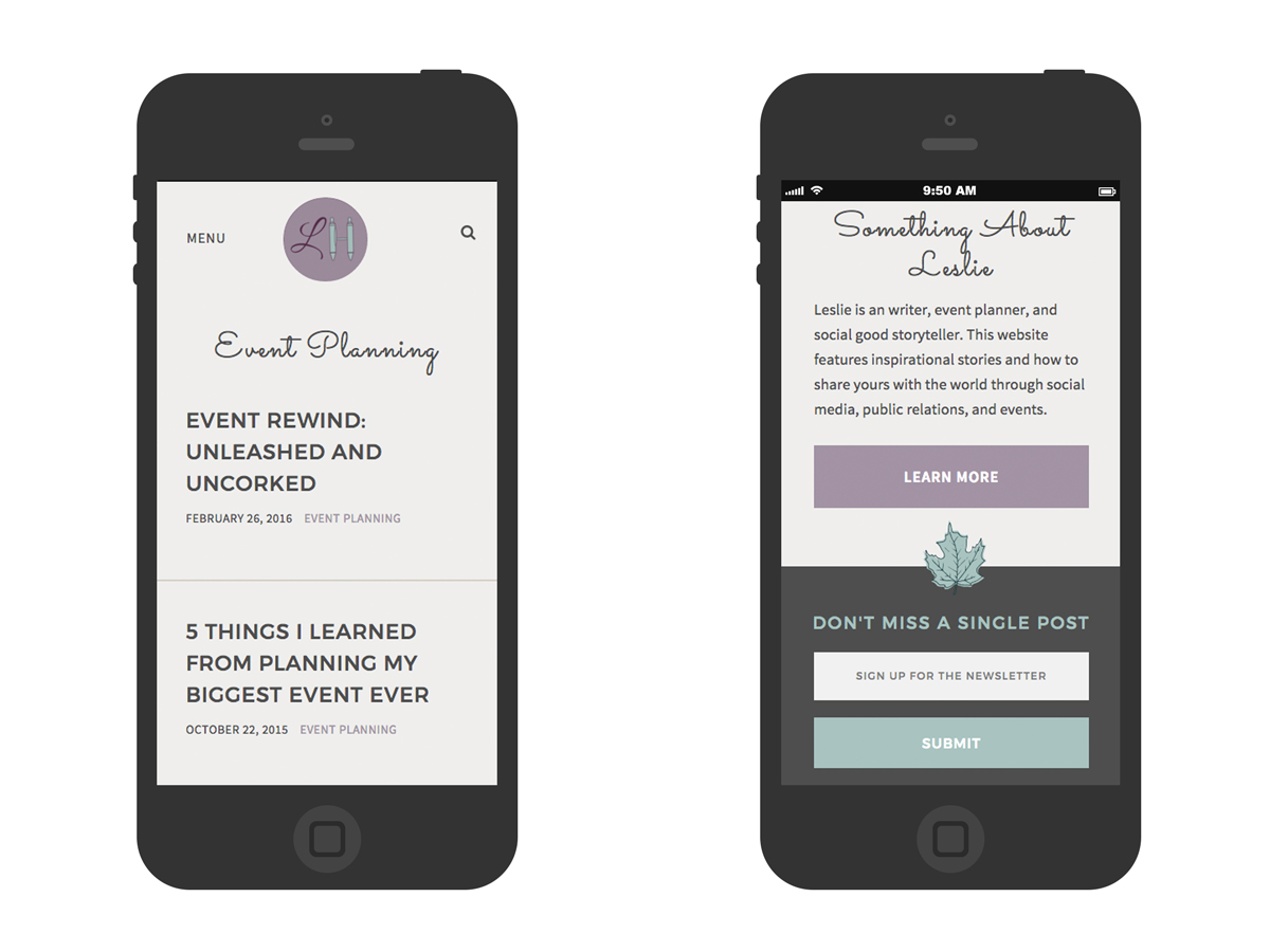
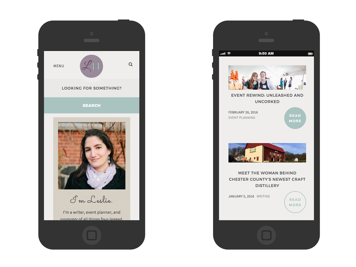
LeslieFHudson.com | ABOUT PAGE
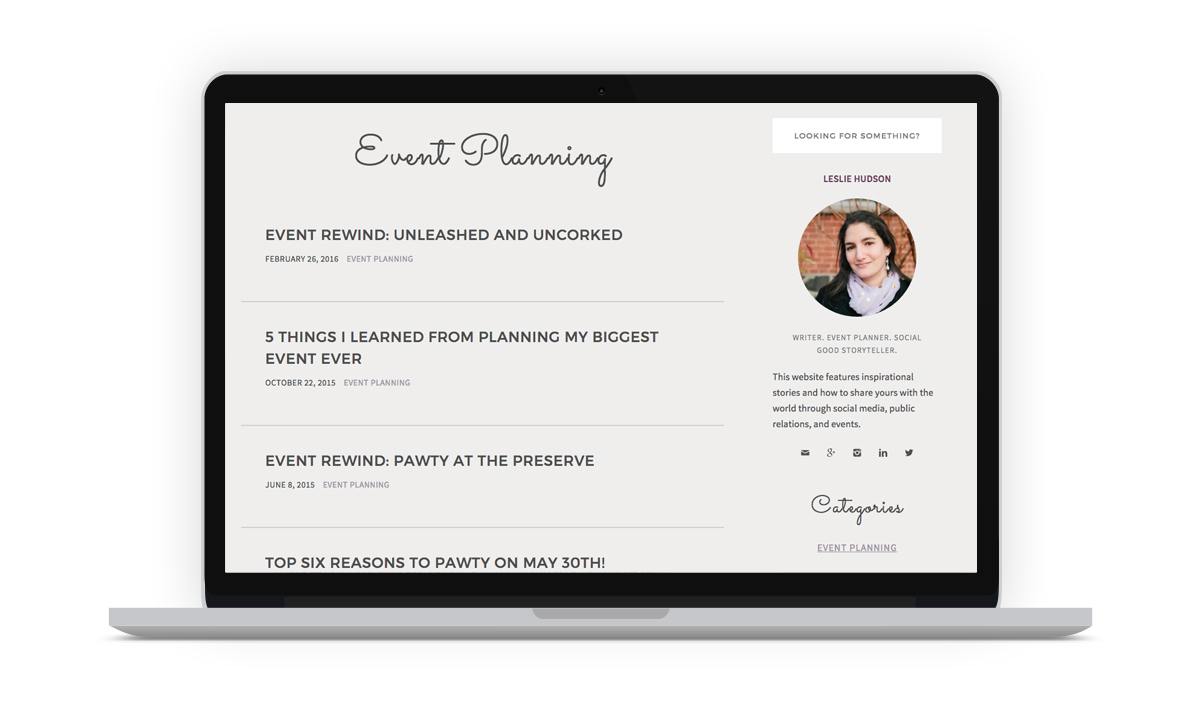
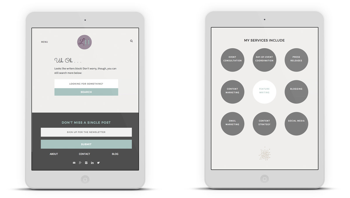
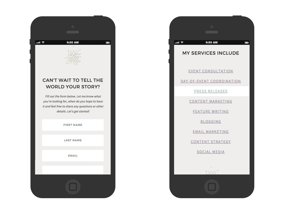
LESLIEFHUDSON.COM | EVENT PLANNING CATEGORY PAGE
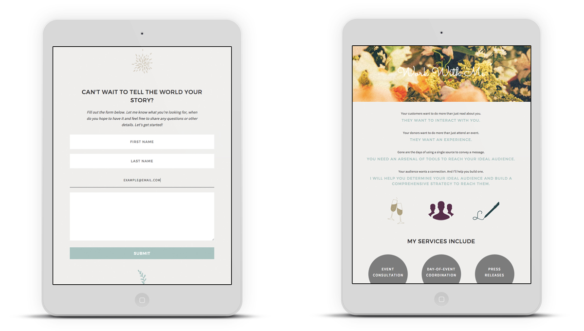
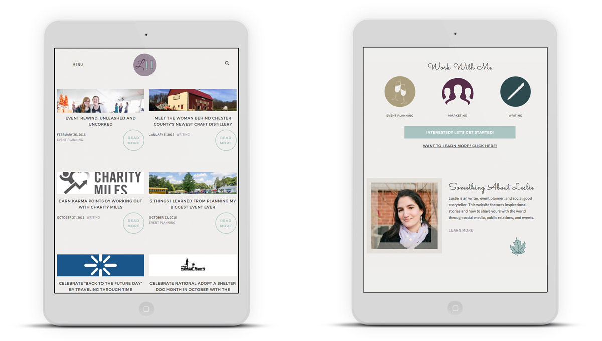
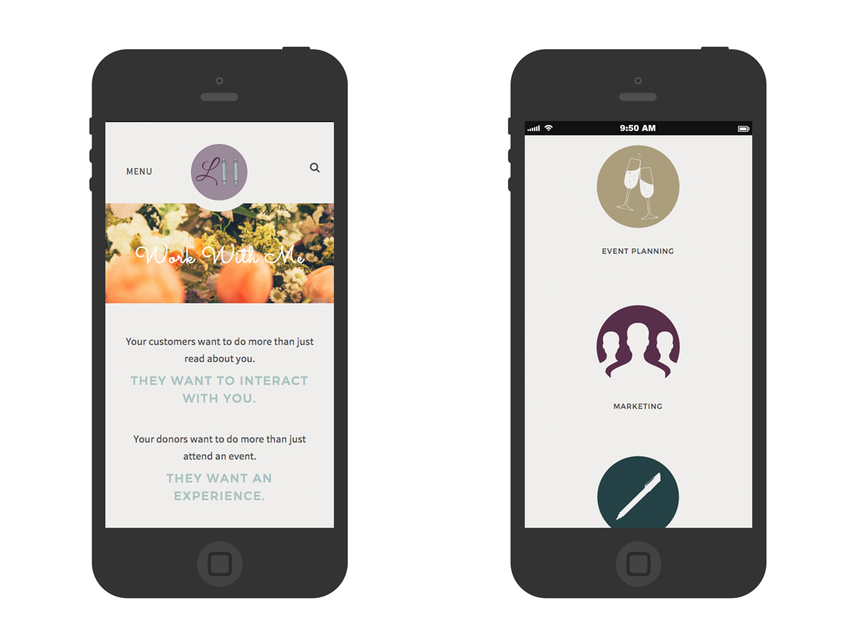
LESLIEFHUDSON.COM | WORK WITH ME PAGE
We established a theme of extremely clickable geometric circles and rectangles across site to showcase images, field inputs and buttons. To align with the whimsical theme we also established a pattern of iconography that would and could be used across site: paw prints, leaves, twigs, and cook books to name just a few.
LESLIEFHUDSON.COM | BLOGROLL
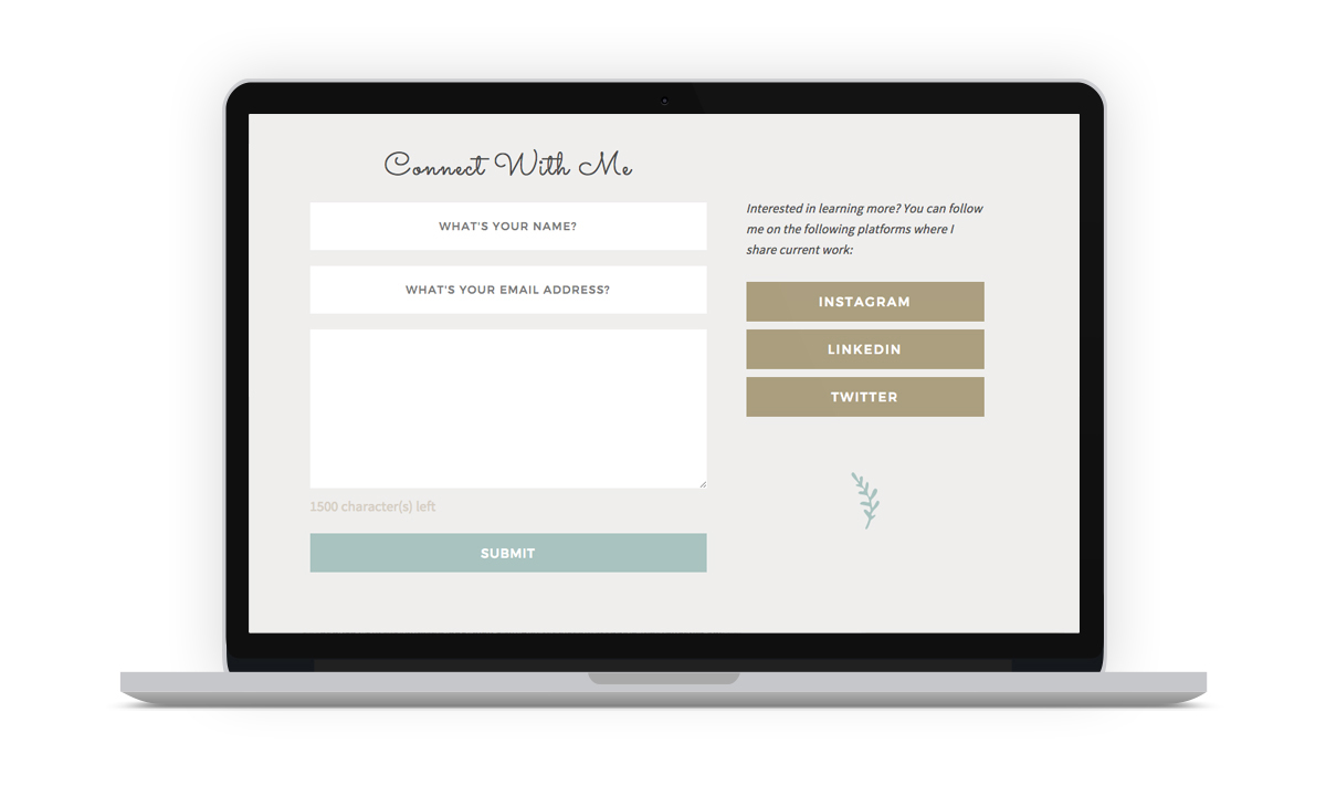
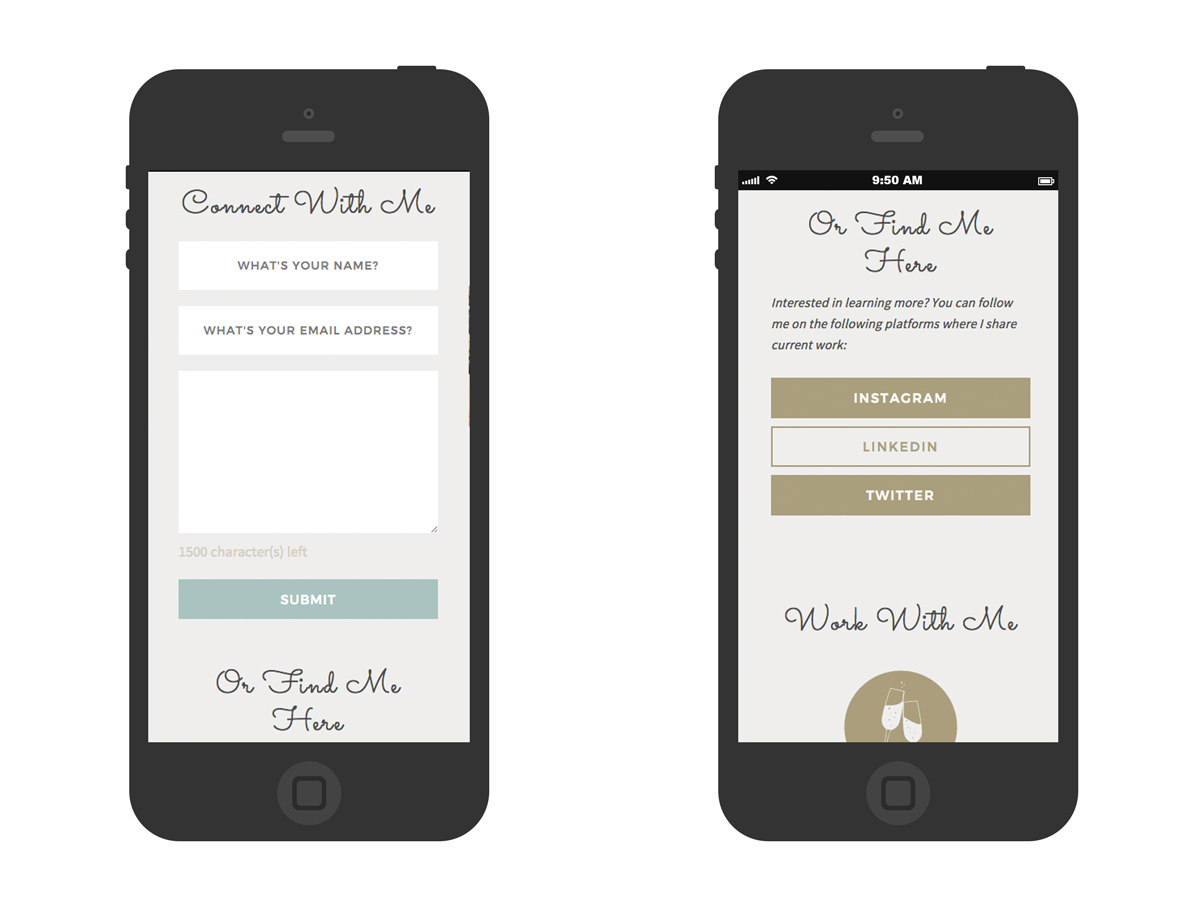
LESLIEFHUDSON.COM | CONTACT FORM
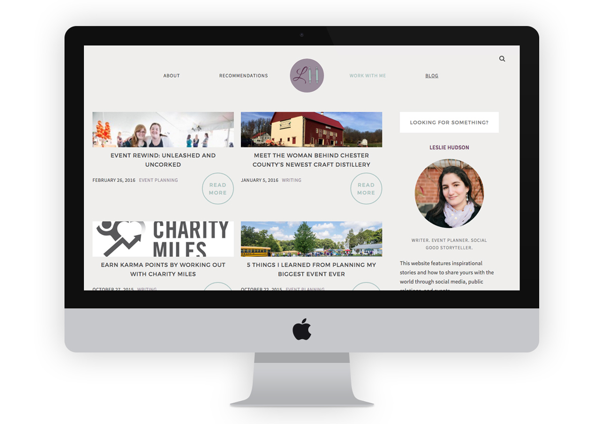
LESLIEFHUDSON.COM | category page & HOMEPAGE (about section)
A few of her icons I developed specifically for her main three roles: event planner, marketing, and writer. For the event planner role and category I designed the champagne flutes toasting, for the marketing role: a group of people, and for the writing role we, of course, went with the mighty pen.
![]()
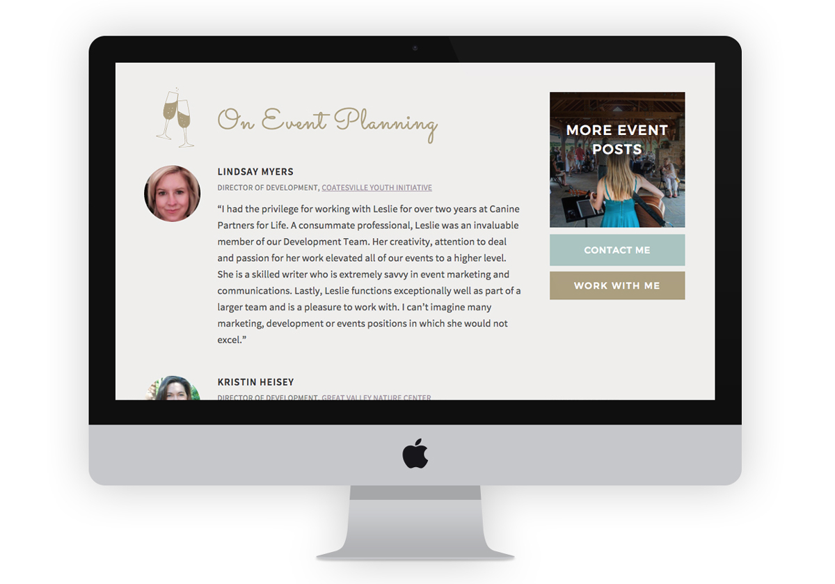
LESLIEFHUDSON.COM | RECOMMENDATIONS PAGE
LESLIEFHUDSON.COM | BLOGROLL & HOMEPAGE
LESLIEFHUDSON.COM | work with me page
As for the designed and developed structure of the site, I wanted to stay true to Leslie’s “calming” and “uncluttered” requests from the initial interview and makes sure this style was utilized site-wide. That is why every page has no more than three main focuses.
But with this simplification we also wanted to avoid the content getting stale to any repeat visitors. That’s why the featured and recent blog post section of the homepage is pulling in dynamically. The recent tab obviously pulls in the three (or two, depending on your screen size) most recent article titles and links. The main image across the homepage and the article associated with the image is dynamically pulled whenever Leslie posts an article tagged with ‘featured’. This gives her the control over updating her page while not forcing her to post an article in multiple parts of her wordpress site.
LESLIEFHUDSON.COM | HOMEPAGE
Lessons Learned
It was the age of wisdom
Working with Leslie on her redesign was an extremely straightforward and clear project. She had a very concrete idea of what she was looking for and as a writer was able to provide extremely well written feedback to help make every iteration and revision a step in the right direction.
The biggest struggle I had on this project had to do with developmental execution of some of my design ideas. For example, the tab section on the homepage is made entirely of CSS. I didn’t want to include the weight of jQuery for one use-case on Leslie’s site so I used the CSS Tricks tutorial of a pure CSS3 tab example to guide my development for this section of her site. But when we entered the QA portion of this project Leslie and I both noticed that the tabs did not render universally across IE9 – Edge. After researching the support, and experimenting a few times I was able to figure out that the font I was using was breaking the tabs because the width of the rendered words pushed passed the space allotted in the tab label. I switched out the font-family and adjusted the letter-spacing accordingly and voila! Fixed.
One of my favorite moments on this project was in developing the focus state of the inputs and textareas across the forms of the site. For too long, considerations for accessible websites were under-documented and under-discussed. But now it’s much more common to find helpful documentation and best-practice emphasis across forums, web standards and mainstream sites.
When I was just out of school, I never worried about the :focus state of any element. I thought it was a “nice to have” for styling purposes. But for people coming into websites using a screen reader it’s sometimes their only way of knowing what they are selecting. When I developed the form inputs on site I made it so that when you :focus on an input it’s background disappears, but it remains underlined to help focus and ground the user to their objective. Now designing and developing for the :focus state has become one of my favorite web-moments with the user.
LESLIEFHUDSON.COM | about (search active) & blogroll (read more focus)
LESLIEFHUDSON.COM | about form & button styles
LESLIEFHUDSON.COM | 404 page & work with me button focus
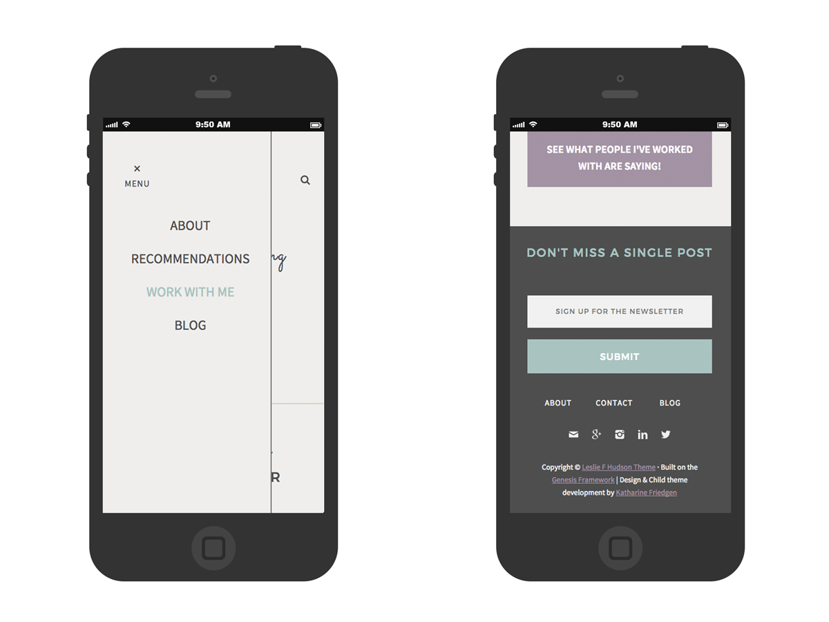
LESLIEFHUDSON.COM | small screen navigation & homepage footer
LESLIEFHUDSON.COM | work with me form & button Styles
Final Thoughts
Every moment was a precious thing, having in it the essence of finality
Leslie’s entire brand focuses around the written word – she tells stories, promotes businesses, and plans functions. With this thought as the cornerstone, I endeavored to create a branded website that focused the audience on Leslie’s words by framing and emphasizing her content with bold shapes, while also illustrating her beliefs and ideals through playful illustrated moments.
In the end, Leslie now has a fully branded, easy-to-update platform to help guide advice-seeking event planners and marketers. A platform where she can also tell the stories of individuals and businesses that inspire her. Working on Leslie’s brand styling and website redesign has been such a wonderful learning opportunity and rewarding experience.
Cited Sources
- A Visit From the Goon Squad by Jennifer Egan
- The Unnamable by Samuel Beckett
- Slaughterhouse-Five by Kurt Vonnegut
- A Tale of Two Cities by Charles Dickens
- Rebecca by Daphne du Maurier