Meet Kristina Friedgen’s Redesign ⇥ Part Two
For this redesign, Kristina and I discussed the three tiers of initiatives she hoped to accomplish.
- Direct students to her acting coaching business. A business with the goal of helping students looking for ways to improve for their theatrical college auditions and prepare for other theatre pursuits.
- Expand on her work as an educator of theatre at Good Counsel High School.
- Showcase her work as an actor, singer, dancer, director and choreographer.
Those are three very hefty goals. One could build a website solely based on one of those goals. For me, as the designer, the first challenge to come to mind was: How do I communicate all these directives without overwhelming the user?
The Last Collaborator is your audience
In order to answer that question I needed to dive deeper into who that user would be. Kristina Friedgen’s audience consists of three main pools of people.
- The first being any potential clients, ages ranging from 14 – 20 years old with little to moderate theatre experience looking to hire an acting coach or students interested in Good Counsel’s Theatre Department. Their primary objective is to find a way to contact Kristina, either for an appointment or to find more information.
- Next we have the potential client’s parents, ages ranging from 35 – 55 years old with varying levels of understanding of theatre as a professional track. Their primary objective is to suss out what Kristina offers as an acting coach and educator and find a way to contact Kristina, either for an appointment or to find more information.
- The third group is what I refer to as “the peers”. These are theatre professionals, ages ranging from 25 to 45 who are looking to Kristina’s website for advice, information about upcoming shows, references to work on previous shows, and more. Their primary objective is more discussion based. They want to learn more about working in theatre from all aspects: do’s and don’ts, professionalism, technical aspects, and more.
It’s not easy taking users that range anywhere from 14 – 55 years old and who have varying levels of theatrical knowledge and find the best way to get them the information they seek in an inferential and efficient manner.
ATTEMPTING TO BRING ORDER OUT OF CHAOS
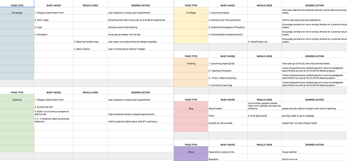
Kristina decided on separating her different varying roles into three sections of her site: Coaching, On-Stage and Teaching. Once that division was decided, together we went through and narrowed down the user-goals for each page. What desired action did she have for the user on each page? Well for coaching it was to make an appointment, for the on-stage page it was to have the user buy tickets to her next show, and the teaching page was to direct users to the Good Counsel site and their next show.
After narrowing down these goals across all her pages, I was ready to start wireframing her site.
KRISTINAFRIEDGEN.COM | WIREFRAMES
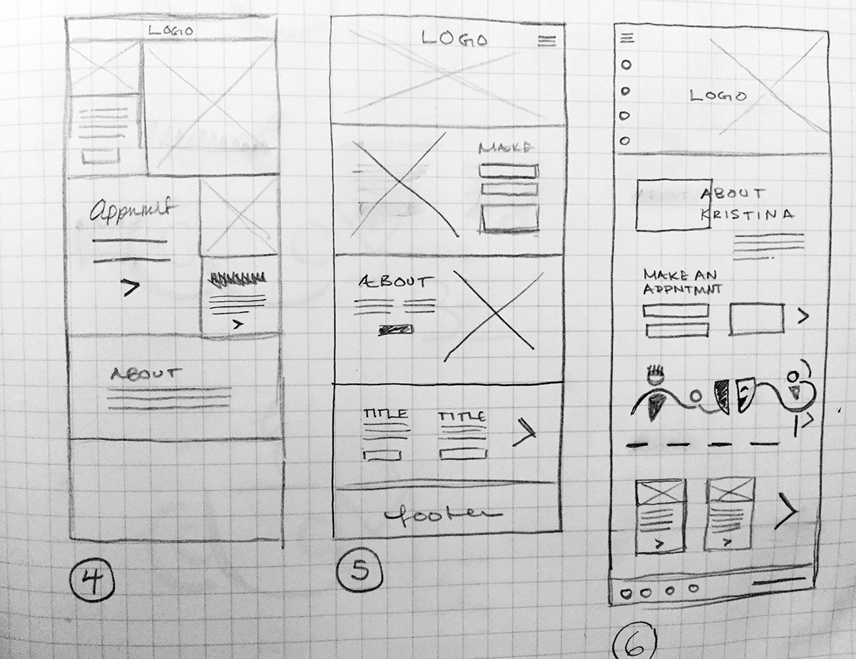
KRISTINAFRIEDGEN.COM | WIREFRAMES
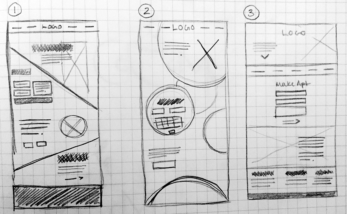
The purpose of these wireframes is not to establish style or aesthetics, but to help expose the hierarchy of elements on a page and how they’ll be seen across multiple devices. At the same time the wireframes were handed off, I also handed off some proposed style tiles.
Style tiles are similar to mood boards, only they utilize designs and styles directly for the site. They utilize the client’s logo and propose color schemes, textures, type treatments, photo treatment, etc. But they do not reflect the web design layout or how pages will be structured.
The goal of the style tiles are to get the general styles that will impact the entire site without prematurely worrying about how the page will layout with that design.
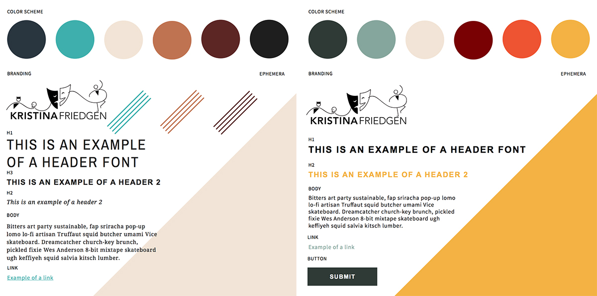
KRISTINAFRIEDGEN.COM | STYLE TILES ROUND I
From our previous mood board discussion Kristina was clear that she desired a design that had energy and positivity but also communicated maturity and professionalism. For this purpose, I kept this initial handoff pretty bare bones as I wanted Kristina to see two versions of “mature” and “energetic” and see which direction she leaned in.
For the wireframes she selected numbers 1, 4, and 5 as she liked the variation of layout and the order in which the elements were layered. As for the style tiles she liked the maturity of the colors but felt they were too “masculine”.
So for the next round I began to incorporate some of the aspects from the wireframes into newly designed style tiles to see which design she felt served her brand’s purpose more:
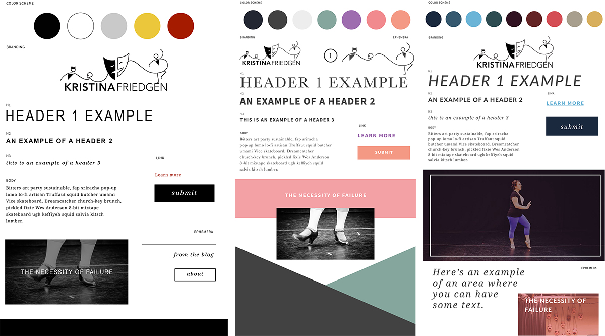
KRISTINAFRIEDGEN.COM | STYLE TILES ROUND II
When I hand off variations of designs to a client, I try to give at least one very different design from the rest. Like a scientist, I try to treat this as a control group. I’ve noticed that this helps the client express more clearly what they like in the proposed designs because they see a more vast difference across all of the deliverables.
Out of all of these, Kristina liked the third one the best as far as color, photo treatment, buttons, and typography go. But in the first one she liked the header type treatments and in the second tile she liked the overlapping angular shapes at the bottom.
ANY MOMENT, BIG OR SMALL, IS A MOMENT AFTER ALL
Finally we come to the part of the process where I hand of the mocks that incorporate the feedback from the wireframes and style tiles. From these the client is able to begin seeing how all the design elements will come together on their site.
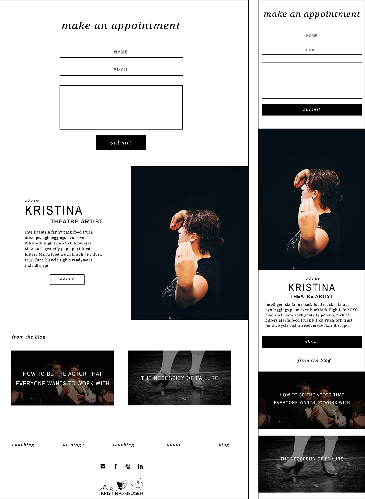
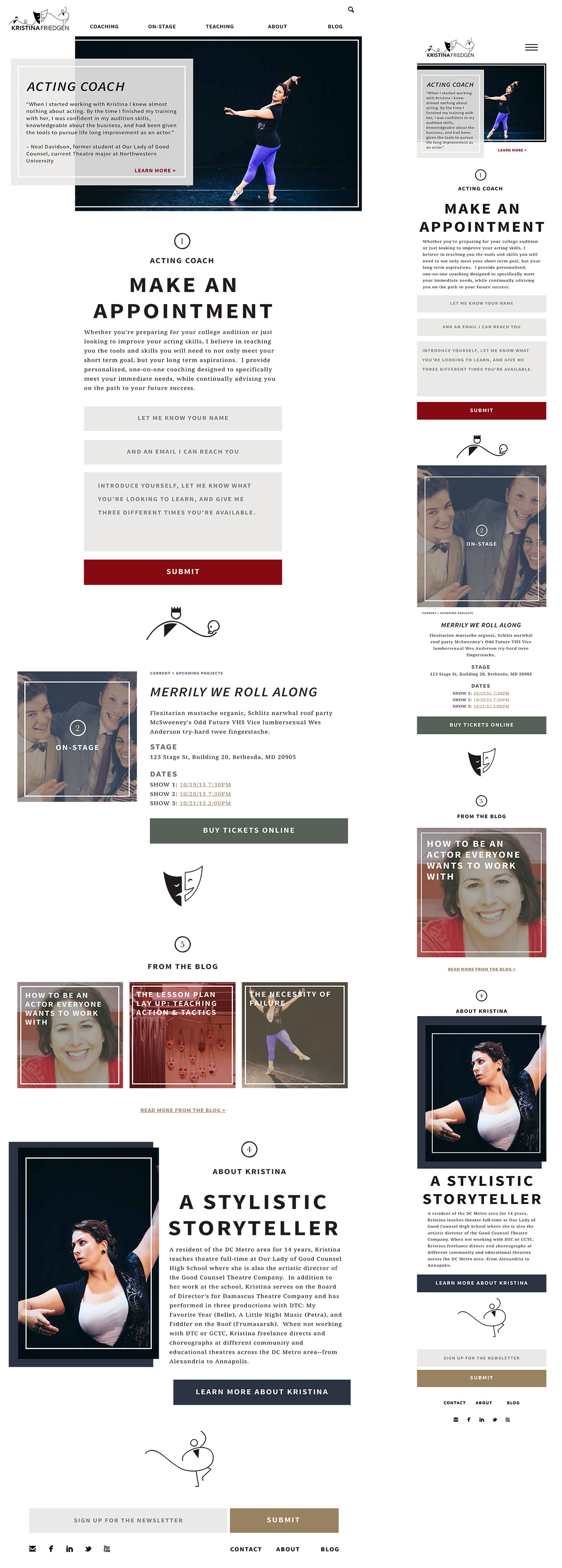
KRISTINAFRIEDGEN.COM | MOCK A
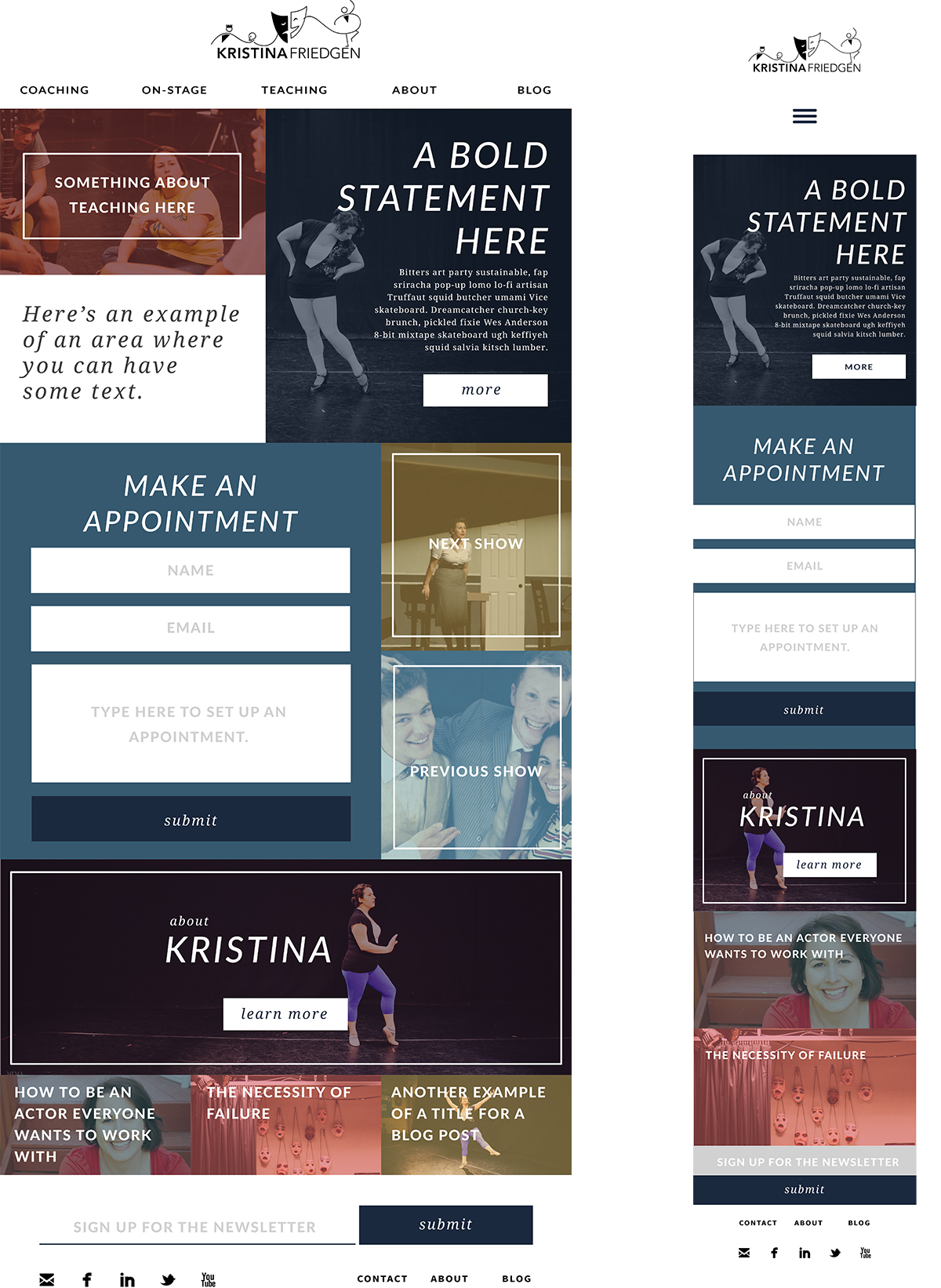
KRISTINAFRIEDGEN.COM | MOCK B
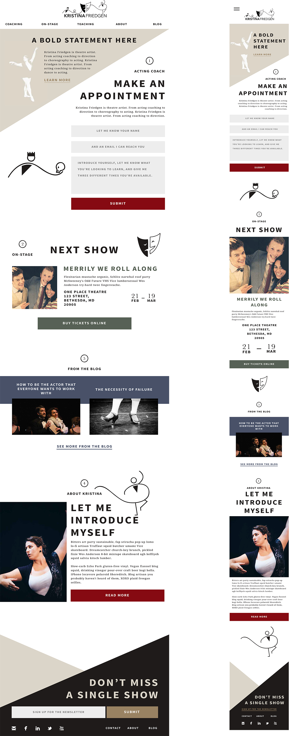
KRISTINAFRIEDGEN.COM | MOCK C
When I hand off mocks at this stage I always show how a design like this would sit on a large screen and a small screen to make sure that even this early in the project, the client is considering the usability and user experience of their site from a mobile or tablet perspective.
Kristina was ecstatic about the mock C, she loved the colors and felt they were mature and bold. She loved the text treatments and the handling of buttons, number styles, and general layout with enough white space to allow the user to visually focus on several items without being overwhelmed. But she found didn’t love the angular treatment of the content at the top of the page.
In mock A, she loved how the titles were designed with the three tiers of different type styles leading to the paragraph fonts. From mock B she found she enjoyed how the images with color overlays and the white border emphasized their content without overpowering the page.
FINISHING THE HAT
Armed with this feedback I was able to hand off a final round of mocks for Kristina to see:
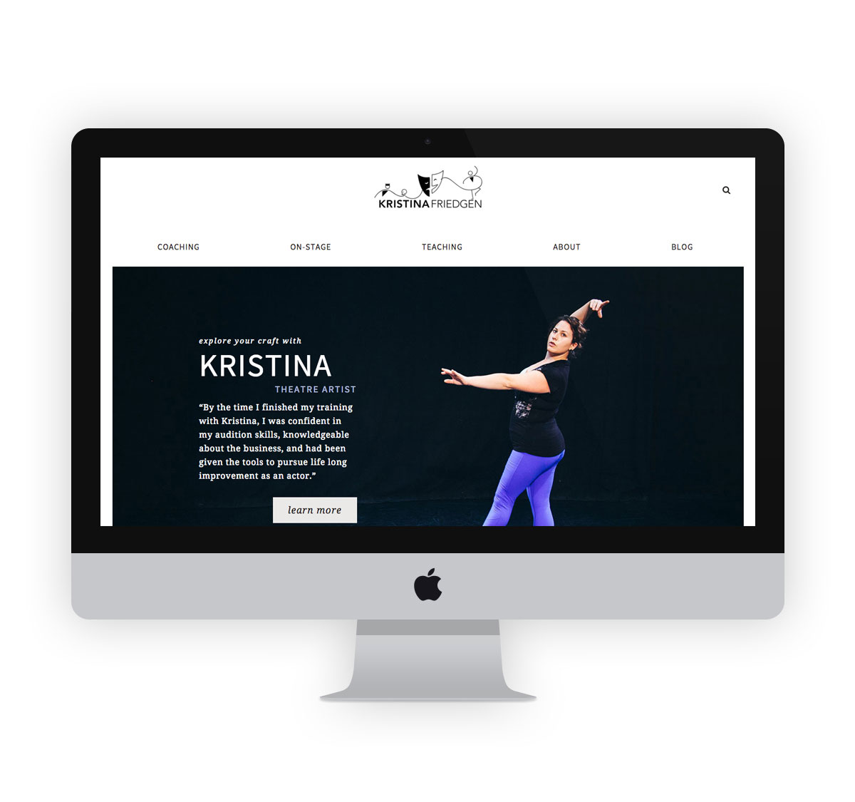
KRISTINAFRIEDGEN.COM | MOCK D
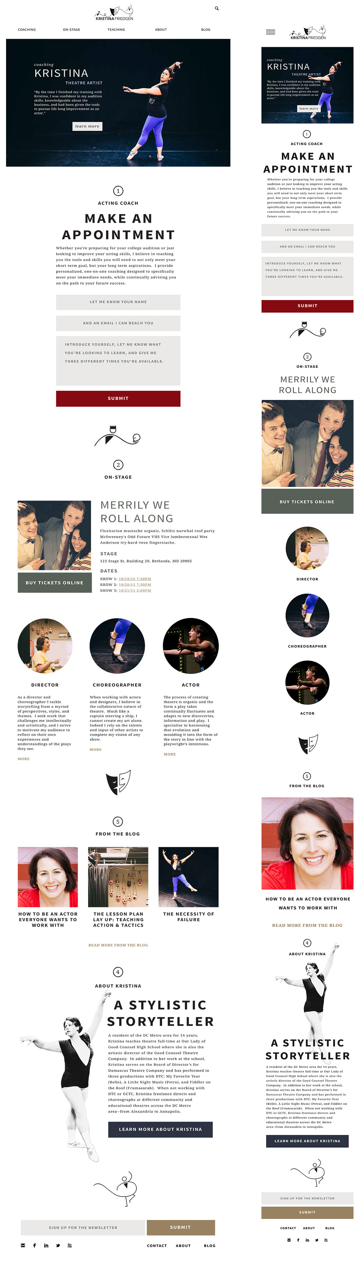
KRISTINAFRIEDGEN.COM | MOCK E
It’s at this stage that the designs begin to look similar, with few differences. For these mocks I tried to incorporate everything Kristina preferred in the previous round while also taking some of the styles a bit farther or interpreting the elements in different ways.
Kristina absolutely loved mock E and her only feedback was she preferred the way the blog section looked in mock D better. From there we had our final design.
Once all styles are approved, it’s at this point that I make the digital style guide:
See the Pen Style Guide: Kristina Friedgen by Katie (@kfriedgen) on CodePen.
The digital style guide is a way for my clients to see their styles in the context they will be delivered: on the web. It’s through these digital style guides that a client can say “oh, I don’t love how the hover state looks on that button”, or “can we make my sign up form larger?” You can’t always rely on pdfs to translate everything perfectly since you never know how they’ll be opened and viewed.
I also like to have the digital style guide as a palette and reference as I develop the site. This is where I begin to design and plan the layout for the website’s css styles and how every page will be coded, what aspects will rely on widgets, what will render in the page content, etc.
For me, designing and developing a website are two sides of the same coin – you can’t consider one while ignoring the other. That only leads to future frustrations. One of the major reasons Kristina wanted a re-design of her website was because her old site was not on a content management system. Her new website is now run on a WordPress child theme that I developed so that she could easily update her website’s content without stress or worry.
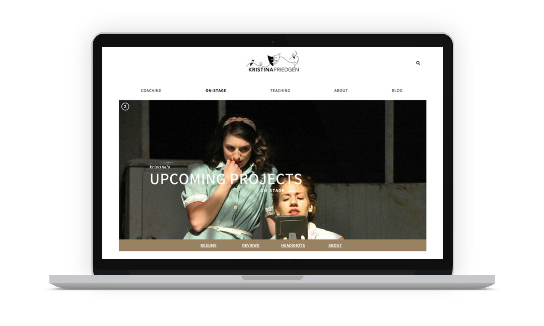
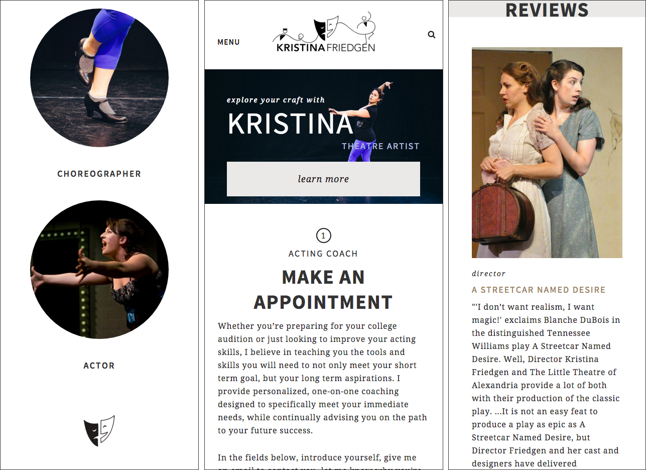
KRISTINAFRIEDGEN.COM | ON-STAGE
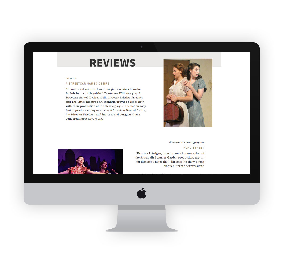
KRISTINAFRIEDGEN.COM | Reviews
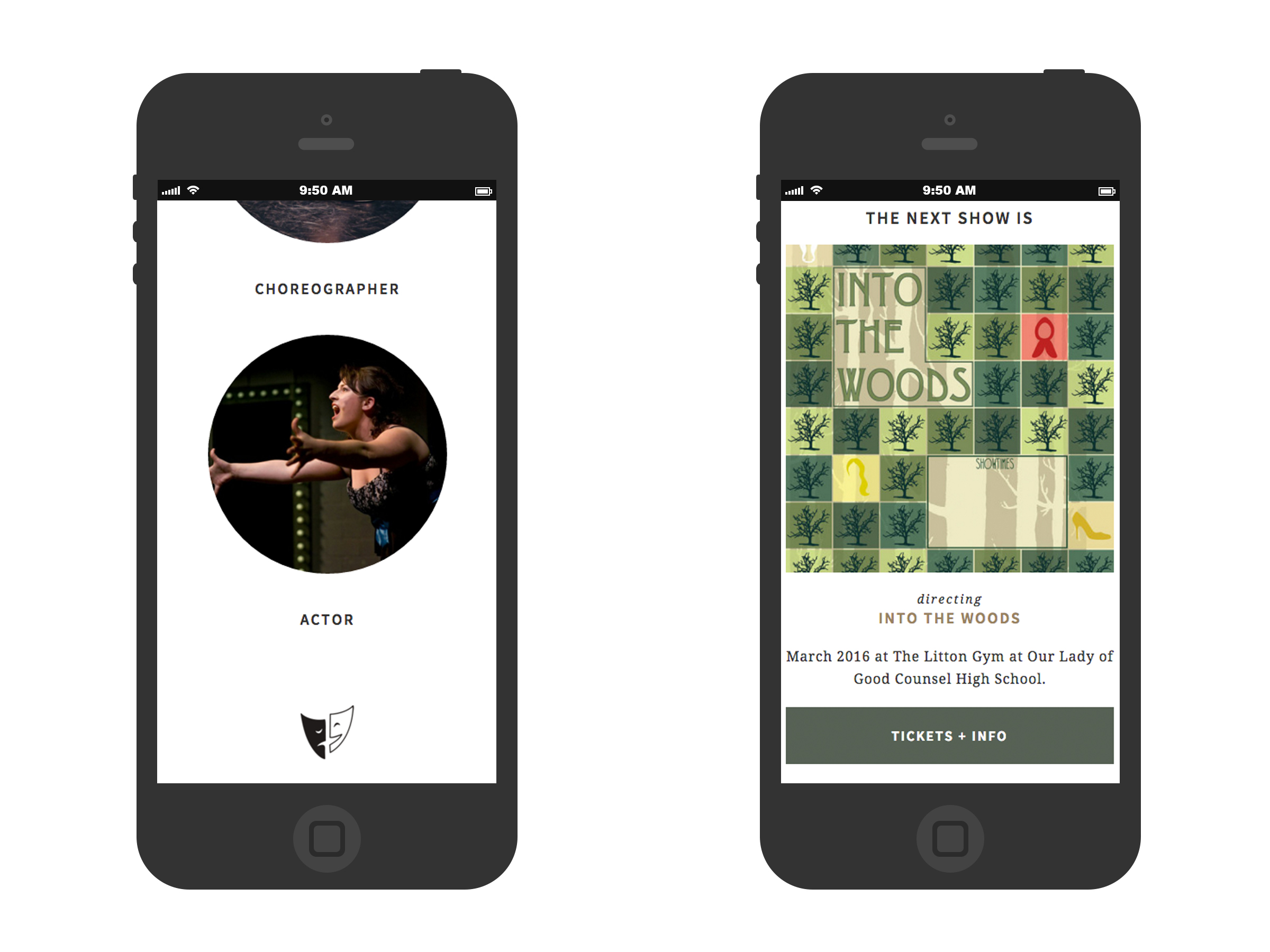
KRISTINAFRIEDGEN.COM | homepage (small screen views)
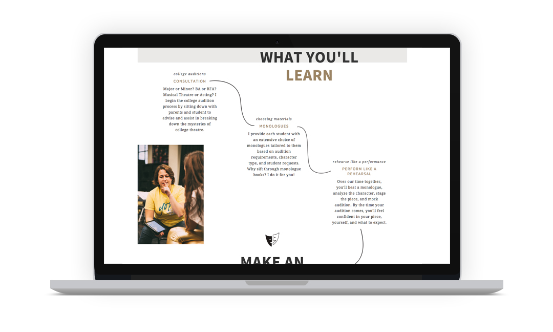
KRISTINAFRIEDGEN.COM | coaching
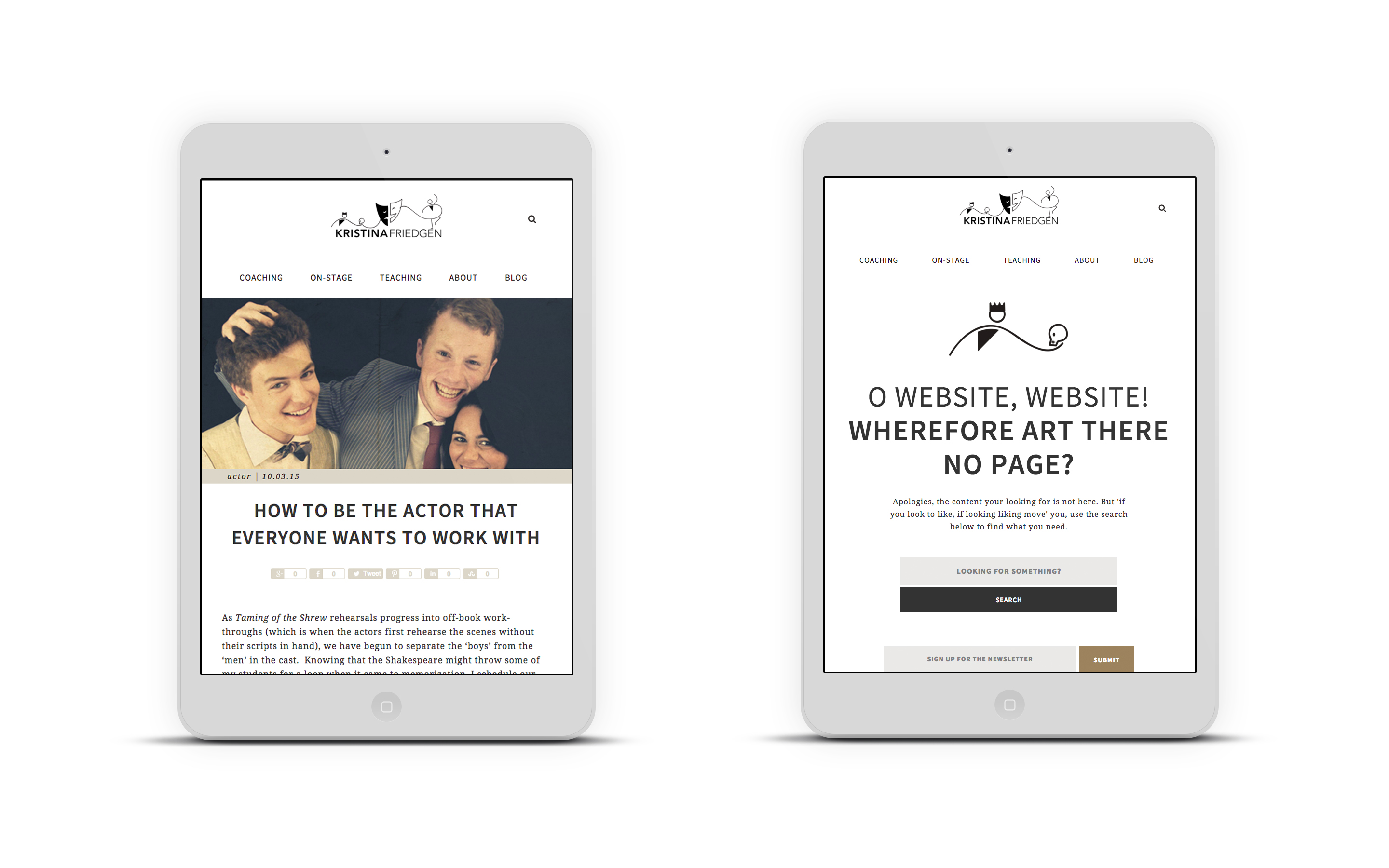
KRISTINAFRIEDGEN.COM | blog post & 404 page
FINAL THOUGHTS
From theatre icons to color schemes all the way to development layout, redesigning and developing Kristina Friedgen’s new brand was never once boring. One of my favorite aspects of being a designer is knowing I’ll learn something new with every project I take on. This was the first project I put extra emphasis on how the client would use the content management system after I was done and how I could develop the site in such a way that would make every update as simple as possible.
Kristina can now have people sign up for coaching lessons, navigate to buy tickets for her shows, learn from the theatrical experiences she shares on her blog, and she can keep everything up-to-date on her own.
Looking back over this entire process, I can’t help but be extremely proud of the end result. What felt daunting in the beginning – taking so many different roles and representing them in one icon on one website – now I can appreciate for what it was: a wonderful creative journey.