
Meet Green Philly Blog ⇥ Part One
Green Philly Blog was born from the drive of two green-loving commuters who wanted a way to dive deeper into city sustainability and contribute to the green movement specifically in Philadelphia.
Green Philly is an independent online publication bringing you the latest sustainability news, events and happenings in Philadelphia. We help you live a local, easy, and low-cost sustainable lifestyle with a side of sass to keep you entertained.
Since it was started in 2008, Julie Hancher has made GPB into an extremely useful and in-depth resource for Philadelphia’s green society.
When she first reached out to me, Julie knew she wanted two specific deliverables:
- A redesigned logo
- A redesigned and developed WordPress child theme
To that end, Julie expressed her goals and what she was hoping to achieve with this branding overhaul and site re-design.
A Fresh Green Start
A Sustainable Site Looking for a Fresh Start
Green Philly Blog’s average demographic is around 25 – 35 year old, city-living, professionals. Julie wanted her brand to reach her current demographic while still being easily and readily accessible to anyone interested in learning more about green activities and information.
Once on the site, Julie wanted the user’s primary action to be to click into the articles and the secondary action: to share the article across social media in order to make the content within reach of a wider audience.
In addition to audience, Julie was looking to re-brand Green Philly to reflect her goals of establishing GPB as the main resource online for green news and information. With that in mind, the look of the logo needed to include a strong Philadelphian presence while not crossing the line into kitschy.
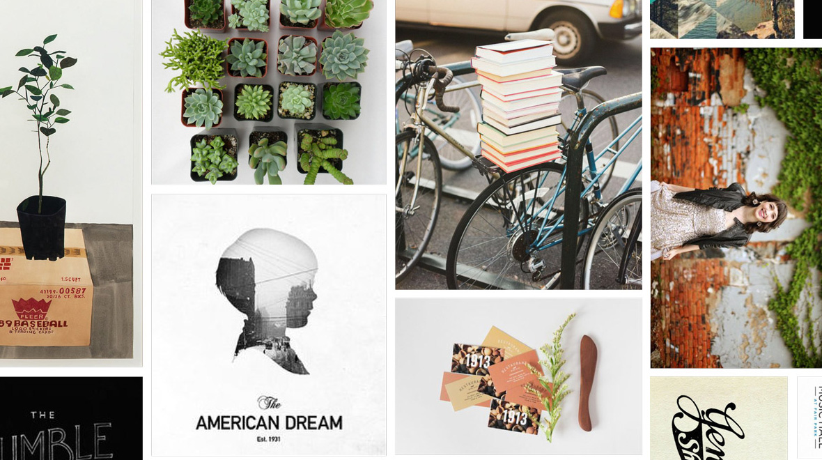
Before I begin any project I start a mood board for myself and a collaborative one with my client. Julie had the initiative to have already started an idea board on pinterest so we went with that to communicate concepts and ideas at a high level in the beginning of the project.
Much of the basis for my own personal moodboard is based on a questionnaire I have each client fill out at the beginning of a project like this. With this project, the main inspirations stemmed from keywords like “urban living”, “nature”, “clean”, “biking”, “Philadelphia”, “history” and color preferences of green, blue, gray, and browns to reference colors found in a city.
Part I: A New Logo Designed
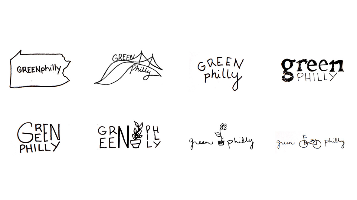
Logo concepts round I
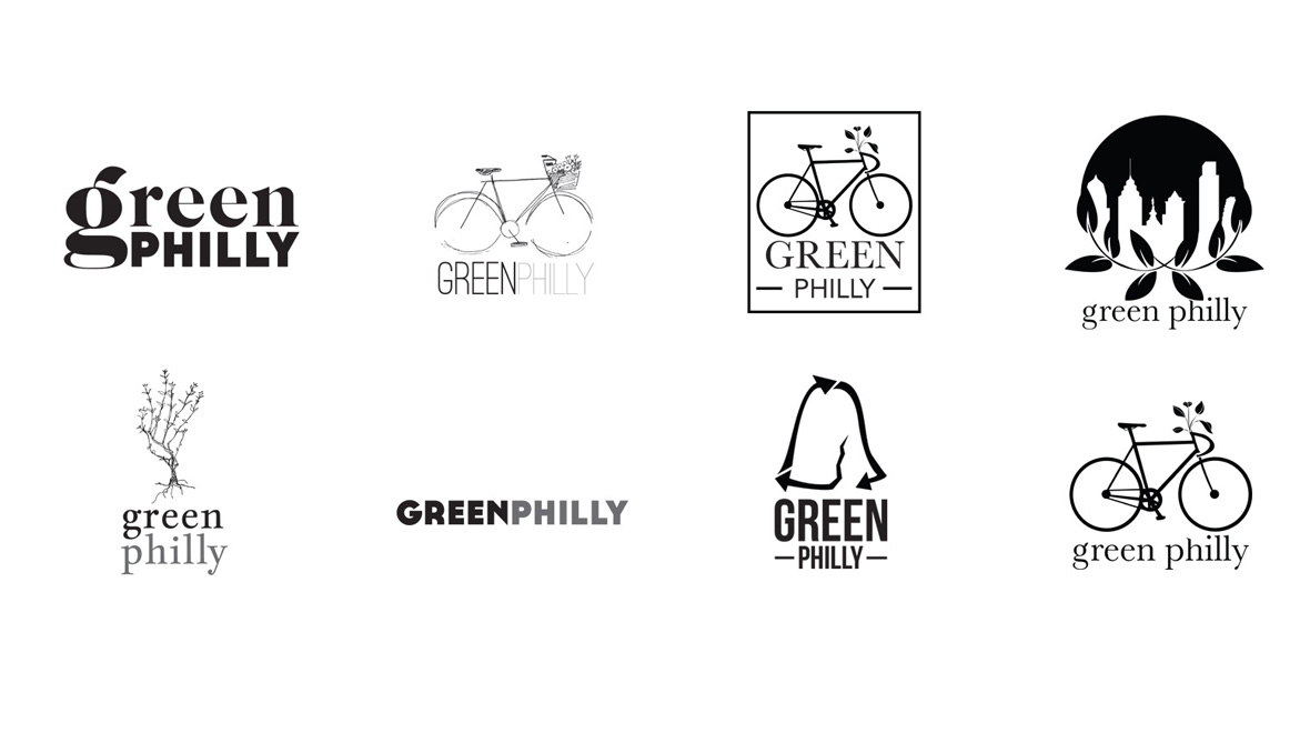
Logo concepts round II
The first half of this project was establishing the new logo design which would help inform the later web design and overall feel and aesthetic of the re-brand. The first round of sketches I handed off to Julie were mainly a way to get the conversation started, raw sketches of high level concepts. The key is to hand off a variety of options – there were a few with text and icons, just text, just an icon, thick lettering, thin lettering, boxy, etc.
After each round I usually say – it’s ok if you don’t like any of these, but tell me specifically what you do like about some of them and what you do not like about others. This helps shape the concepts and push it towards a curated solution.
After the first round Julie was interested in exploring some options of just the words alone, some options featuring specific icons: bicycles with flowers, plants, and window boxes of plants. This led us to more discussions focusing the design towards iconography that embraces Philadelphia history and culture. Iconography like the Liberty bell, Ben Franklin, etc. and in addition to that keeping bicycle and nature themes present was also a priority.
Logo concepts round III
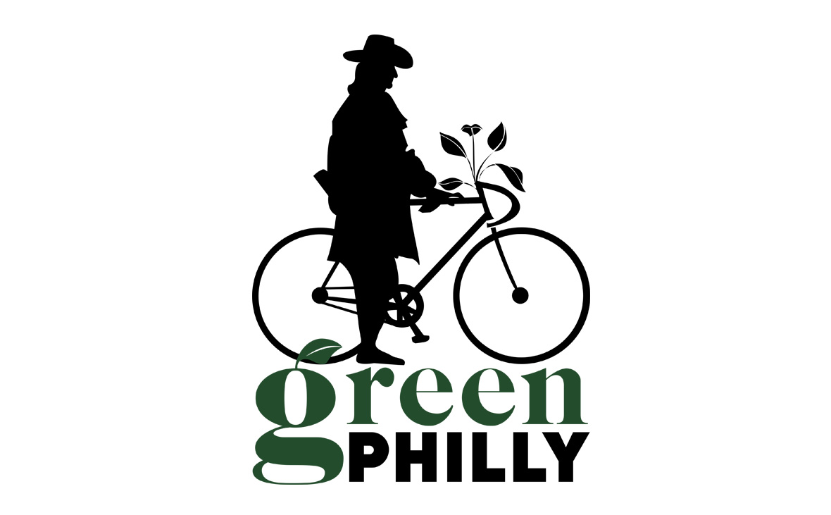
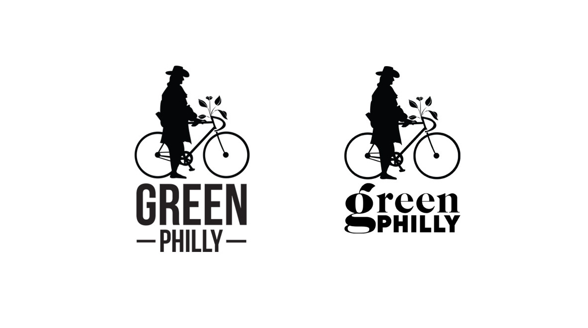
Final logo design
Making William Penn look good in green
Here is where we narrowed it down to the silhouette of William Penn with his urban, sustainable bike. The integration of the Green Philly typography came in a little bit later with the added leaf embellishment on the “g”. In the end, we both felt this logo captured the spirit of the Green Philly Blog manifesto while also lending itself to having an approachable, unique and fun vibe.